
Casual Morning: a bold all-caps handwritten family for playful branding
Design style
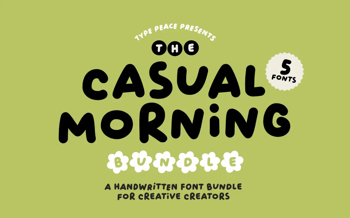
Casual Morning is an all-caps handwritten face built on thick, marker-like strokes rather than fine calligraphic ones. The letters lean slightly forward and wobble just enough to feel drawn by hand rather than traced by a plotter. It sits closer to lettering than script — there’s no joining between letters, so each character stands as its own small gesture. The bold weight and rounded terminals give it a friendly, upbeat mood rather than anything moody or refined.
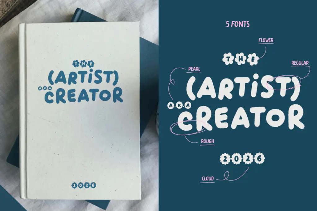
The family spreads across five styles: Regular and Rough carry the workhorse job of titles and running text, while Cloud, Pearl and Flower are decorative variants meant for accents rather than paragraphs. Rough adds texture and edge wear that reads well at larger sizes, giving the set a bit of range without straying from its core handwritten voice. It’s not a subtle typeface, and it isn’t trying to be — the drawing commits fully to a loose, energetic style.
Character set and features
Each letter comes in two versions, and the font uses OpenType Standard Ligatures to automatically swap in the alternate whenever two identical letters sit next to each other. This is the most useful engineering decision in the package: without it, doubled letters in a handwritten face almost always look mechanically repeated, which breaks the illusion of a human hand. Here, a word like “BALLOON” or “COFFEE” avoids that stutter, and the swap is invisible enough that most viewers won’t notice the trick — they’ll just sense the word feels more natural.
The set covers numbers, punctuation and symbols, plus multilingual support across Western, Central and South Eastern European Latin characters, at least in the Regular and Rough styles — worth checking if the decorative styles need the same coverage for a particular project. Being all-caps only, there’s no lowercase to worry about pairing, which simplifies typesetting but also means you’re always working with the same visual register: shouty, upright, attention-grabbing. There’s no true italic or light weight to soften it.
Use cases
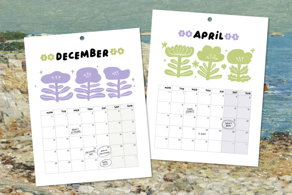
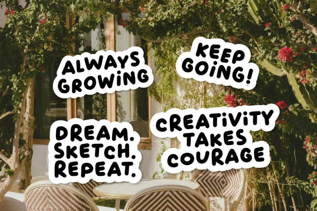
This is a display font first, and it should be treated that way. Short headlines, social thumbnails, sticker-style labels, packaging call-outs and quote graphics are where the bold strokes and hand-drawn wobble earn their keep. The Rough style suits food and drink branding that wants a bit of grit — think coffee bags, snack packaging, farmers’ market signage. The Cloud, Pearl and Flower variants are narrow-purpose: drop caps, badges, small decorative flourishes around a headline set in Regular.
It’s not built for body copy — all-caps handwriting fatigues the eye quickly past a sentence or two, and the deliberate irregularity that makes it charming at large sizes gets noisy at small ones. For anything needing sustained reading, pair it with a plainer companion face and reserve Casual Morning for the attention-grabbing line above it. Used that way — as a punchy header font in social or packaging work — it does its job without overreaching.
What we liked, and what we didn’t
Strengths
- Automatic double-letter substitution avoids the robotic repeated-letter problem common in handwritten fonts
- Five coordinated styles give some flexibility between clean, rough and decorative accent use
- Bold, consistent stroke weight reads clearly on packaging and social thumbnails at a glance
Trade-offs
- All-caps-only structure limits it strictly to short text and headlines, not body copy
- The decorative accent styles are narrow in application and need a plainer companion for full layouts
Casual Morning is a confident, energetic display face that knows exactly what job it's for: short, punchy headlines with a hand-drawn feel. The double-letter swap feature is a genuinely smart touch. Just don't ask it to set body text or carry a whole layout on its own.
Verdict

Tantype reviews typefaces in depth — every font is tested in real branding, editorial and screen layouts before a word gets written. 555+ fonts reviewed and counting.