Serif
3.9
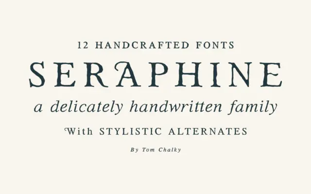
Seraphine Serif: a handcrafted serif family for editorial and branding work
Design style Seraphine sits in the well-populated territory of the warm, handcrafted serif — the kind of face that wants…
 Tantype

Design style Seraphine sits in the well-populated territory of the warm, handcrafted serif — the kind of face that wants…
Tantype
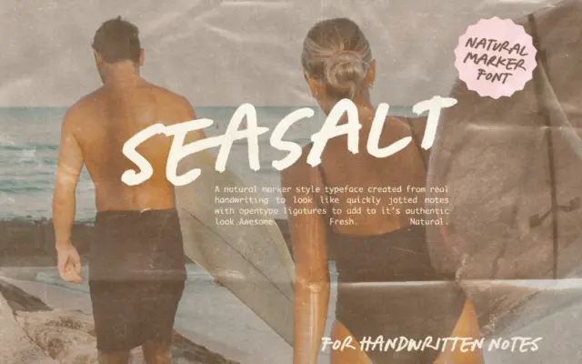
Design style Seasalt reads as marker on paper rather than pen on paper. The strokes are broad and slightly blunt…
Tantype
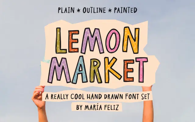
Design style Lemon Market is a handwritten display font built around deliberate irregularity. Letters wobble slightly off baseline, strokes vary…
Tantype
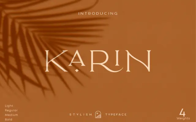
Design style Elegant Karin is an all-caps serif built around a narrow, upright skeleton. The contrast is moderate rather than…
Tantype
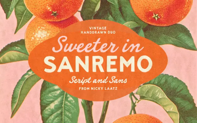
Design style Sanremo takes its cues from hand-painted signage and old matchbook printing — the kind of lettering you’d find…
Tantype
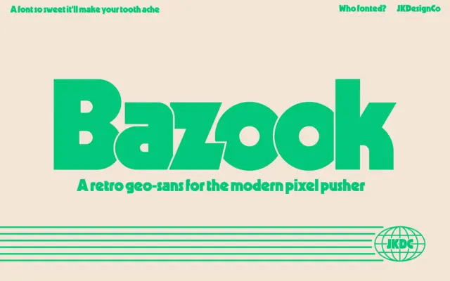
Design style Bazook is a single-weight display sans that leans hard into the geometric-sans-gone-heavy tradition of Kabel and Geo 231,…
Tantype
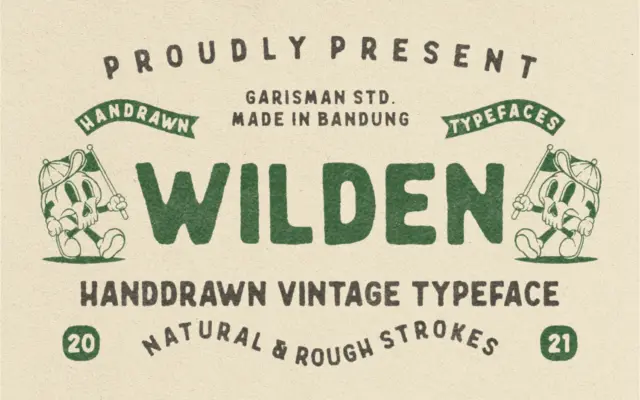
Design style Wilden reads as a handdrawn display letter built for a worn, printed-badge look rather than a general text…
Tantype
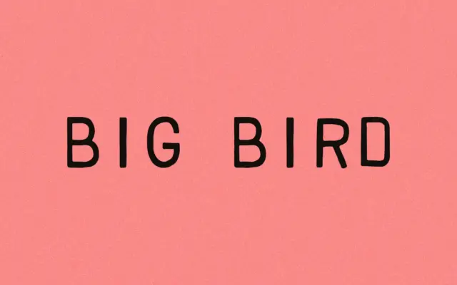
Design style Big Bird belongs to the stamp-and-seal school of hand-drawn lettering: the kind of face that looks like it…
Tantype
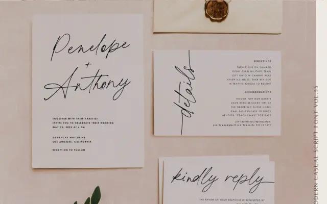
Design style Printed Moments belongs to the casual-script family that has flooded the market over the past few years, but…
Tantype