
Seasalt: a casual marker script for notes, labels and everyday branding
Design style
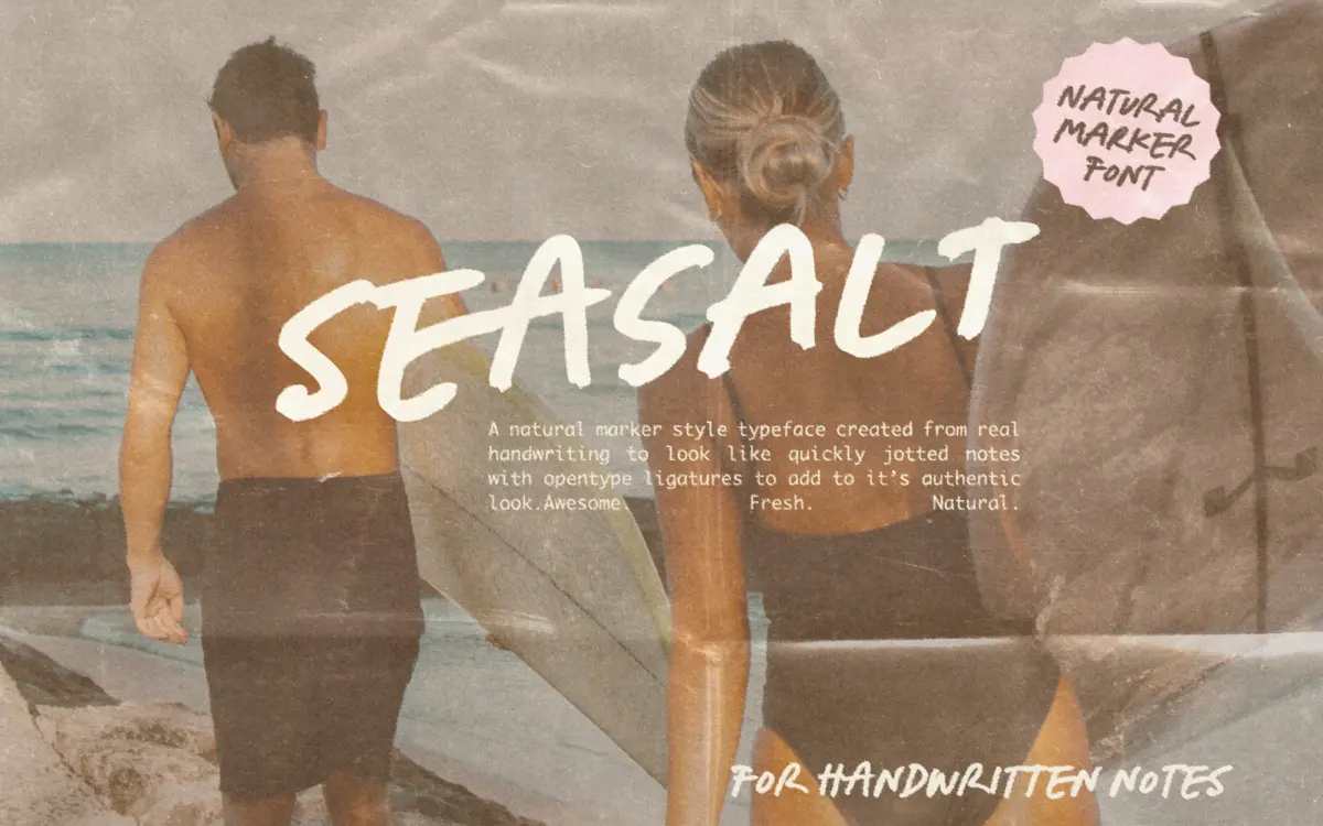
Seasalt reads as marker on paper rather than pen on paper. The strokes are broad and slightly blunt at the ends, with none of the taper you’d get from a brush or ballpoint script. That gives it a flatter, more graphic quality than most handwriting fonts — closer to a felt-tip note left on a fridge than a signature. Letters lean casually rather than connect fluidly, and the baseline wanders just enough to avoid the dead-straight look that gives away a computer font at a glance.
It comes in three variants — Upright, Regular and Slanted — which is really just three angles of the same voice rather than three distinct moods. That’s useful in practice: you get consistency across a layout without every line looking identical, but don’t expect the Upright to feel formal or the Slanted to feel like a different typeface. They’re siblings, not alternatives.
Character set and features
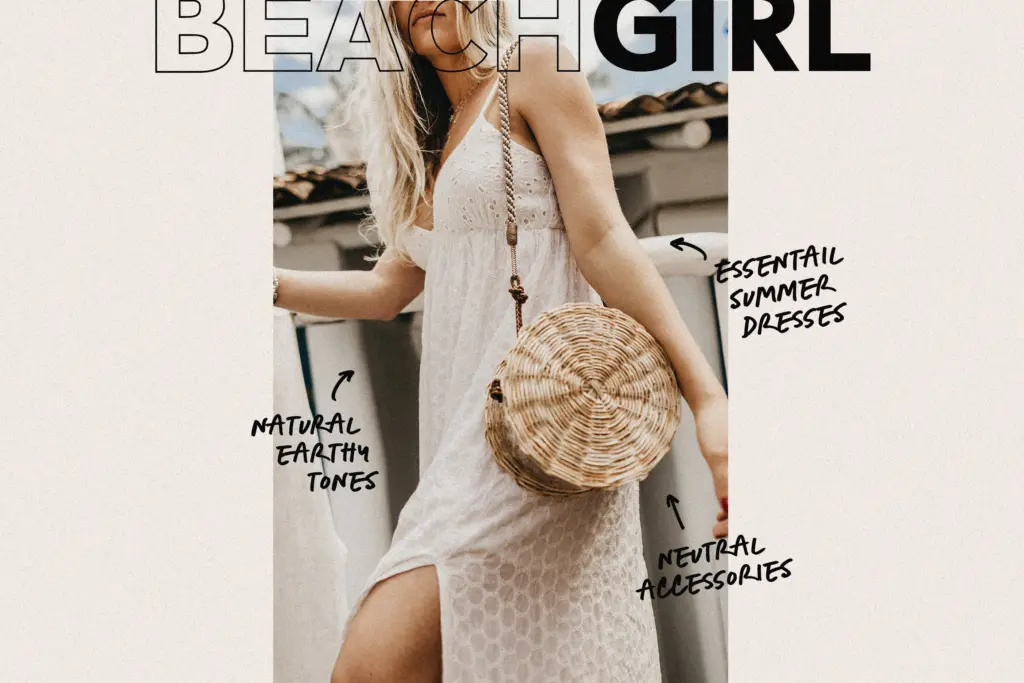
The OpenType ligatures are doing real work here. Casual scripts live or die on whether repeated letter combinations look natural, and Seasalt’s ligature set smooths over the joins that would otherwise betray the underlying font mechanics — double letters, common pairs, that sort of thing. Where it applies, the effect holds up: words look like they were dashed off rather than typeset.
The bundled doodles — arrows, scribbles, underlines — are a genuinely practical extra rather than filler. They’re the kind of marks a designer would otherwise have to draw by hand to finish off a casual layout, and having them as glyphs saves time on quick jobs.
The caveat is Canva. If you’re building there, the ligatures don’t apply, and a chunk of what makes this font feel handwritten rather than typed disappears. It still functions as a script, just a flatter, more repetitive one. Language support runs across most Western European languages plus a scattering of others, which covers a reasonable spread of everyday commercial use without being exhaustive.
Use cases
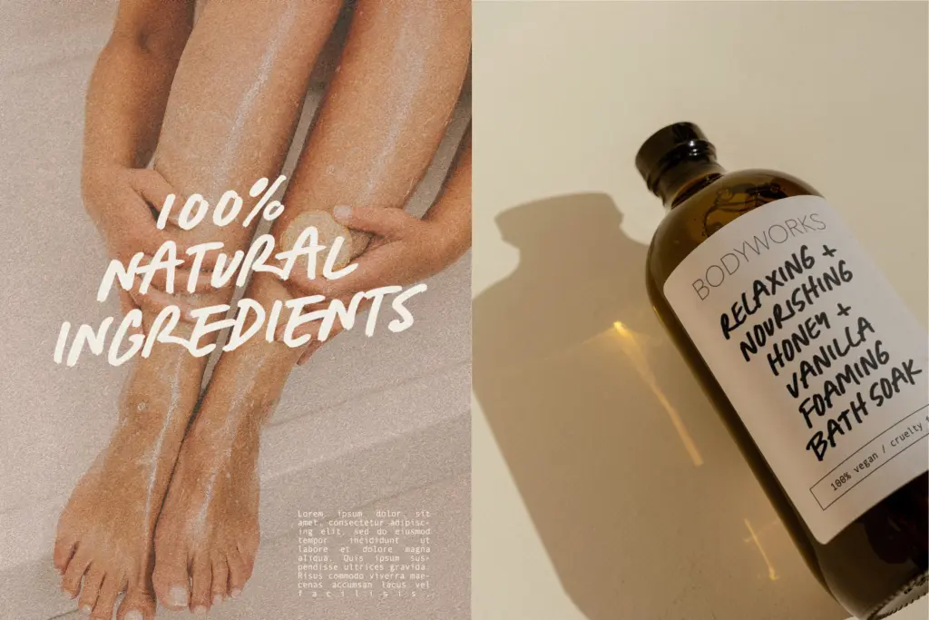
Seasalt sits comfortably in the space between handwriting and branding — recipe cards, notebook covers, packaging that wants to feel personal rather than corporate, social graphics that need a
What we liked, and what we didn’t
Strengths
- Marker-style strokes give it a distinct graphic weight most handwriting fonts lack
- Ligatures genuinely improve realism where the software supports them
- Bundled doodles are useful finishing marks rather than throwaway extras
Trade-offs
- Loses much of its handwritten quality in Canva or other apps without ligature support
- The three variants are close in feel rather than offering real stylistic range
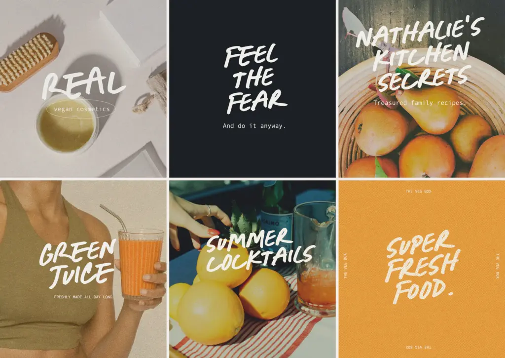
Seasalt does one job well: quick, marker-style handwriting for casual branding and paper goods. It's not a font for long passages or formal work, and it loses some of its charm outside OpenType-aware software, but for labels, headlines and short lines of copy it delivers a convincing handmade feel.
Verdict

Tantype reviews typefaces in depth — every font is tested in real branding, editorial and screen layouts before a word gets written. 555+ fonts reviewed and counting.