
Lemon Market: a handmade trio for playful branding and packaging
Design style
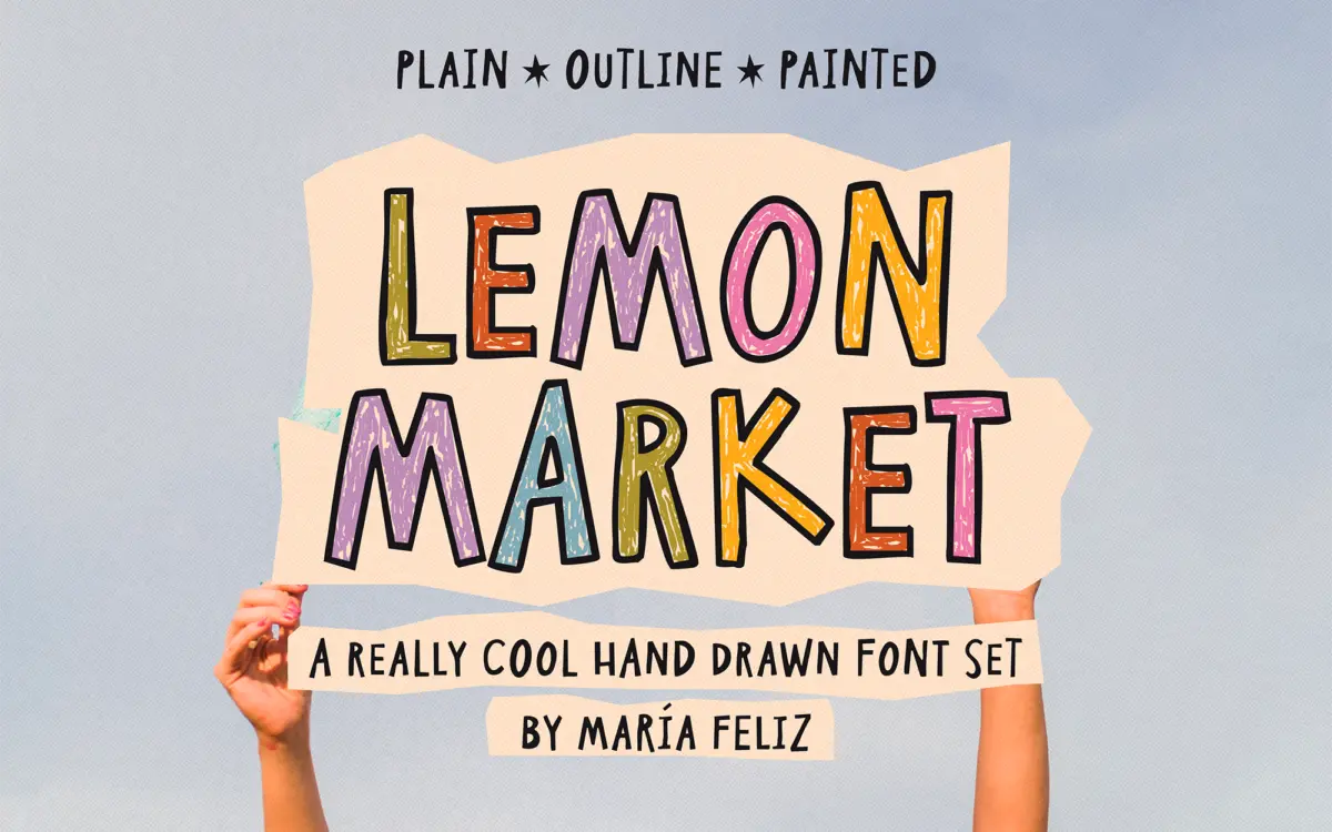
Lemon Market is a handwritten display font built around deliberate irregularity. Letters wobble slightly off baseline, strokes vary in weight from one instance to the next, and the mix of uppercase and lowercase within a single case is intentional rather than accidental — the seller pairs slightly larger and smaller forms to fake the rhythm of real handwriting. It reads as a marker or paint-pen script rather than a formal calligraphic one: no elegant swashes, no consistent contrast, just a loose, felt-tip energy.
The three versions — Outline, Plain, and Painted — are really the same skeleton dressed differently. Plain is the cleanest, a solid single-weight handmade letterform. Outline strips it to a line, useful for layering or stamping over colour. Painted adds texture and rough edges, leaning into the craft, DIY look. None of the three is a neutral workhorse; all of them announce themselves.

Character set and features
The set covers upper and lowercase, with most accented characters included, so basic multilingual typing should work, though anyone setting non-English copy should check specific diacritics before committing. Three extra symbols are bundled in — a centred dot, a heart, and a star doubled across two keys — meant for building small compositions like a hand-lettered sticker rather than functioning as a proper glyph set.
Because the three styles share letterforms, they layer directly on top of each other: Outline behind Painted, for instance, gives a hand-built, sticker-shop effect without needing separate design software tricks. That layering is really the feature here — buy one, get a small system of effects, though anyone expecting OpenType alternates or automatic randomisation will be disappointed. The irregularity is baked into the fixed letterforms, not generated contextually, so repeated letters in a word will look identical every time rather than shifting like true lettering would.

Use cases
This is a font for short bursts of text, not paragraphs. Quotes, single words, packaging call-outs, sticker text, greeting card sentiments — anything under a line or two where the handmade wobble reads as charm rather than noise. The three-version setup make it genuinely useful for small brands selling kids’ products, craft goods, or anything wanting a friendly, unpolished voice: a jam label, a birthday card, a social post with a short caption layered over a photo.
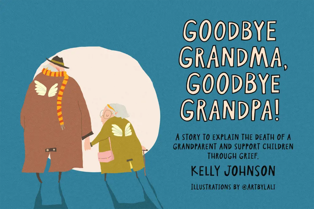
It is not built for body copy or dense information. At small sizes the irregular baseline and varying letter weights start to fight legibility, and in long stretches the charm turns into visual noise. It also doesn’t suit anything aiming for restraint or sophistication — Lemon Market has one register, cheerful and a bit chaotic, and it holds that register whether you want it to or not. For the right brief — playful branding, packaging with personality, kids’ book covers — that single-mindedness is exactly the point.
What we liked, and what we didn’t
Strengths
- Three matched styles (Outline, Plain, Painted) layer directly for sticker and packaging effects without extra design work
- Deliberate size variation between letters gives a convincing handmade feel rather than a generic script look
- Bundled symbols add small decorative options for compositions without needing extra icon assets
Trade-offs
- Fixed letterforms mean repeated letters look identical every time, so the handmade illusion has a visible ceiling
- Legibility drops at small sizes or in longer text, limiting it to short-form use
Lemon Market delivers exactly what it promises: a loose, handmade display font with three layered versions for quick craft-style compositions. It's built for short text and playful branding, not for anything requiring restraint or long-form legibility. A solid pick for a specific job, not a do-everything typeface.
Verdict

Tantype reviews typefaces in depth — every font is tested in real branding, editorial and screen layouts before a word gets written. 555+ fonts reviewed and counting.