
Elegant Karin: an all-caps serif for branding work that needs restraint
Design style
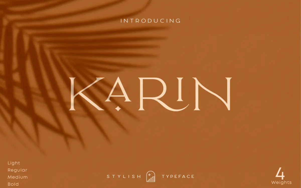
Elegant Karin is an all-caps serif built around a narrow, upright skeleton. The contrast is moderate rather than high — thick-thin transitions are present but not sharpened into the razor strokes you see in high-fashion display serifs. That restraint is the point. Where a lot of “elegant” serifs lean on exaggerated flourishes to earn the label, this one gets there through proportion: tight letterspacing at default settings, condensed counters, and serifs that are more nub than flag. The result reads as tidy and controlled rather than showy.
Because it’s caps-only, the typeface lives or dies on word shapes rather than ascender-descender rhythm. Kaligra has kept the caps close in height so a set word doesn’t look like a rack of uneven pickets, which is the usual failure mode of all-caps display serifs. It won’t be mistaken for a workhorse text serif, but as a short-line, high-impact face it holds its structure well.
Character set and features
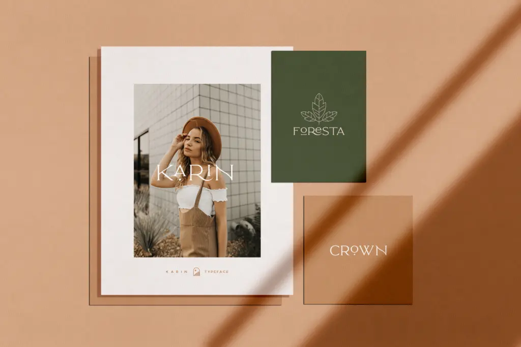
The set includes stylistic alternates and ligatures, along with accented characters for extended Latin coverage — useful if your project needs more than basic English diacritics. Numerals and punctuation are included, and the font comes in four weights, which gives some room to build a hierarchy without switching families entirely: a bold for a headline, a lighter cut for a subhead or tagline underneath.
The ligatures and alternates are worth actually opening the glyphs panel for, since the default character mapping is fairly plain by design — the personality is stored in the alternates rather than baked into every letter. That’s a sensible way to keep the base set legible while still offering flourish on demand, but it does mean the font requires a bit more manual setting than a face where every glyph is already doing the work. Anyone setting this straight out of the box without touching alternates will get a competent but unremarkable result; the interesting version takes a few extra minutes in the glyphs panel.
Use cases
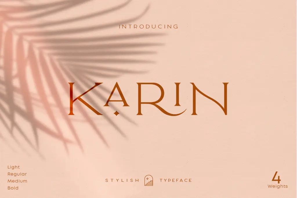
This is a branding font first. Logotypes, short packaging lockups, clothing labels and product tags are the obvious home — the tight tracking and caps-only structure suit a name or short phrase set once and reused across a line of products. It also does reasonable work as a magazine header or section title where you want something with more presence than a plain sans but don’t need a script’s warmth.
It’s less suited to anything requiring lowercase, which rules out body copy, long headlines with mixed case, or situations where all-caps setting would look shouty — think long invitation lines or paragraph-length signage. Pair it with a plain sans or a simple serif for supporting text; it isn’t built to do that job itself. For a single word or short lockup at the top of a package, a menu, or a logo, though, it does what it sets out to do without needing much dressing up.
What we liked, and what we didn’t
Strengths
- Tight, even caps make short word-marks read as a single controlled shape
- Four weights give some hierarchy options without leaving the family
- Alternates and ligatures add flourish on demand without cluttering the base set
Trade-offs
- Caps-only construction rules out body copy or long-form headlines
- The default character mapping is plain until you manually swap in alternates
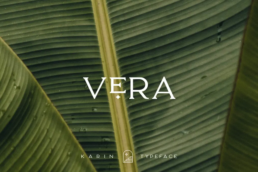
Elegant Karin is a competent, restrained all-caps serif suited to short branding lockups rather than general text setting. Its personality lives in the alternates, which rewards a bit of manual glyph work but leaves the default set fairly plain. Good for logos and packaging, not a substitute for a full text family.
Verdict

Tantype reviews typefaces in depth — every font is tested in real branding, editorial and screen layouts before a word gets written. 555+ fonts reviewed and counting.