
Seraphine Serif: a handcrafted serif family for editorial and branding work
Design style
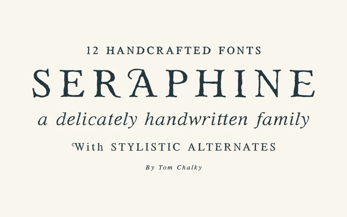
Seraphine sits in the well-populated territory of the warm, handcrafted serif — the kind of face that wants to soften classic structure without abandoning it. Tom Chalky has drawn it with slightly irregular curves and terminals that avoid the mechanical crispness of a strictly geometric revival. The result reads as approachable rather than severe, closer to a letterpress-influenced text face than a formal book serif.
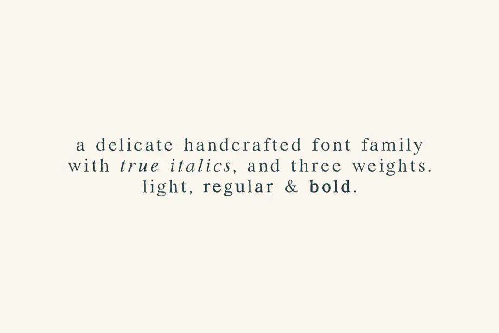
The family splits into regular and rounded versions, each carried through light, regular and bold weights with true italics. That’s a sensible structure: the rounded cuts soften the serifs and joins further, giving a gentler, almost friendly tone that the straight-edged regular cuts don’t attempt. The two aren’t wildly different from each other — this isn’t a rounded-versus-humanist split so much as a dial being turned a few degrees — but it’s enough to shift the mood of a layout without changing typefaces entirely.
Where the design earns its keep is in the small asymmetries: terminals that don’t quite match their mirror image, serif brackets that vary slightly stroke to stroke. It’s a look designers reach for when they want to imply craft without going fully calligraphic or distressed.
Character set and features
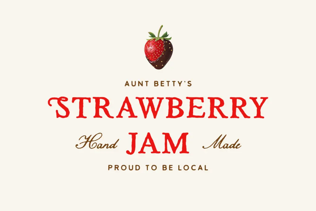
The family covers a full Latin multilingual glyph range, so European-language setting is accounted for. Stylistic alternates are included, though they’re described as subtle — don’t expect the alternates to transform the voice of the face; they’re more a way of relieving repetition in longer headlines or logotypes than a separate stylistic register.
Twelve fonts total — two style groups, three weights each, plus italics — is a workable range for most identity or editorial jobs without tipping into the kind of sprawling superfamily that becomes hard to manage. The light weight is the most distinctive cut here; it carries the handcrafted quality most clearly and is where the subtle irregularities in the drawing are easiest to see. The bold, by contrast, thickens things enough that some of that personality gets absorbed into sheer stroke weight — it still reads as part of the family, but it’s the least interesting cut of the twelve.
The true italics are a genuine plus. Too many
What we liked, and what we didn’t
Strengths
- True italics that connect structurally to the roman rather than just sloping it
- Rounded and regular style groups give two distinct moods from one family
- Light weight carries the most personality and reads well at larger print sizes
Trade-offs
- Bold weight loses much of the handcrafted character to sheer stroke thickness
- Light weight can thin out at small sizes on lower-resolution screens
Seraphine is a competent handcrafted serif with a genuinely useful structure — two style groups, three weights, true italics — built for branding, packaging and editorial work that wants warmth over neutrality. It doesn't reinvent the handcrafted-serif genre, but the light weight and italics carry real character. Best treated as a mid-register workhorse rather than a display showstopper.
Verdict

Tantype reviews typefaces in depth — every font is tested in real branding, editorial and screen layouts before a word gets written. 555+ fonts reviewed and counting.