
Printed Moments: a casual ballpoint script for invitations and packaging
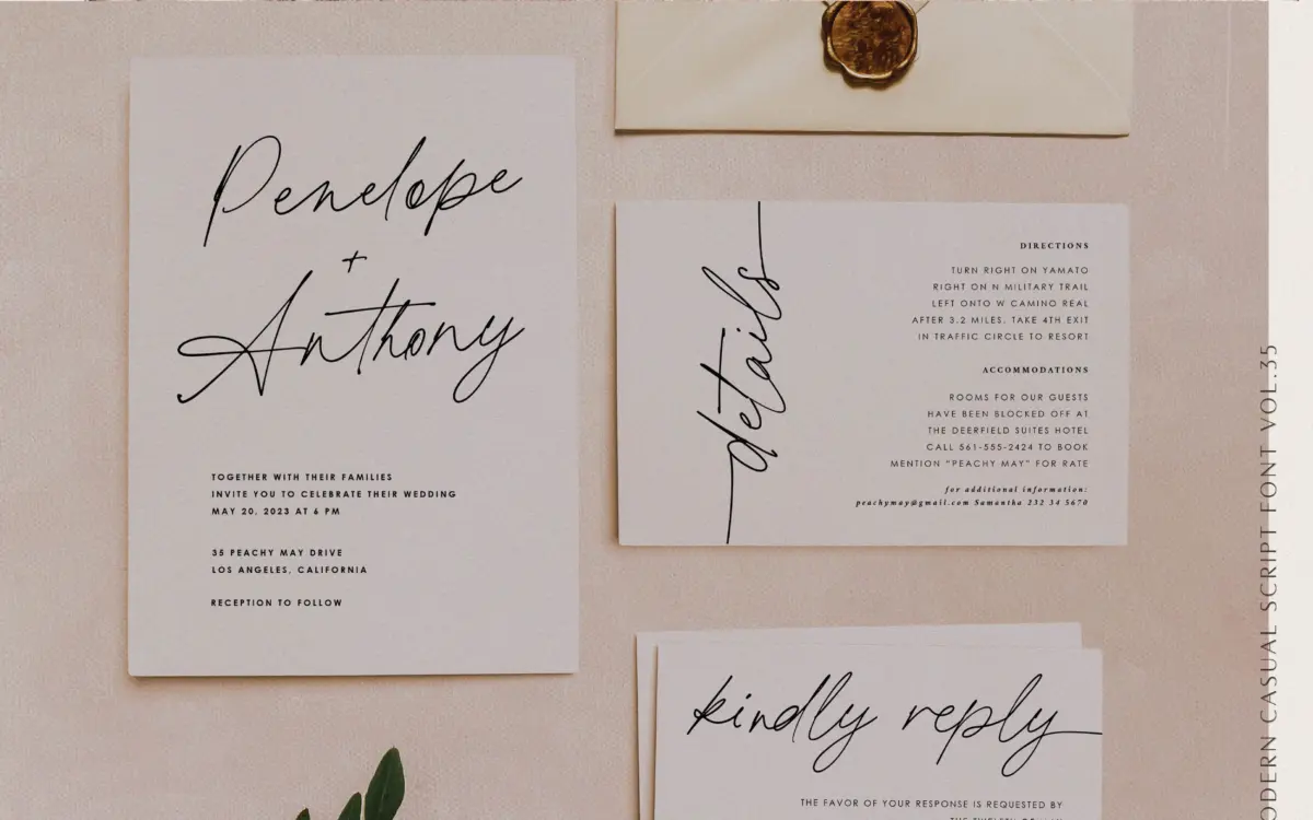
Design style
Printed Moments belongs to the casual-script family that has flooded the market over the past few years, but it does a few things to earn its place. The stroke reads like a smooth ballpoint pen rather than a brush or a flexible nib. That means the contrast is gentle and even, without the sharp thick-thin swing you get from calligraphic scripts. The result feels closer to a confident handwritten note than a formal invitation script, which is a deliberate choice and a limiting one at the same time.
Letters lean forward at a moderate angle and connect with a loose, unforced rhythm. Nothing about the joins looks engineered; the spacing between strokes has some of the natural unevenness you’d expect from actual handwriting, though it never tips into illegibility. The x-height sits a touch higher than classic copperplate scripts, which keeps lowercase letters from collapsing into each other at small sizes but also flattens some of the drama a script typeface can bring to a headline.
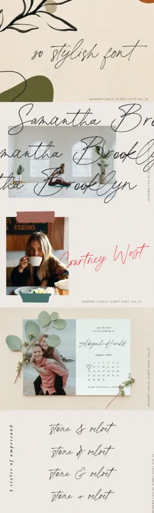
Character set and features
The set covers uppercase and lowercase, numerals, punctuation, and multilingual symbols, so it will handle accented Latin text without falling apart. The standout feature is the 134 ligatures, split between beginning and ending lowercase forms. These are what give the font its handwritten credibility — they let common letter pairs flow into each other rather than sitting as isolated glyphs stitched together, which is usually the giveaway that a script font is a font and not actual writing.
Using the ligatures well takes some manual work. Like most scripts of this type, the automatic OpenType substitution only gets you partway; a designer setting a headline or a logotype will still want to swap in alternates by hand to avoid repetition and awkward collisions where ascenders and descenders meet. The swash forms mentioned in the seller’s marketing aren’t dramatic showpieces — they’re subtle enough to use in body-adjacent settings without becoming the focal point of the composition. That restraint is the font’s main personality trait: it doesn’t shout.
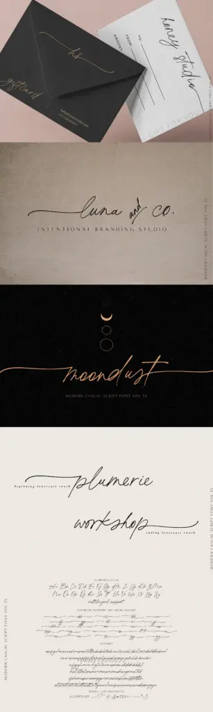
Use cases
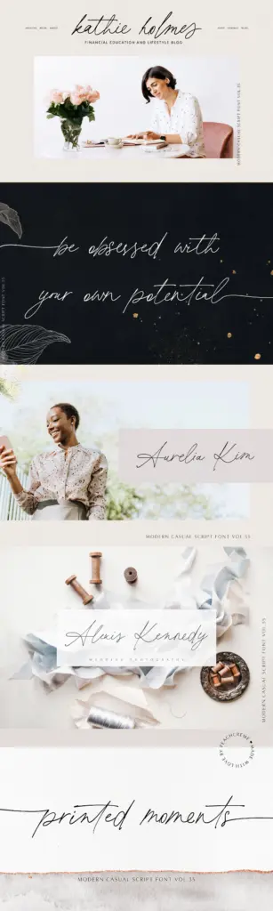
This is a font for short bursts of casual warmth — a product label, a greeting card, a line on packaging, the signature line on an invitation suite. It’s not built to be a formal wedding script; there are more ornamented, higher-contrast scripts for that job. Printed Moments works better where you want something that reads as personal and unfussy rather than ceremonial: a small business card, a hand-lettered logotype for a bakery or a boutique, a social media graphic that needs a friendly voice.
At smaller sizes it holds up reasonably well thanks to the even stroke weight, though tight paragraph settings should be avoided — scripts like this are meant for single lines or short phrases, not extended reading. Pair it with a plain sans or serif for supporting text; asking it to carry a whole layout on its own will tire the eye quickly.
What we liked, and what we didn’t
Strengths
- Ballpoint-style stroke gives an even, natural handwriting feel
- 134 beginning and ending ligatures let letter pairs connect convincingly
- Multilingual and punctuation support make it usable beyond basic English text
Trade-offs
- Subtle swashes mean it lacks the drama needed for formal or luxury invitation work
- Automatic ligature substitution still requires manual glyph swapping for clean headline setting
Printed Moments is a competent, unfussy casual script built around a smooth ballpoint texture and a generous ligature set. It suits short, friendly applications like packaging and cards more than formal invitation work, and it needs manual glyph swapping to look its best.
Verdict

Tantype reviews typefaces in depth — every font is tested in real branding, editorial and screen layouts before a word gets written. 555+ fonts reviewed and counting.