Serif
3.9
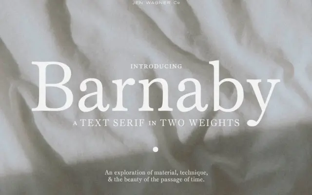
Barnaby: a quiet text serif built for reading, not shouting
Design style Barnaby sits firmly in the restrained camp of contemporary text serifs. The contrast between thick and thin strokes…
 Tantype

Design style Barnaby sits firmly in the restrained camp of contemporary text serifs. The contrast between thick and thin strokes…
Tantype
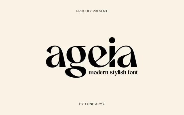
Design style Ageia sits in the geometric-sans family that’s become the default vocabulary for modern branding, but it doesn’t try…
Tantype
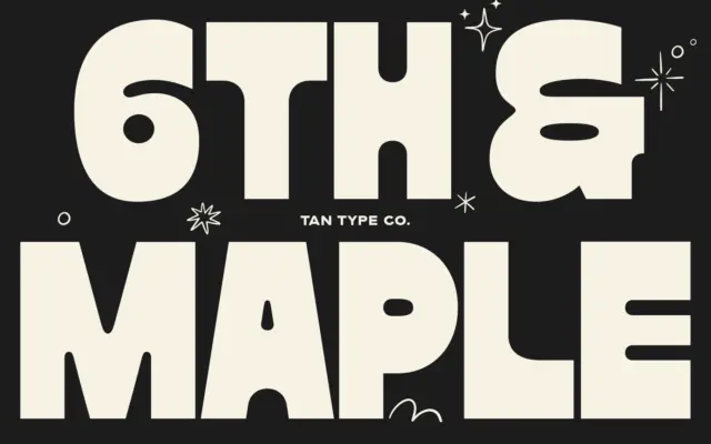
Design style Maple is a fat display face built around thick, blocky strokes with almost no contrast between thick and…
Tantype
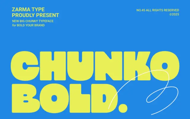
Design style Chunko Bold sits in the current wave of oversized geometric sans faces built for one job: filling space…
Tantype
Design style Ratch sits in familiar geometric grotesk territory but doesn’t stay quietly there. The circular bowls, near-monolinear strokes, and…
Tantype
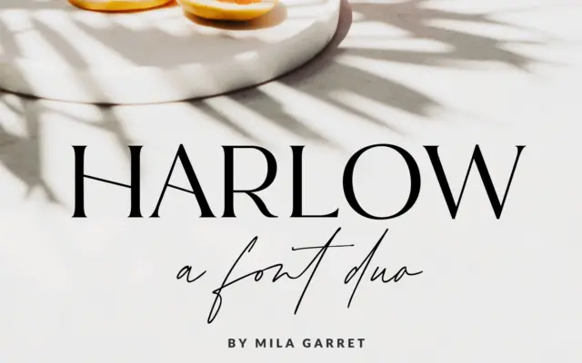
Design style Harlow is a two-part release: a pared-back serif and a casual handwritten script meant to sit alongside it.…
Tantype
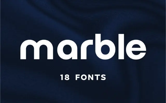
Design style Marble sits in the geometric-minimalist camp of sans serifs, the family of letterforms built from near-perfect circles and…
Tantype
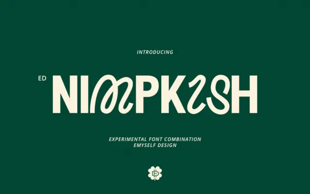
Design style ED Nimpkish is built on a single, slightly odd premise: the uppercase and lowercase don’t belong to the…
Tantype
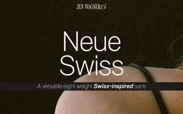
Design style Neue Swiss sits in the well-worn tradition of the neo-grotesque revival: closed apertures, low stroke contrast, a quiet…
Tantype