
NT Seawave: A High-Contrast Serif for Fashion and Luxury Branding
Design style
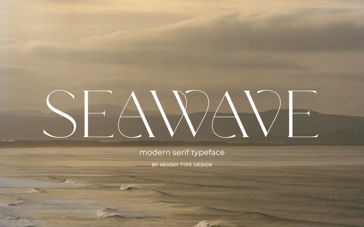
NT Seawave sits in the modern serif tradition: sharp contrast between thick and thin strokes, unbracketed or minimally bracketed serifs, and a vertical stress that gives it a poised, upright posture. This is the family of serifs that magazines and fashion houses reach for when they want a headline that reads as expensive rather than friendly. The thins are drawn fine, sometimes hairline fine, which is where the elegance comes from but also where the risk sits.
The letterforms lean formal rather than eccentric. There’s no attempt to be quirky or hand-touched here — the curves are controlled, the axis is consistent, and the overall rhythm is calm. It reads as a font built for restraint: a few well-chosen words set large, with plenty of space around them, rather than a typeface that wants to fill a page with texture.

Character set and features
The seller states the font supports over 200 Latin-based languages, which suggests a broad set of accented characters and regional glyphs beyond the standard Latin set. That’s a meaningful claim for anyone working across European markets or multilingual branding, though buyers with specific language needs should confirm coverage against their own text before committing to a layout.
Beyond language support, no OpenType feature list, weight range, or italic companion is specified in the materials available. That’s worth flagging: a high-contrast display serif like this often lives or dies on having a matching italic or a bolder cut for hierarchy, and without confirmation of those, it’s safest to treat NT Seawave as a single-style headline tool rather than a full working family until proven otherwise.
Use cases
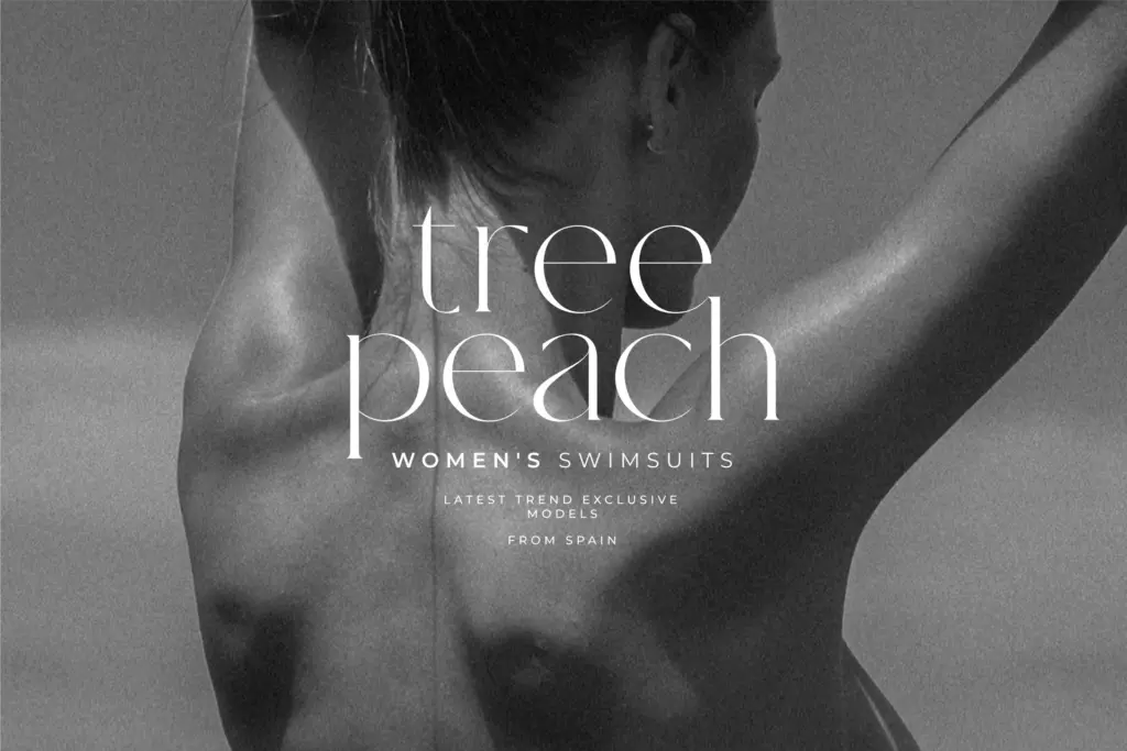
This is a display face first. The thin strokes and tight contrast mean it wants size — headlines, logotypes, cover lines, packaging hero type, invitation lettering. At those sizes the elegance reads clearly and the thin serifs stay crisp. Push it down into body copy or small captions and the hairlines are likely to break up or vanish depending on the substrate, screen resolution, or print stock, so it’s not a font to set a paragraph in.
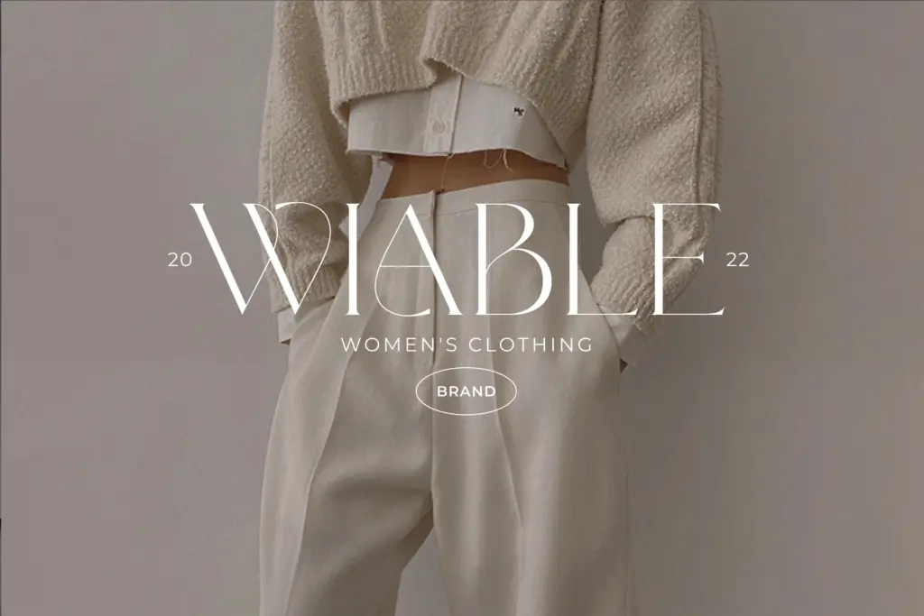
Given the visual register, NT Seawave suits fashion branding, beauty and cosmetics packaging, editorial mastheads, wedding stationery, and luxury identity work — anywhere a client wants type that signals taste through restraint rather than personality through decoration. It pairs naturally with a plain, quiet sans for body text and supporting information, letting the serif carry the moment of first impression while a workhorse typeface handles the reading.
Where it will struggle is in contexts that demand warmth, informality, or heavy use at small sizes — tech products, dense UI, or anything that needs to feel approachable rather than composed. Used within its lane, though, it does a clean, competent job of the classic high-contrast serif brief.
What we liked, and what we didn’t
Strengths
- Clean, controlled contrast that reads as considered rather than decorative
- Broad Latin-based language support useful for international branding work
- Strong presence at display sizes, especially for fashion and packaging headlines
Trade-offs
- Fine hairlines make it unreliable for body copy or small print applications
- No confirmed weight range or italic companion, limiting hierarchy options within a single family
NT Seawave is a competent high-contrast serif built for headline and branding moments rather than everyday setting. It does the elegant-luxury brief well at large sizes but the documentation leaves gaps around weights and features that buyers should check before relying on it for a full identity system.
Verdict

Tantype reviews typefaces in depth — every font is tested in real branding, editorial and screen layouts before a word gets written. 555+ fonts reviewed and counting.