
GW Grack: an ultrabold squarist grotesk built for variable-width branding
Design style
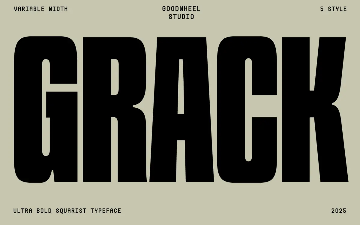
GW Grack sits at the heavy end of the geometric sans spectrum, but it earns the description “squarist” more than most fonts that claim it. The counters are boxed rather than rounded, corners are held tight, and the overall proportion feels closer to a stencil-cut block than a conventional grotesk. Strokes are uniformly thick, with almost no visible contrast, which pushes the letterforms toward shape rather than calligraphic gesture. This is a display sans built to be looked at as a mark first and read as text second.
The variable axis is the more interesting part of the design. It runs from an ultrabold, near-solid setting down to a regular width, and the compression is handled through width rather than weight, so the letters narrow and tighten rather than thin out. That gives designers a genuine range to work with from one file, rather than a single stunt weight dressed up with a marketing name.
Character set and features
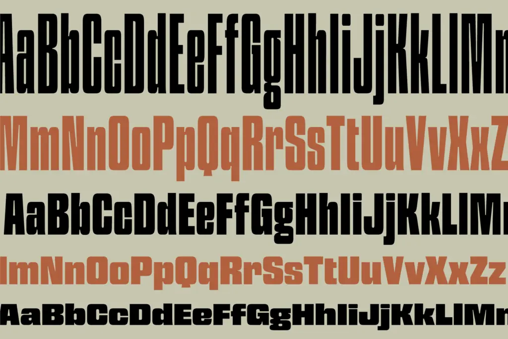
The character set covers Windows 1252, which brings in the accented characters needed for the long list of European and East African languages the seller notes, including Scandinavian, Baltic-adjacent, and several Bantu-language diacritics. That’s a wider net than most ultrabold display faces bother casting, and it’s a real practical plus if a brand needs to set copy beyond English without swapping typefaces.
Where the design is more limited is in finesse. At this weight, some rounder letters — O, C, G — start to lose their curve and edge toward the square module, which is clearly intentional but does mean the font reads as a single strong idea rather than a flexible family with subtlety built into different weights. There’s no companion italic or lighter text-optimised cut mentioned, so what you see at the heaviest setting is largely what you get throughout the range, just narrower.

Use cases
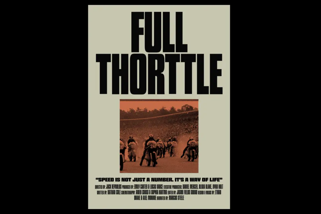
This is a logotype and headline font before anything else. The squared, ultrabold forms make strong wordmarks, especially for brands wanting to signal weight, confidence, or a slightly brutalist edge — think tech products, streetwear, sports branding, or packaging that needs to shout from a shelf. The variable width axis is genuinely useful here: a designer can dial in exactly how much horizontal space a lockup needs without redrawing anything, which is handy for app icons, social avatars, or squeezing a wordmark into a fixed banner.
It is less suited to anything resembling body copy. At small sizes the tight counters and heavy strokes will clog, and the squared apertures don’t leave much room for legibility to breathe. Treat it as a headline, poster, or badge typeface, paired with a plainer working typeface for supporting text. Packaging front-of-pack lettering, event signage, and single-word branding moments are where it will do its best work; multi-line paragraphs are not what it was drawn for.
What we liked, and what we didn’t
Strengths
- The variable width axis gives real, usable range from a single file
- Broad Windows 1252 language coverage is unusual for a display-weight font
- Squared geometric forms make strong, distinctive wordmarks and badges
Trade-offs
- Tight counters and heavy strokes clog at small sizes, ruling out body text
- The design offers one strong idea rather than a family with tonal variety
GW Grack is a confident, single-minded ultrabold display sans with a useful variable width axis. It's built for logos, badges, and headline moments, not for text, and the squared geometry means it doesn't flex much beyond that lane. Worth having for brand and packaging work, less so as an all-purpose typeface.
Verdict

Tantype reviews typefaces in depth — every font is tested in real branding, editorial and screen layouts before a word gets written. 555+ fonts reviewed and counting.