
Collidge: an ultra-bold sans built for logos and loud headlines
Design style
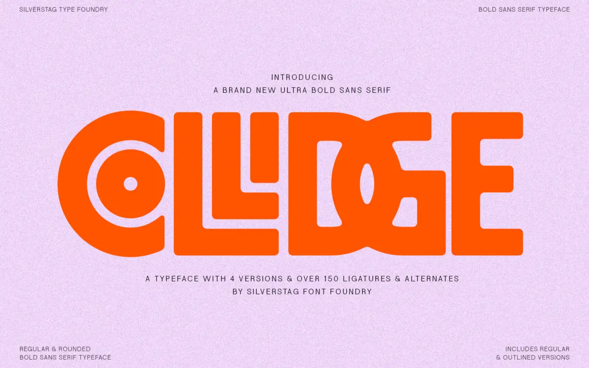
Collidge is an ultra-bold sans serif designed to take up space. The strokes are chunky and the counters are squeezed tight, so at large sizes it reads as a solid block of ink with just enough daylight inside the letters to keep them legible. Angles are sharp rather than soft, and there’s an urban, poster-like weight to the whole thing that puts it closer to a display slab in spirit than a workhorse grotesk.
The family comes in four variants: regular, regular outlined, rounded, and rounded outlined. The outlined versions strip the fill and leave just the contour, which turns the same letterforms into something you can layer, colour separately, or use as a texture rather than a solid mark. The rounded cut softens the terminals and corners, pulling the design away from its harder-edged default and toward something friendlier, closer to a bubble-letter feel without losing the bulk. Having all four in one family means you’re not hunting for a companion style when a project needs contrast — outline-on-solid, rounded-on-square — it’s already built in.
Character set and features
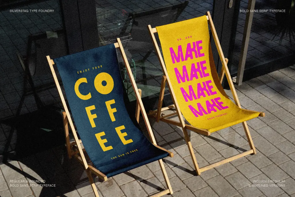
The headline feature here is the ligature and alternate set — reportedly over 150 of them. That’s a substantial number for a display face, and it suggests the designer wanted Collidge to feel less like a fixed alphabet and more like a kit of parts. In practice, ligatures at this scale are most useful for specific letter pairs that tend to clash at extreme boldness — overlapping bowls, colliding ascenders — and for giving designers a way to make a wordmark feel less like it was typed and more like it was drawn. Alternates give you a second (or third) option for individual letters when you want a logo to feel less generic than the default glyph.
The typeface is described as supporting more than 90 languages, which matters if you’re building international branding or need Central European or Baltic character coverage alongside basic Latin. That’s worth checking against your specific language needs before committing a headline system to it, but the breadth suggests the character set was built with more than English-language display work in mind.
Use cases
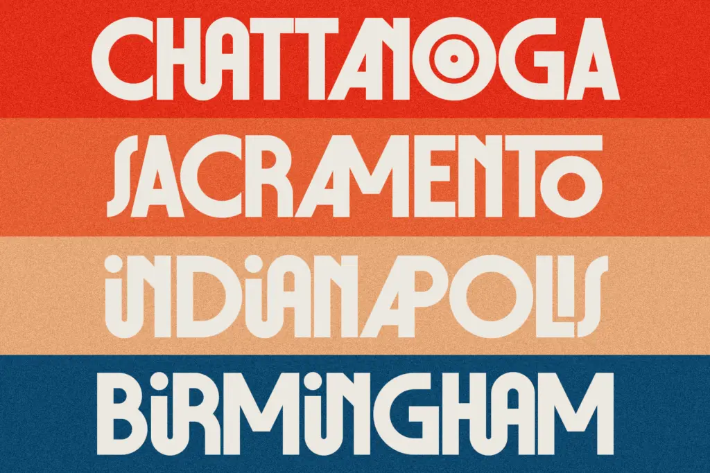
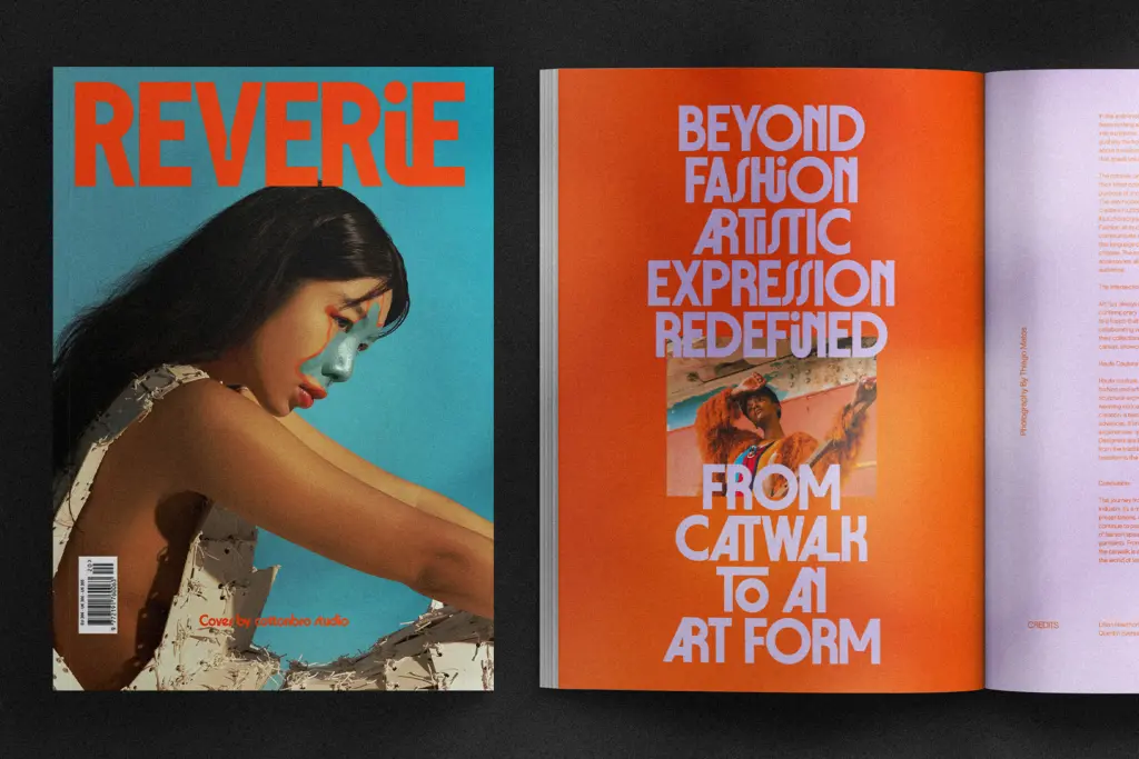
Collidge is a headline and logotype font, not a body-text font, and it doesn’t pretend otherwise. The weight and tight spacing that make it punch at 200 points will work against you at 12 points — this is not a face for paragraphs, captions, or anywhere the eye needs to move quickly across running text. Where it earns its keep is in sports branding, poster type, app icons, social graphics, and single-word or short-phrase logotypes where the goal is maximum visual weight in minimum space.
The rounded and outlined variants extend its range a little: rounded suits playful or youth-oriented branding, outline versions are handy for overlays on photography or for two-colour treatments. But all four variants share the same core limitation — this is a family built for a handful of words, not a paragraph, and it should be treated as a specialist tool rather than a default choice for a whole brand system.
What we liked, and what we didn’t
Strengths
- Four built-in variants (regular, rounded, and their outlined counterparts) cover a surprising range of moods without needing a separate family
- Over 150 ligatures and alternates give logo and wordmark work genuine room to feel custom rather than typed
- Reported support for 90+ languages extends its use beyond English-only branding
Trade-offs
- Tight counters and heavy strokes make it unsuitable for anything below display sizes
- The bold, urban character is distinctive but narrows the range of brands it will suit
Collidge is a confident, heavyweight display sans that does one job well: making a short phrase or logotype feel loud. The four-variant structure and deep ligature set give it more flexibility than most single-cut display faces, but it's strictly a headline tool, not a text face.
Verdict

Tantype reviews typefaces in depth — every font is tested in real branding, editorial and screen layouts before a word gets written. 555+ fonts reviewed and counting.