
Activica: a neo-grotesque with a graphic-symbol system built in
Design style
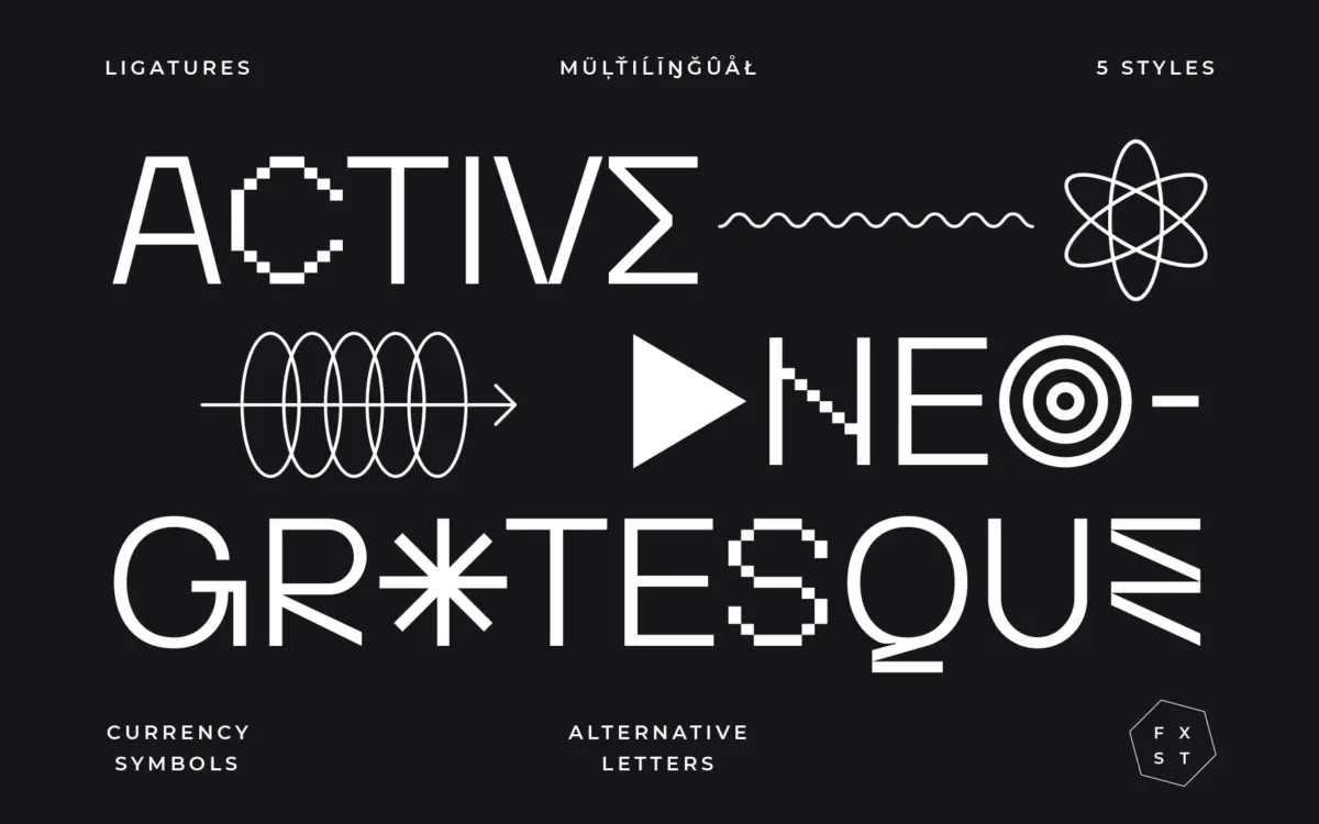
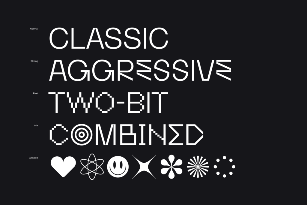
Activica presents itself as a neo-grotesque, and at its core that’s accurate: even stroke weight, restrained curves, a construction that leans on geometric regularity rather than humanist flourish. But the seller’s own description of it as a “graphic system” is closer to the truth of what makes it interesting. Alongside the standard alphabet sits a set of shapes and symbols that push the font past plain text-setting into something closer to a modular design kit. That duality is the whole pitch: a calm, legible sans when you need one, and a source of graphic marks when you don’t.
The letterforms themselves are tidy rather than distinctive. Apertures are moderately open, terminals are cut straight rather than rounded, and there’s none of the eccentric detailing you’d find in a more characterful grotesque. That restraint is deliberate — it’s what lets the font sit quietly under a busy layout of symbols and alternates without a fight for attention.
Character set and features
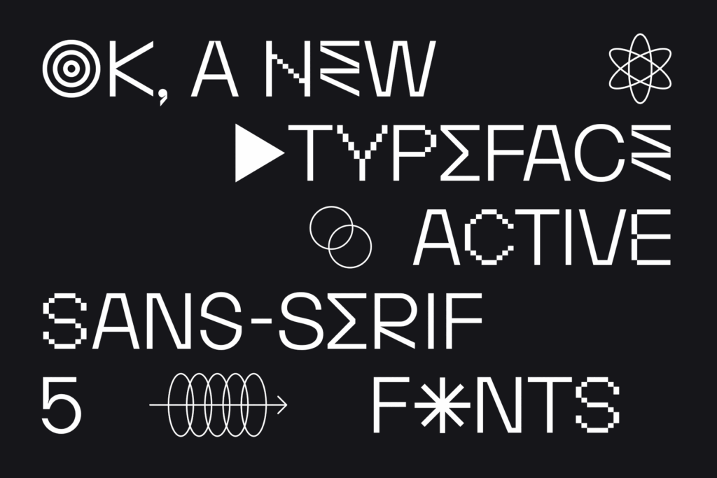
Activica ships with ligatures, alternate letters and currency symbols, accessed through OpenType features in applications like Illustrator, Photoshop or InDesign — you’ll need software that supports a glyphs panel to reach them, since they won’t trigger automatically in something like Word. The alternates give the typeface some room to loosen up: swapped letterforms and ligatures can push a static grotesque toward something with more personality on a title or logotype, without changing the working typeface used in the body.
Language support covers most Latin-based languages, which is worth checking against your specific diacritic needs before committing a multilingual project to it, but it’s a reasonable baseline for European-market work. The symbol and shape set is the least conventional part of the package — useful for designers who want to build icons, patterns or graphic accents that visually match the type rather than sourcing them separately, but it’s also the part most likely to go unused if your project doesn’t call for it. Buyers expecting a dense expert set of stylistic sets and case-sensitive punctuation may find the feature list here more modest than the marketing language suggests.
Use cases
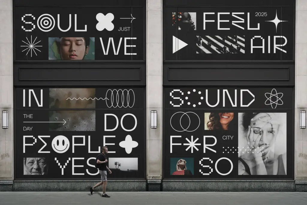
This is a font built for branding and identity work more than long-form reading. Its neutral grotesque skeleton handles headlines, packaging typography and poster work comfortably, and the alternate letters and ligatures give logotype designers something to customise without leaving the family. The bundled graphic shapes make it a reasonable fit for a brand system that wants type and iconography to feel like they came from the same hand — a small studio building out a visual identity, a product label, a poster series.
It’s less suited to editorial or body-text use, where its calm-but-generic grotesque forms won’t distinguish themselves at length, and the graphic-symbol angle becomes irrelevant. Treat it as a display and branding tool with a bonus symbol kit, not a workhorse text face, and it does its job efficiently.
What we liked, and what we didn’t
Strengths
- Alternate letters and ligatures give logotypes room to loosen up without a total style change
- Bundled graphic shapes let type and iconography share a visual language in branding systems
- Even, restrained grotesque construction keeps it legible at headline sizes
Trade-offs
- The base letterforms are tidy but not distinctive enough to carry long-form text
- OpenType features require design software with a glyphs panel, limiting quick use in basic apps
Activica is a competent, restrained neo-grotesque padded out with ligatures, alternates and a graphic symbol set aimed at branding work. It's more useful as a display and identity tool than a text face, and the symbol system is a nice extra rather than a reason to buy it on its own.
Verdict

Tantype reviews typefaces in depth — every font is tested in real branding, editorial and screen layouts before a word gets written. 555+ fonts reviewed and counting.