
Bilda: a heavyweight geometric sans with a true variable italic
Design style
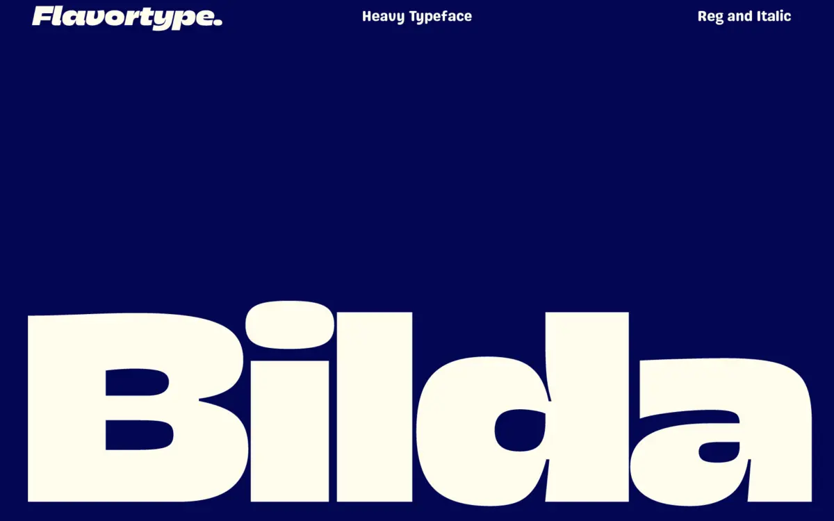
Bilda sits squarely in the current run of heavy geometric sans faces built for headlines rather than paragraphs. The skeleton is round-ish and simple — circular o’s, a single-storey a in the italic, uncomplicated terminals — but the weight is pushed hard enough that counters get small and the whole thing reads as one dense mass at large sizes. That’s the point. It’s not trying to be a neutral workhorse; it wants to sit on a poster or a logotype and be the loudest thing in the room.
The ‘contemporary’ label the seller uses is fair enough. There’s a slight playfulness in some of the curve terminations and the italic’s slant, but it doesn’t tip into novelty. It reads more like a brand-display face than a quirky script substitute — closer to the kind of bold geometric sans you see on packaging and app icons than to anything decorative.
Character set and features
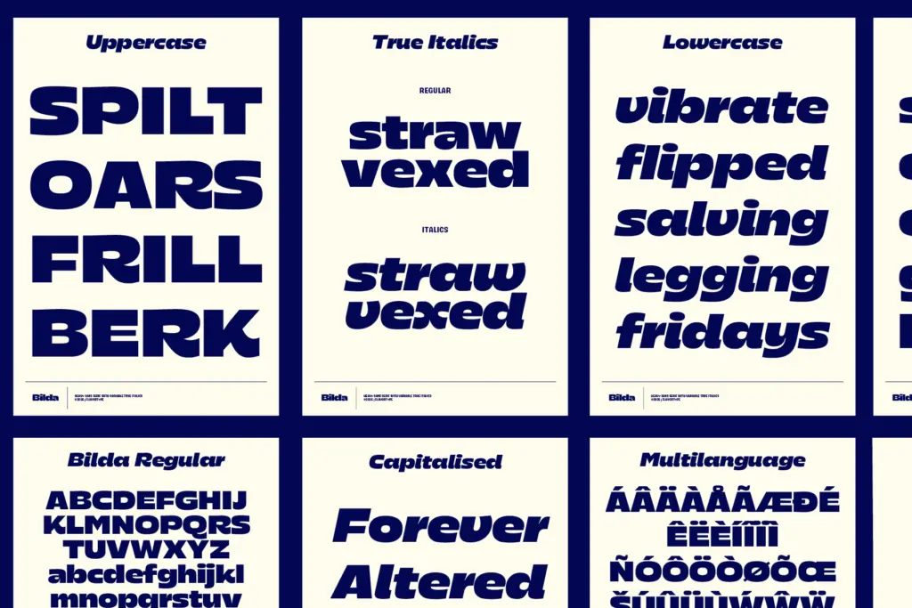
The core offering is two styles, Regular and a True Italic, plus a variable axis that lets you dial in slant continuously rather than jumping between a handful of static cuts. That’s the most useful engineering decision here — a true italic drawn as its own set of forms, not just a mechanically sheared version of the roman, gives it real personality when tilted, and the variable control means you can match slant to a layout rather than settling for whatever the designer happened to ship.
Language coverage is broad, built around the sort of extended Latin set you’d want for European and African language markets — lots of diacritics, several less common Latin-script languages included. That’s a genuine practical plus if your work needs to travel outside English-only copy.
What’s notably absent is a wider weight range. This is a heavy-only family: no light, no regular-weight text companion, no condensed cut. If you need Bilda to also handle body copy or a lighter subhead, you’re out of luck within this family alone.

Use cases
Bilda is built for short bursts of type at large sizes: wordmarks, poster headlines, app store graphics, social media titles, packaging hero type. The heaviness gives it presence from a distance and on small screens where thin strokes disappear, which is exactly where a lot of branding work happens now. The variable italic is worth using deliberately — a light slant for a subtle callout, a fuller slant for something that reads more energetic — rather than treating it as a novelty toggle.
It is not a text face. At paragraph sizes the counters close up and the heavy strokes fight each other; don’t reach for it below display sizes. It also won’t function as a full brand system on its own — pair it with a lighter, more neutral sans for body copy and supporting text, since Bilda’s job is to be the single loud voice, not the whole conversation.

What we liked, and what we didn’t
Strengths
- True italic forms rather than a mechanically slanted roman
- Continuous variable slant control gives fine-tuned emphasis
- Broad Latin-script language support for a display face
Trade-offs
- Single heavy weight only, no lighter or text-friendly companion in the family
- Counters close up quickly below display sizes, limiting it to headline use
Bilda is a confident, heavyweight display sans with a properly drawn true italic and useful variable slant control. It does one job — loud, short-form branding type — well, but it's not built to go any lighter or smaller than that.
Verdict

Tantype reviews typefaces in depth — every font is tested in real branding, editorial and screen layouts before a word gets written. 555+ fonts reviewed and counting.