
Armany: A Fluid Sans Display Face for Clean, Modern Headlines
Design style
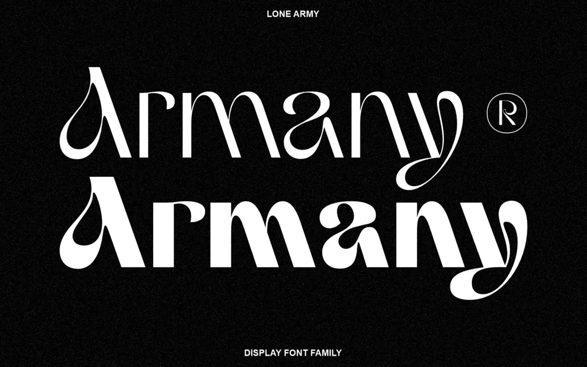
Armany is a sans serif display face built around a single idea: soften the geometry just enough to feel human without losing the crispness that display sans faces need at large sizes. The seller calls this a ‘fluid touch,’ and you can see it in the way strokes taper slightly into curves rather than terminating in hard, mechanical cuts. It is not a rounded sans in the bubbly sense — corners stay mostly sharp — but there is a looseness to the curves on letters like S, C and G that keeps the face from reading as sterile.
The proportions lean toward a slightly condensed rhythm, which suits headline settings where you want a line of type to feel dense and confident rather than airy. Stroke contrast is minimal, as expected of a sans, but not perfectly monolinear — there are subtle thick-thin transitions on the curved strokes that give the letterforms a drawn quality rather than a purely constructed one. This is a display face with a point of view, even if that point of view is understated.
Character set and features
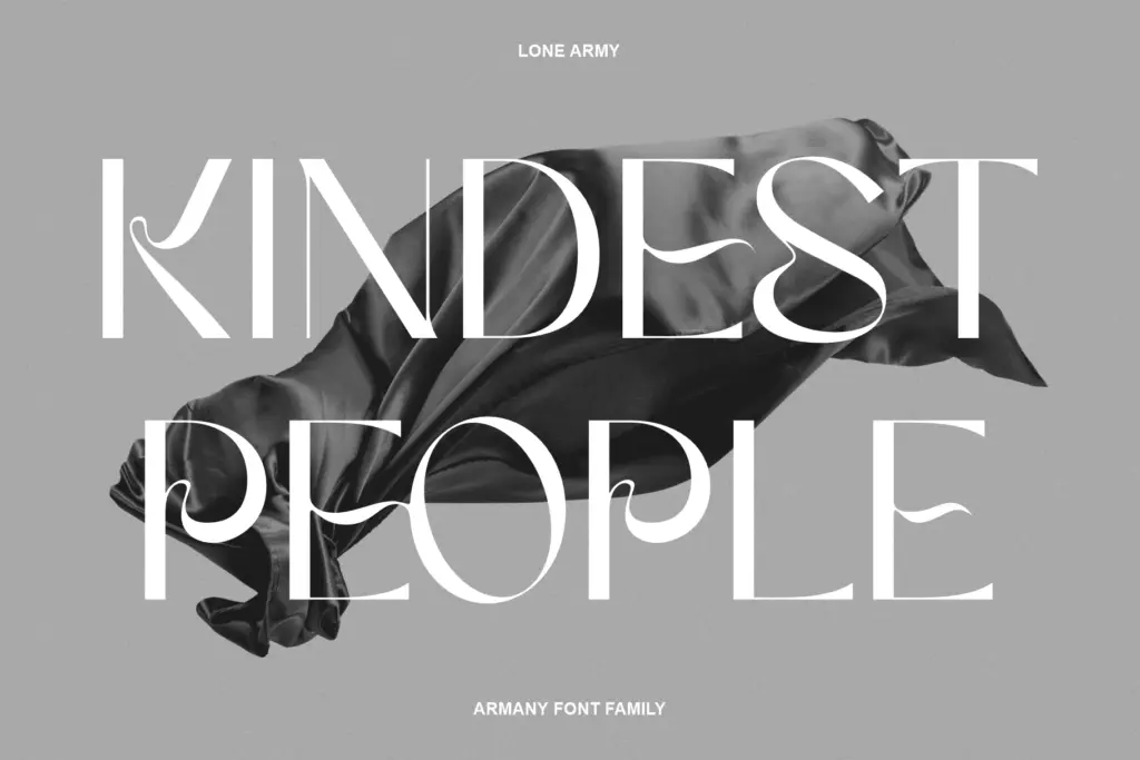
As a display family, Armany is built for short bursts of text rather than paragraphs. The letterforms are wide enough to read comfortably at large sizes but the tight spacing and condensed proportions mean it is not designed for body copy. Uppercase forms carry more personality than lowercase — the caps have a confident, almost architectural stance, while the lowercase set feels a touch more restrained by comparison, which is common in display sans designs where the capitals do the heavy lifting in a logotype or headline.
Numerals and basic punctuation follow the same fluid logic as the letters, with rounded terminals that echo the softened corners elsewhere in the set. There’s nothing exotic here in terms of alternates or ligatures based on what’s provided — this reads as a straightforward, single-style display font rather than a sprawling system with swash variants or contextual substitution. That simplicity is part of its appeal: what you see is what you get, and it is consistent across the set.
Use cases
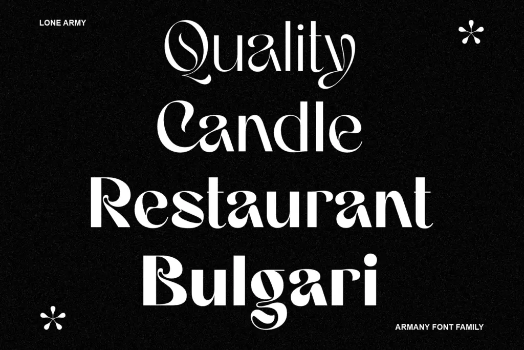
Armany’s natural home is short-form display work: logotypes, headline treatments, social graphics, packaging front-of-pack type, and signage where a handful of words need to carry visual weight. The condensed rhythm makes it efficient in tight spaces — app icons, banner ads, product labels — where a wider sans would run out of room. Because the fluid detailing is subtle rather than decorative, it also works in business and editorial contexts that want something a step warmer than a strictly geometric sans without tipping into overtly playful territory.
It is less suited to long-form reading. The tight spacing that makes it punchy at large sizes works against it in paragraph settings, where letters can start to feel cramped and the softened curves lose their charm at small point sizes. Pair it with a plain, wider-set sans or a simple serif for body text if you need a full editorial system, and let Armany do the job it’s built for: the headline, not the paragraph.
What we liked, and what we didn’t
Strengths
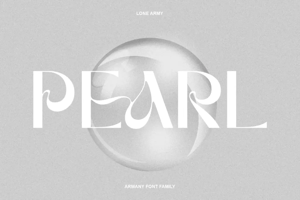
- Softened curves on letters like S, C and G give it a drawn, human quality without sacrificing crispness
- Condensed proportions make it efficient in tight display spaces like banners and packaging fronts
- Consistent, no-nonsense character set that avoids overcomplicating a single clear idea
Trade-offs
- Tight spacing and condensed rhythm make it unsuitable for body copy or long-form text
- Lowercase forms feel less distinctive than the capitals, limiting its impact in lowercase-only headlines
Armany is a competent condensed display sans with a subtle softened quality that keeps it from feeling purely geometric. It does headline work well but doesn't stretch much beyond that job. Worth a look if you need a punchy, slightly warmer alternative to the usual geometric sans for logos and short display copy.
Verdict

Tantype reviews typefaces in depth — every font is tested in real branding, editorial and screen layouts before a word gets written. 555+ fonts reviewed and counting.