Serif
3.9
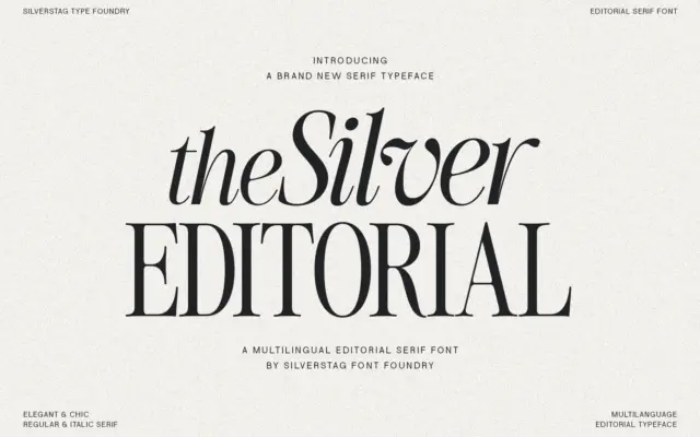
The Silver Editorial Serif: an 80s-flavoured display serif for headlines
Design style The Silver Editorial is a high-contrast serif built for attention rather than for reading paragraphs. Its debt to…
 Tantype

Design style The Silver Editorial is a high-contrast serif built for attention rather than for reading paragraphs. Its debt to…
Tantype
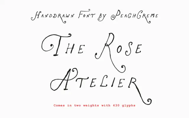
Design style The Rose Atelier is a hand-drawn display script built around loose, curling capitals and a lighter, more restrained…
Tantype
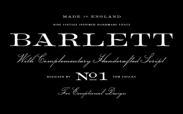
Design style Barlett No.1 leans hard on the look of 19th-century English typefounding — the kind of serif you’d expect…
Tantype
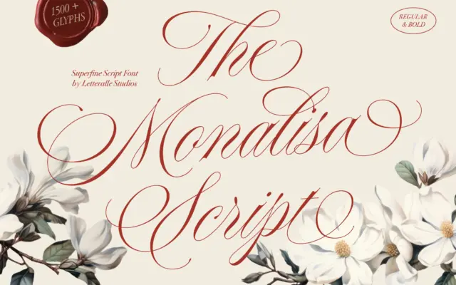
Design style Monalisa Script sits squarely in the fine-nib calligraphy tradition — thin, tapering strokes, high contrast, and a slant…
Tantype
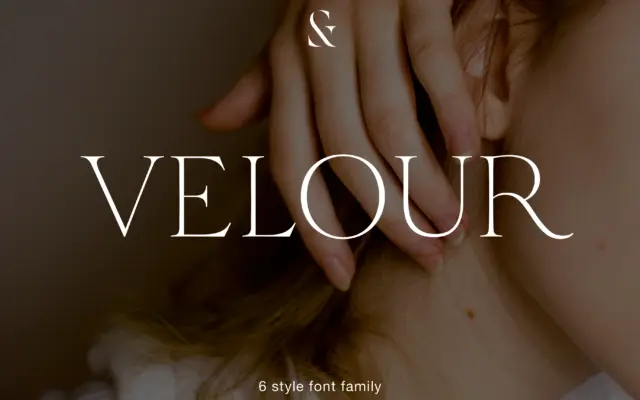
Design style Velour sits in that familiar territory of thin, bracketed serif display faces built for headlines rather than paragraphs.…
Tantype
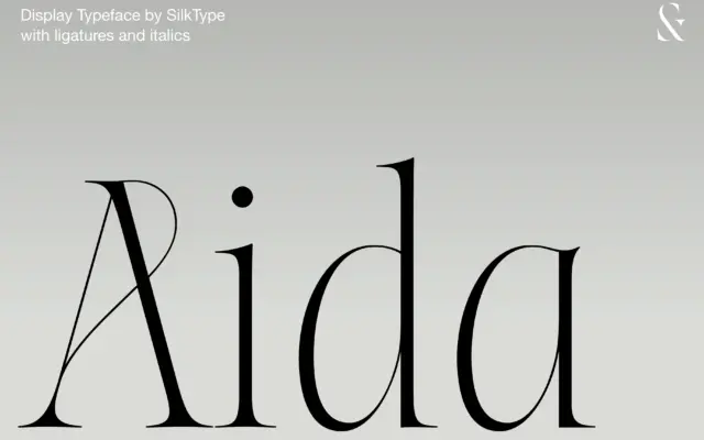
Design style Aida sits at the extreme end of the contrast scale: thick stems that thin out into hairline serifs…
Tantype
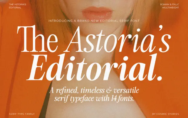
Design style The Astoria’s Editorial Serif sits in a familiar but well-populated lane: the advertising-inspired serif that borrows its bones…
Tantype
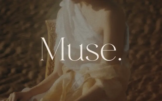
Design style Muse belongs to the modern-serif family that fashion branding has leaned on for years: hairline serifs, dramatic thick-thin…
Tantype
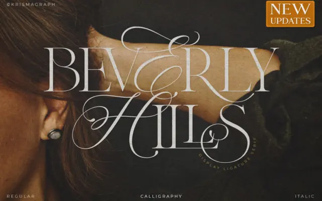
Design style Beverly Hills sits at the intersection of calligraphy and serif construction, and it wears that hybrid identity openly.…
Tantype