
Beverly Hills: a ligature serif for wedding suites and glamour branding
Design style
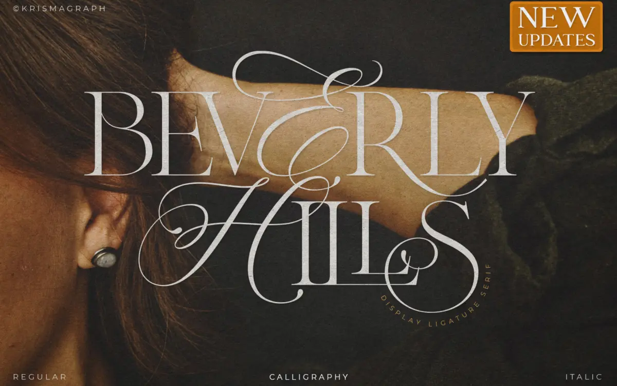
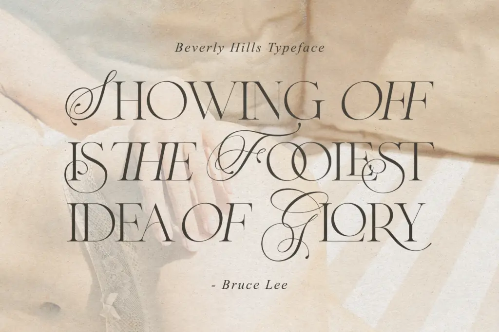
Beverly Hills sits at the intersection of calligraphy and serif construction, and it wears that hybrid identity openly. The letters carry high-contrast strokes, thin hairline serifs, and swelling curves that suggest a broad-edged pen even though the overall structure leans formal rather than casual. It reads as a display serif dressed up with calligraphic flourish, rather than a calligraphy face tamed into serif discipline.
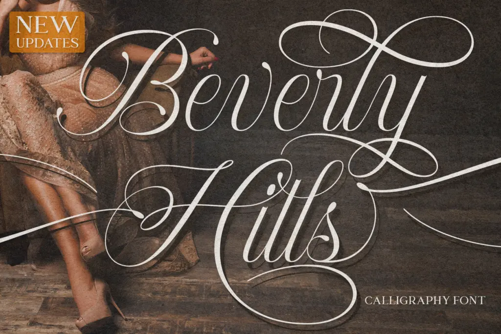
The three versions — regular, italic, and calligraphy — give the face a working range within a single stylistic idea. The regular is the most restrained, useful where you need the serif backbone without the flourish. The italic slants into something closer to handwriting, with narrower apertures and a quicker rhythm between letters. The calligraphy version is the showpiece: swashes extend well beyond the baseline and x-height, and letters lean on each other in a way that only works set large and set short. None of the three is neutral. This is a face with a point of view about glamour, and it doesn’t pretend otherwise.
Character set and features
The 56 ligatures are the actual selling point here, and they matter more than the letterforms alone. Rather than the usual fi/fl pairs, these are decorative joins built for whole word endings and common letter combinations, letting a name or a short phrase read as one continuous calligraphic gesture instead of a row of separate glyphs. PUA encoding means those ligatures are reachable by keystroke, not buried in an OpenType feature panel most page-layout tools ignore — a practical decision, since a lot of the software this font is aimed at doesn’t support automatic ligature substitution anyway.
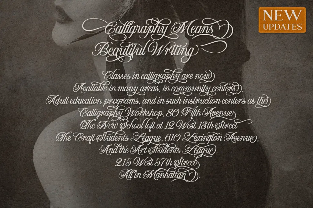
Multilingual support is mentioned in the source material but not detailed further, so treat that as a general accented-character allowance rather than a guarantee for any specific language. The face is built for short strings: names, single words, opening lines. It is not built to be read in paragraphs, and the ligature system actively resists it — a sentence of calligraphy-version text starts to look like a knot rather than a line.
Use cases
Wedding stationery is the obvious fit, and the calligraphy version in particular does the work a couple’s names and a date need done: warm, ornamental, personal-feeling without tipping into full script chaos. Branding and logotype work is the second clear use — a boutique, a fashion label, a perfume or cosmetics line looking for something that reads as considered rather than mass-produced. Editorial titling, social quote graphics, and packaging accents round out the brief’s own suggestions, and they hold up: this is a headline face, not a body face, and it knows it.
Where it won’t help: anything needing sustained reading, dense layouts, or a neutral voice. Pair it with a plain sans or workhorse serif for supporting text, and keep the calligraphy version for the one or two words that need to carry the emotional weight of the piece.
What we liked, and what we didn’t
Strengths
- The 56 ligatures are built for real word endings, not just token fi/fl pairs, and give the calligraphy version its distinct rhythm
- Three versions — regular, italic, calligraphy — cover a useful range from restrained to fully ornamental within one cohesive style
- PUA encoding makes the ligatures accessible by keystroke, which matters given how many design tools ignore OpenType features
Trade-offs
- The calligraphy version becomes hard to read past a handful of words, limiting it strictly to short-text use
- It leans heavily into one glamorous, feminine-coded mood, so it won't suit projects needing a neutral or restrained serif voice
Beverly Hills is a confident, ornamental headline face that does one job well: short, glamorous text for weddings and fashion-adjacent branding. Its ligature set is genuinely useful rather than decorative filler, but the calligraphy version's flourish makes it unsuitable for anything longer than a line or two. Buy it for names and titles, not for paragraphs.
Verdict

Tantype reviews typefaces in depth — every font is tested in real branding, editorial and screen layouts before a word gets written. 555+ fonts reviewed and counting.