
Aida: a high-contrast display serif for luxury and editorial headlines
Design style
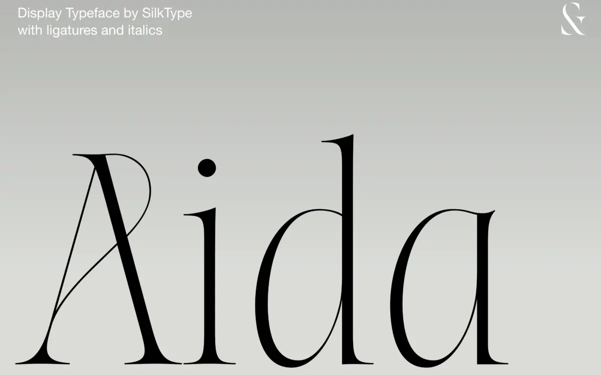
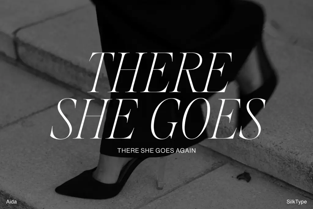
Aida sits at the extreme end of the contrast scale: thick stems that thin out into hairline serifs and connecting strokes so fine they nearly disappear at small sizes. This is the modern-serif effect designers reach for when they want a headline to feel expensive rather than loud. The Roman is upright and formal, built on narrow apertures and long, tapering serifs that give it a slightly brittle, jewellery-like precision. The italic loosens things up considerably, with more calligraphic entry and exit strokes and a visible slant that reads as handwriting filtered through a ruling pen. Together the two styles cover a fairly narrow emotional range — restrained, cool, a little austere — and Aida doesn’t pretend otherwise. It isn’t trying to be warm.
Character set and features
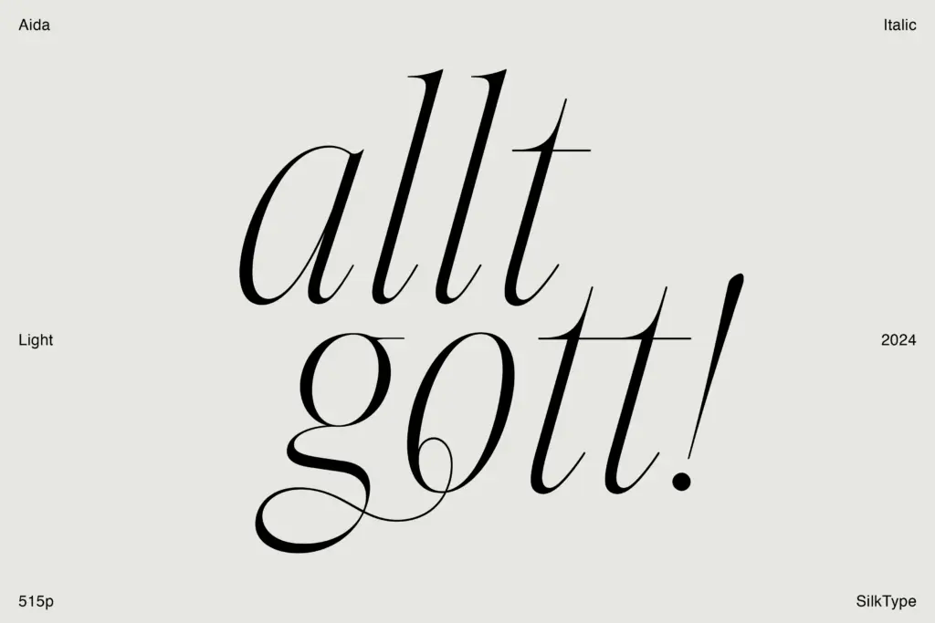
The headline feature here is the ligature set: over 100 ligatures and alternate letterforms, which is a genuinely large number for a display serif and suggests real attention was paid to how letters collide at large sizes. In practice this means the connecting strokes between certain letter pairs — the kind that would otherwise look mechanical or collide awkwardly given how thin the hairlines get — have been drawn by hand rather than left to default kerning. That matters more than it sounds like it should, because a face with this much contrast will show every clumsy join at 80pt. The alternates give some room to vary a wordmark or a masthead without switching typefaces, which is useful for anyone setting the same word repeatedly across a campaign and wanting it to look considered rather than repeated. What the brief doesn’t tell us is how deep the language support goes or whether there’s a full numeral and small-caps set, so treat those as open questions rather than assumptions — check the character map before you commit a project to it.
Use cases
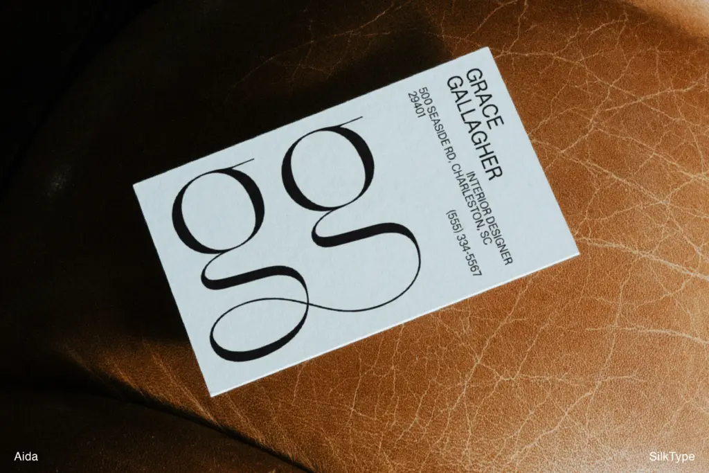
Aida’s natural home is headline and display work: magazine covers, fashion logotypes, packaging for cosmetics or wine, wedding stationery that wants elegance without going full script. The extreme contrast means it needs air around it — generous tracking, plenty of white space, and ideally a print or high-resolution digital context where the hairlines won’t blur or drop out. On a low-resolution screen, at small point sizes, or reversed out of a dark background, those hairline serifs are the first thing to break; this is not a body-text font and shouldn’t be asked to be one. Pair it at large sizes for headlines and drop to a plainer serif or sans for running copy, since Aida’s job is to say one word beautifully, not a paragraph. For branding work — logo design, luxury packaging, editorial mastheads — the ligatures and alternates give it enough flexibility to avoid looking like a stock display face, provided the layout gives it room to breathe.
What we liked, and what we didn’t
Strengths
- Over 100 hand-drawn ligatures and alternates keep repeated letter pairs from looking mechanical
- Roman and italic styles offer distinct moods — formal versus calligraphic — without switching typeface
- Extreme contrast gives wordmarks and headlines a distinctly premium, editorial feel
Trade-offs
- Hairline strokes are fragile at small sizes and on low-resolution or reversed-out screens
- Emotional range is narrow — it's cool and formal by design, not adaptable to warmer branding
Aida is a sharp, high-contrast display serif that does one job — elegant headline and branding work — very well, and doesn't pretend to do more. The ligature set is unusually deep for this category and lifts it above the average thin-serif display font. Just don't ask it to run at small sizes or on screen.
Verdict

Tantype reviews typefaces in depth — every font is tested in real branding, editorial and screen layouts before a word gets written. 555+ fonts reviewed and counting.