
The Rose Atelier: a curly hand-drawn display face for soft branding
Design style
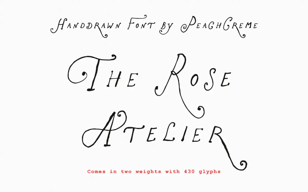
The Rose Atelier is a hand-drawn display script built around loose, curling capitals and a lighter, more restrained lowercase. The flourishes sit mostly on the caps, where entry and exit strokes loop back on themselves before settling into the word. It reads as informal rather than calligraphic — there’s no consistent pen angle or contrast logic driving the letterforms, which is typical of hand-drawn display work and not a flaw so much as a category marker. The line quality is even and confident, without the wobble that plagues cheaper hand-lettered fonts.
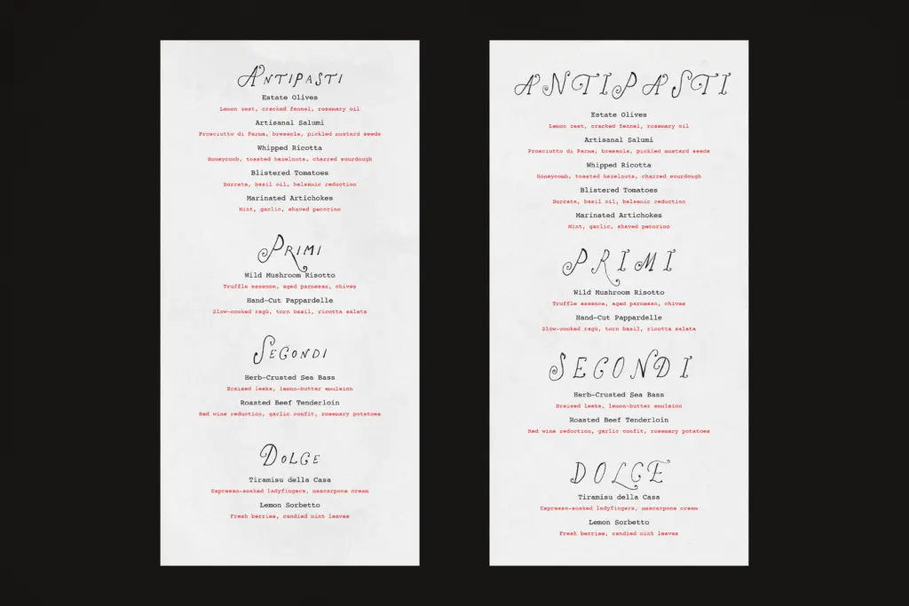
Where it distinguishes itself from generic ‘cute script’ territory is in the doubling of the alphabet. A second full alternate set (ss01) gives every letter and numeral a genuinely different drawing, not just a tweak to a serif or a stroke weight change. That’s a real design decision, not a marketing bullet point — it means the font can carry two distinct moods depending on which set you load, or blend both in a single line of type for texture.
Character set and features
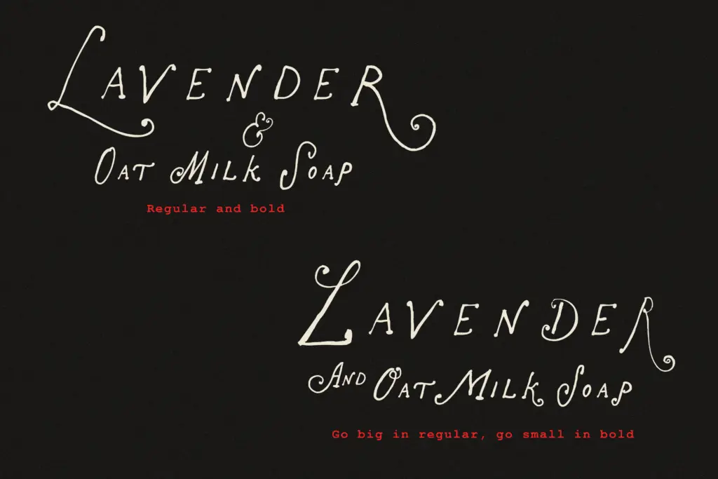
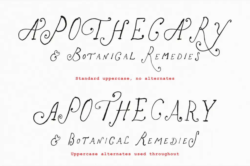
Regular and Bold weights cover the basics. Beyond that, the feature set is genuinely deep for a display face: ss01 swaps the entire alphabet and numerals for a second style, while ss02 through ss05 layer in extra decorative variants for a subset of letters — mostly uppercase, with occasional treatment for lowercase r and s. This is where buyers need to pay attention, because coverage across those four sets is uneven by the seller’s own account. Some letters get four or five alternates; others get none. That’s not a dealbreaker for a display font used a few words at a time, but it does mean this isn’t a face you can treat like a fully systemised OpenType script with predictable substitution behaviour. Expect to hand-pick glyphs in a layout program rather than rely on automatic contextual alternates to do the work for you.
The upside of that manual approach is control. Because the alternates are stylistic sets rather than randomised contextual swaps, you choose exactly which glyph appears where, which matters a lot when you’re setting a short product name or a monogram and need every letter to feel intentional rather than accidental.
Use cases
This is a font for short bursts of type, not paragraphs — logotypes, boutique packaging, invitation headers, product labels, social graphics with a handmade, feminine-leaning tone. The looping capitals make strong initials and monograms; the calmer lowercase keeps longer words from turning into visual noise. It pairs naturally with cottagecore, fairycore, and coquette-adjacent branding where a slightly imperfect, drawn quality is the point.
It’s not built for body copy or dense editorial settings — legibility drops off quickly below a certain size, as it does with most hand-drawn display faces, and the flourish-heavy capitals need generous surrounding space to avoid crowding. Treat it as a headline and accent typeface, backed by a plainer sans or serif for supporting text, and it does its job well.
What we liked, and what we didn’t
Strengths
- A genuinely complete second alphabet (ss01), not just a handful of swapped letters
- Confident, even line quality that avoids the shaky look common in hand-drawn scripts
- Looping capitals make strong monograms and short logotypes
Trade-offs
- Decorative alternates in ss02–ss05 cover letters unevenly, so results require manual checking against previews
- Not legible at small sizes or in continuous text, limiting it to headline and accent use
The Rose Atelier is a well-drawn, flourish-heavy display script that earns its keep through a genuinely doubled character set rather than gimmicky extras. It's strictly a short-text, headline-and-label font, and the uneven coverage of its bonus stylistic sets means some manual glyph-picking is unavoidable. For boutique branding, packaging, and invitation headers with a soft, handmade feel, it delivers more than most fonts in this niche.
Verdict

Tantype reviews typefaces in depth — every font is tested in real branding, editorial and screen layouts before a word gets written. 555+ fonts reviewed and counting.