
Monalisa Script: a feminine calligraphy face with genuine depth of alternates
Design style
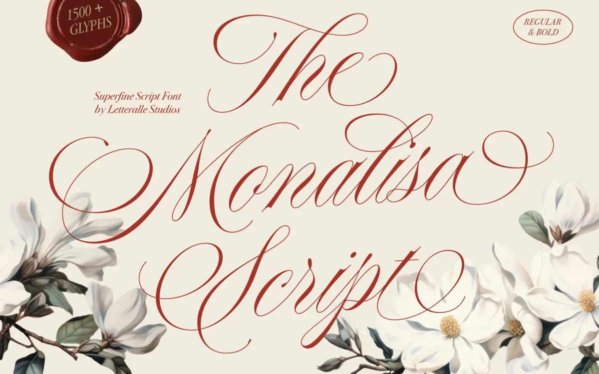
Monalisa Script sits squarely in the fine-nib calligraphy tradition — thin, tapering strokes, high contrast, and a slant that leans toward the romantic rather than the brisk. The joins are loose and open, so words don’t clot into a dark ribbon the way some heavier scripts do. It reads as classic and feminine, closer to a wedding invitation hand than a signage script. The bold companion doesn’t just thicken the strokes; it changes the personality slightly, giving the face a bit more presence for headlines while keeping the same underlying calligraphic logic.
What separates this from a generic script is the flourish work. The swashes on ascenders and descenders are drawn with restraint — long enough to register as ornamental, not so long that they collide with neighbouring lines. That’s a common failure point in scripts this delicate, and Monalisa mostly avoids it, though tight leading will still need watching.
Character set and features
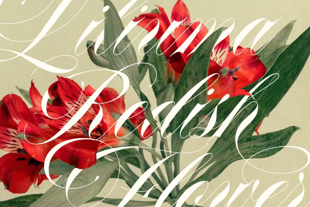
The glyph coverage is the real selling point here. Rather than one fixed shape per letter, most characters carry multiple stylistic alternates, accessed through the numbered naming convention (G2, G3, G4 and so on) or through stylistic sets. In practice this means a designer can vary the same word across a project — a logo lockup, a package front, a social tile — without the repetition that flat scripts fall into when a name or word repeats a letter twice in a row. Ligatures are included to smooth over awkward letter pairs, and the punctuation and numeral sets are drawn with the same weight logic as the lowercase, so a price tag or a date doesn’t look bolted on. Multilingual support extends the font’s reach beyond a single-language project, though as with any script, extended diacritics are worth test-setting before committing, since accents can crowd the ascender flourishes.
The catch with this much alternate coverage is that it asks something of the user. Getting the best out of Monalisa Script means going into OpenType features or manually swapping glyphs, not just typing and walking away. Designers comfortable with glyph panels will get real mileage from it; those expecting a plug-and-play script may only ever see the default forms, which are pleasant but not the font’s strongest argument for itself.
Use cases
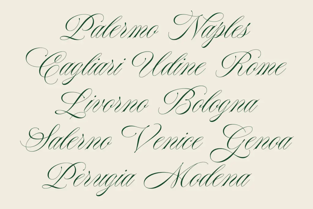
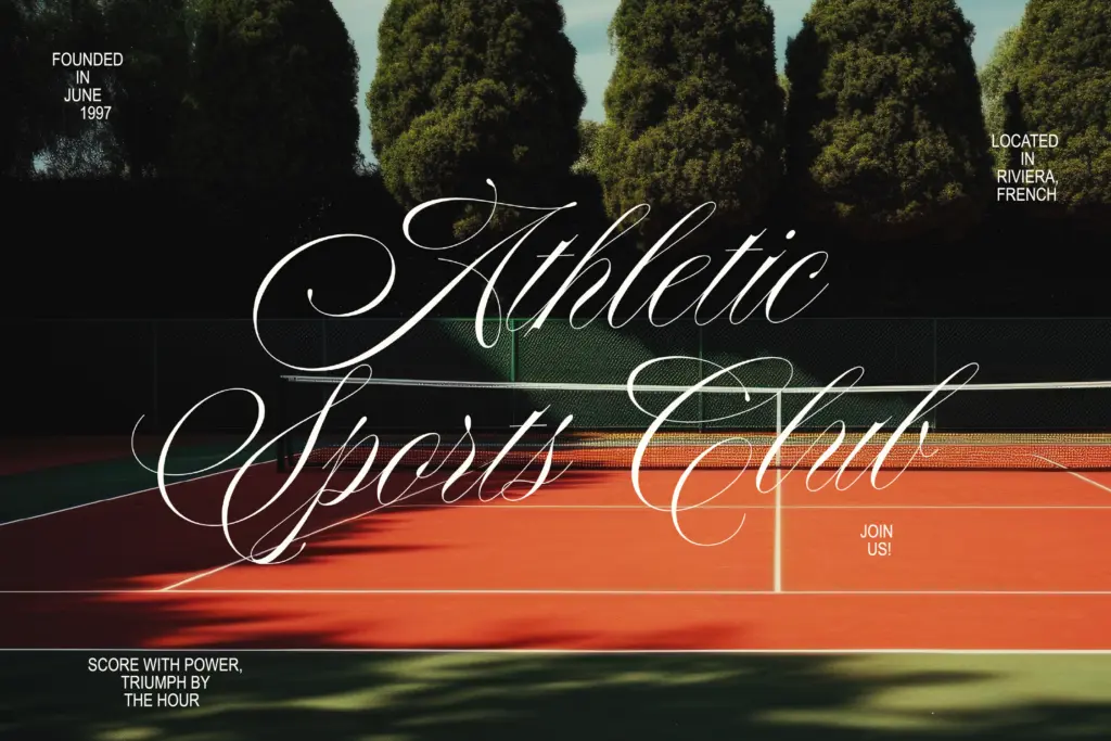
This is a font for finished, considered pieces rather than quick text-heavy layouts. Wedding stationery is the obvious fit — invitations, place cards, monograms — where the elegant, high-contrast strokes and swash capitals carry a single word or short phrase well. It also works for logotypes and branding marks that want a handwritten, upscale feel: cosmetics, boutique packaging, editorial mastheads, quote graphics for social media. The bold weight holds up reasonably at smaller sizes for short labels, but the regular weight’s fine hairlines are not built for body copy or long-form reading — keep it to headlines, names, and short lines of type, and pair it with a plain sans or serif for anything that needs to actually be read at length.
What we liked, and what we didn’t
Strengths
- Extensive stylistic alternates let repeated letters vary naturally within a word
- Swash flourishes are restrained enough to avoid colliding with adjacent lines
- Bold weight extends the script's use into smaller-scale branding and packaging work
Trade-offs
- Fine hairline strokes in the regular weight limit it to short lines, not body text
- Getting full value from the alternates requires manual glyph work, not just typing
Monalisa Script is a well-drawn fine-line calligraphy face with an unusually generous set of alternates that rewards designers willing to dig into the glyph panel. It's built for short, elegant lines — invitations, logos, packaging — not paragraphs. Skip it if you need something legible straight out of the box with no setup.
Verdict

Tantype reviews typefaces in depth — every font is tested in real branding, editorial and screen layouts before a word gets written. 555+ fonts reviewed and counting.