Serif
3.7
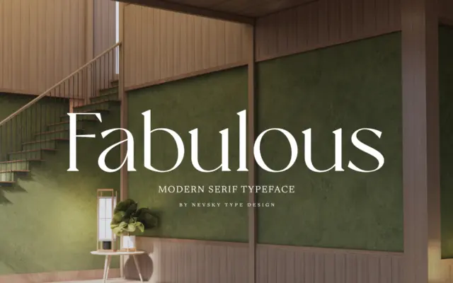
NT Fabulous: a high-contrast serif for fashion and luxury branding
Design style NT Fabulous belongs to the family of high-contrast serifs that draw on the didone tradition without fully committing…
 Tantype

Design style NT Fabulous belongs to the family of high-contrast serifs that draw on the didone tradition without fully committing…
Tantype
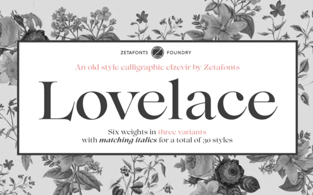
Design style Lovelace is Zetafonts’ take on the nineteenth-century Old Style revival, pulling from the same lineage that produced Benguiat…
Tantype
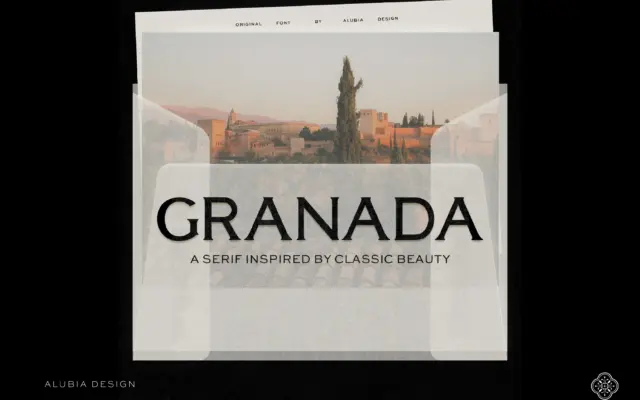
Design style Granada is a serif built for headlines, not paragraphs, and it makes that intention obvious from the first…
Tantype
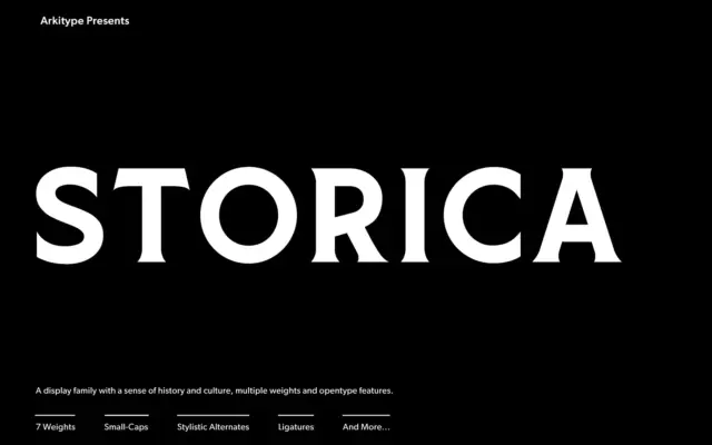
Design style Storica leans on the proportions of classical roman lettering — the kind carved into stone rather than set…
Tantype
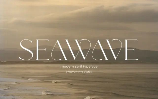
Design style NT Seawave sits in the modern serif tradition: sharp contrast between thick and thin strokes, unbracketed or minimally…
Tantype
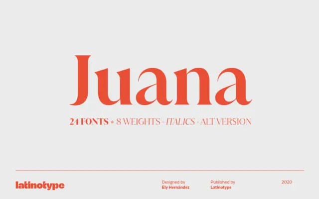
Design style Juana belongs to the family of high-contrast serifs that trade the calm rhythms of text faces for something…
Tantype
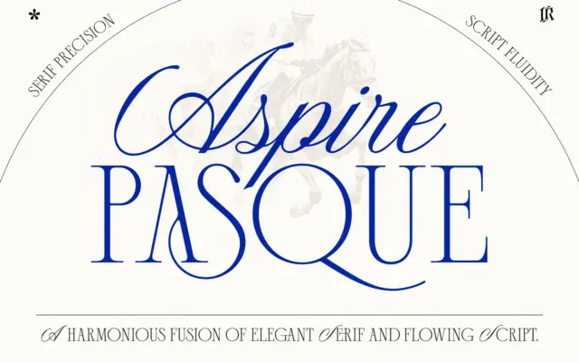
Design style Aspire Pasque pairs two fonts built to sit on the same page without competing for attention. The script…
Tantype
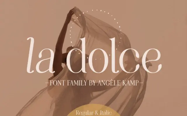
Design style La Dolce sits in the modern serif camp that has become a staple of feminine branding: moderate stroke…
Tantype
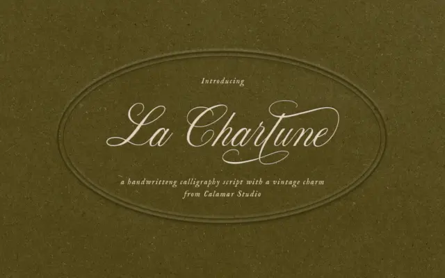
Design style La Charlune takes the bones of copperplate script — the steep slant, the thick-thin contrast built from pressure…
Tantype