
La Dolce: a feminine serif family for wedding and branding work
Design style
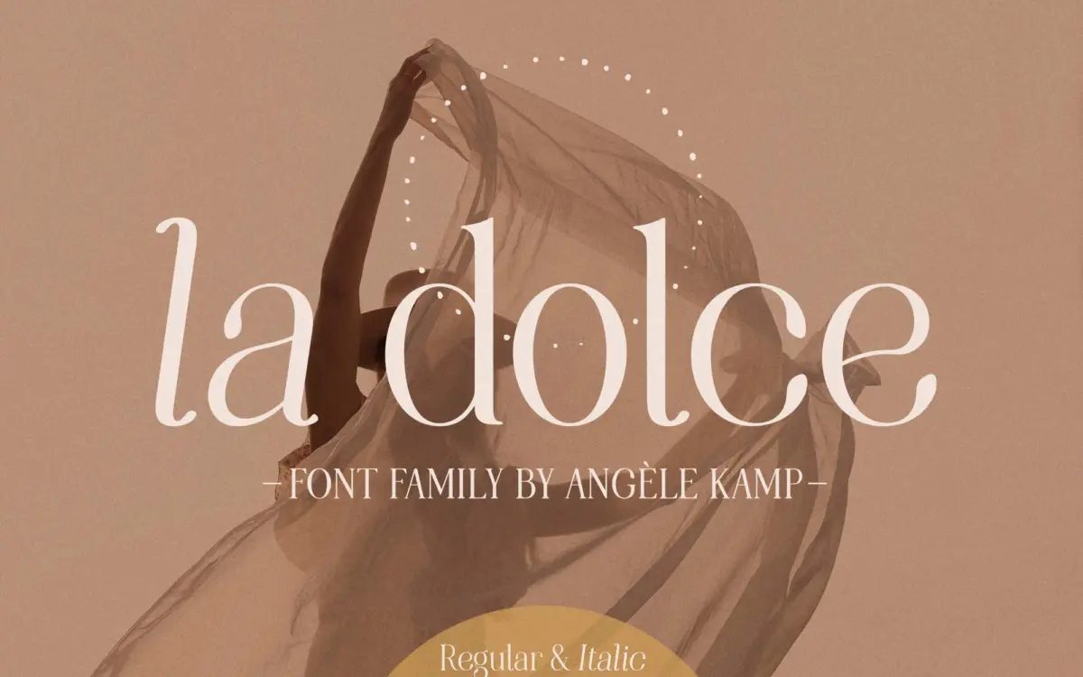
La Dolce sits in the modern serif camp that has become a staple of feminine branding: moderate stroke contrast, a fairly narrow set width, and finials that soften rather than snap. The bold weight leans into the contrast a bit more, giving it the look of a small display face rather than a workhorse text serif, which matches its stated purpose. The italic is where the personality actually lives — the entry strokes swing and the letter axis shifts noticeably, giving it a handwritten quality that the upright weights only hint at. Nothing here is experimental. It reads as a competent, well-worn interpretation of the genre rather than a fresh argument about what a modern serif can look like, but the drawing is even and the proportions are consistent across weights, which is not a given in family packages like this.
Character set and features
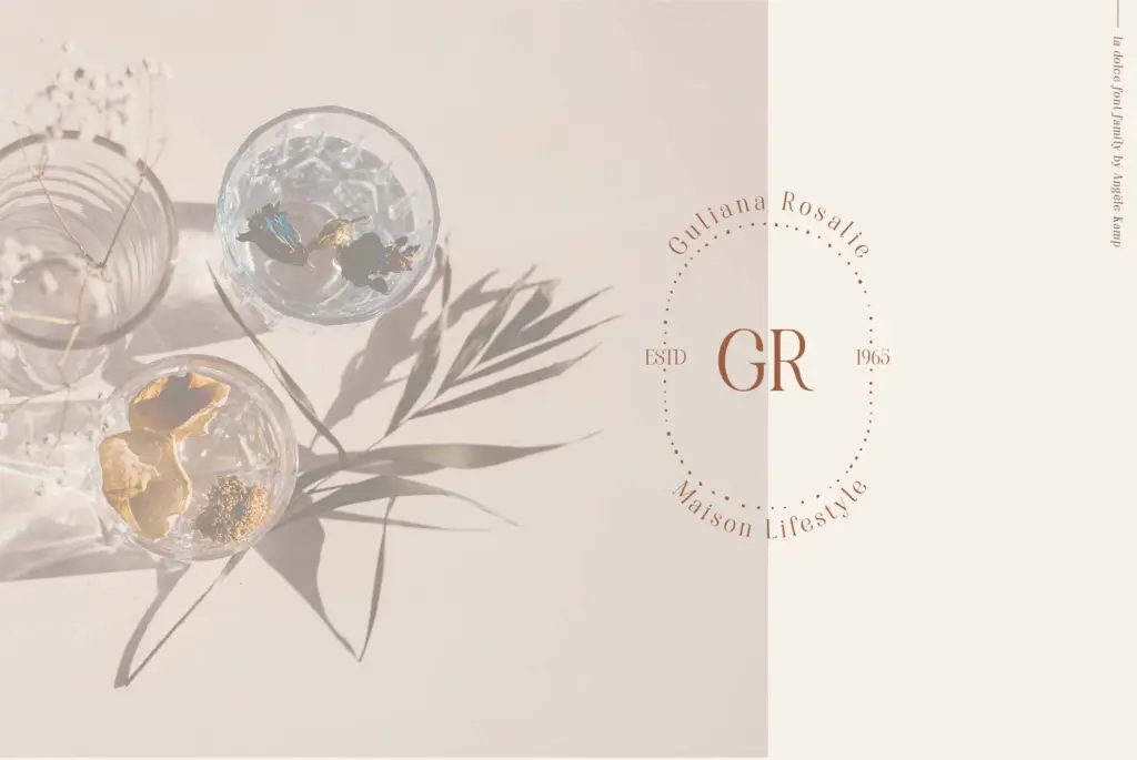
The family comes as four core weights — Regular, Bold, Italic and Bold Italic — plus nine hand-drawn shapes bundled in as supporting graphics. Those extras are ornamental rather than typographic: think small flourishes and marks to dress up an invitation or a label, not swashes built into the font’s glyph set. Because the package doesn’t specify OpenType features like ligatures, alternates, or extended language support, it’s safest to treat this as a solid four-style serif with decorative add-ons, rather than a feature-rich system font. That’s fine for its intended scale of use, but designers wanting contextual alternates or a built-out small caps set will need to look elsewhere or fake it manually.
At smaller sizes the moderate contrast holds up reasonably well, though the italic’s looser rhythm starts to feel busy below body-copy size — it wants room to breathe. The bold weight is the most reliable performer for short lines: headlines, monograms, single words on packaging.
Use cases
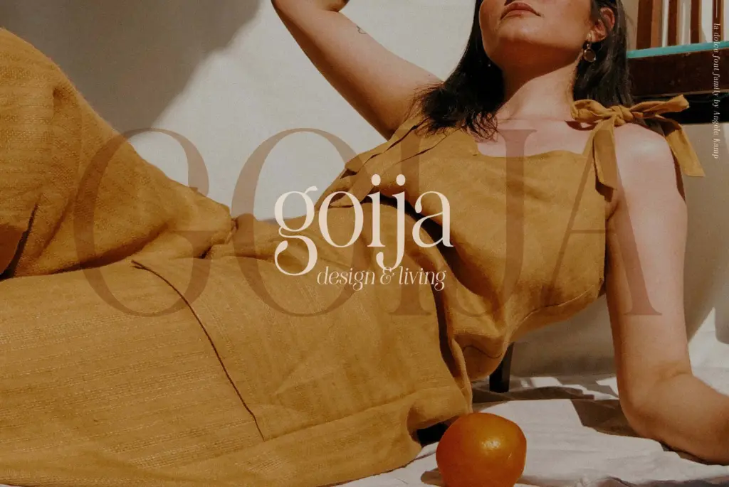
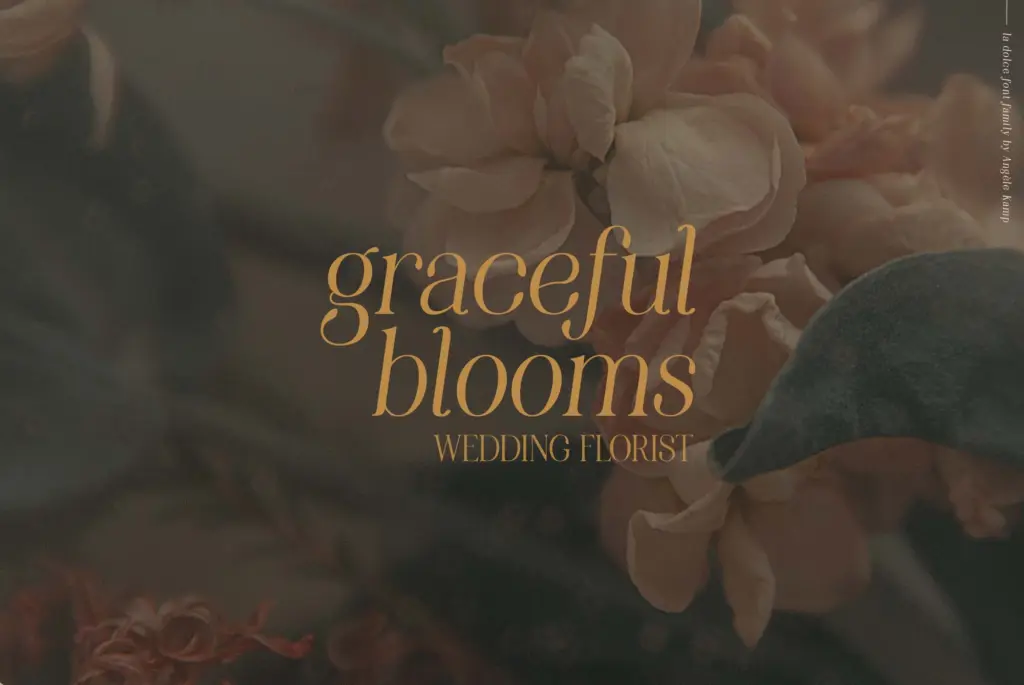
This is a family built for the identity-and-invitation end of the market, and it does that job honestly. Wedding stationery, boutique branding, product labels, and short editorial headlines are where it will earn its keep — anywhere a project wants warmth and a slightly vintage, feminine tone without going fully script. The bundled hand-drawn shapes make sense in that context too: a small floral mark next to a monogram, a divider under a couple’s names.
It is less suited to long-form text. The italic in particular is not built for paragraphs, and the family as a whole doesn’t offer the weight range or the technical depth (no light or black weights, no stated numeral sets) that a full editorial or UI system would need. Treat it as a display-and-accent family: strong in headers, pull quotes, logotypes, and short lockups, but not the typeface to run a whole document in.
What we liked, and what we didn’t
Strengths
- The italic weight has a genuinely handwritten, loose rhythm that distinguishes it from the upright styles.
- Bold weight performs reliably for short headlines, monograms, and packaging.
- Bundled hand-drawn shapes give a practical way to add ornament without hunting for separate assets.
Trade-offs
- No stated OpenType features like ligatures or alternates, so the glyph set feels basic for a serif family at this price point in ambition.
- The italic loses clarity at small sizes and isn't suited to long-form text.
La Dolce is a well-drawn, feminine modern serif that does exactly what it promises for wedding and boutique branding work. It's not technically ambitious — four weights, no stated OpenType depth — but the italic has real character and the bold weight is a dependable headline tool. Best used as a display and accent face rather than a body-copy workhorse.
Verdict

Tantype reviews typefaces in depth — every font is tested in real branding, editorial and screen layouts before a word gets written. 555+ fonts reviewed and counting.