
Aspire Pasque: a serif-and-script duo for quiet luxury branding
Design style
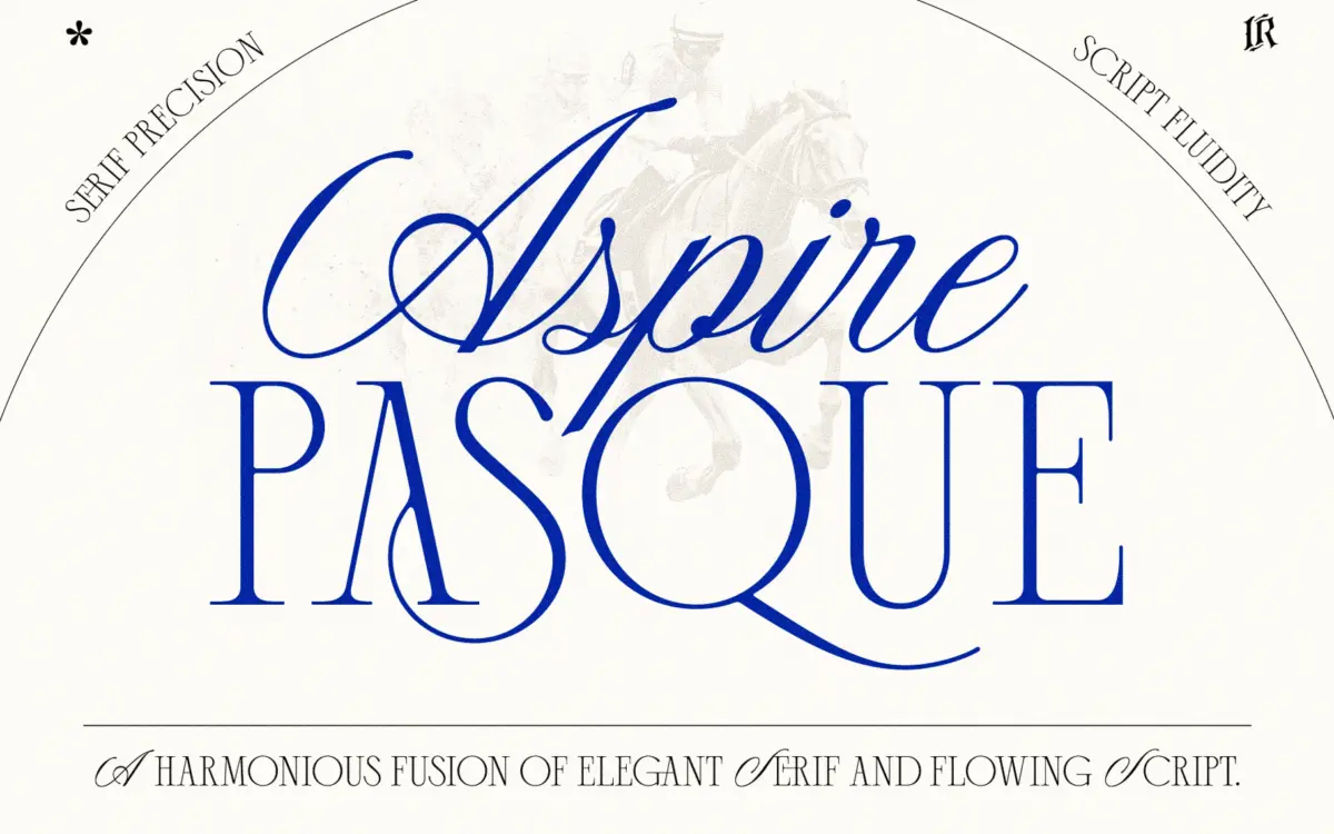
Aspire Pasque pairs two fonts built to sit on the same page without competing for attention. The script half carries the fluid, connected strokes you’d expect from this category: moderate contrast, loose loops, and a slight forward lean that keeps it from feeling static. It isn’t aggressively calligraphic — no dramatic swash flourishes fighting for the eye — which is the right call for a support font. The serif companion is where the duo earns its ‘refined’ billing. It’s a classic-leaning serif with restrained bracketed serifs and even stroke weight, closer to a text-adjacent display face than anything eccentric. Together they read as a coordinated set rather than two fonts thrown into a bundle after the fact, which is more than can be said for a lot of duos on the market.
Character set and features
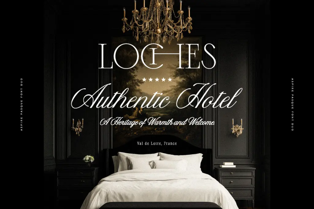
The script has the ligatures and connecting forms that make handwriting-style faces usable rather than just decorative — letters knit together at reasonable x-heights instead of leaving visible gaps between glyphs, which is where cheaper script fonts usually fall apart. The seller notes support for English plus Western and Central European languages, so accented characters are accounted for if you’re setting copy beyond basic English. What isn’t clear from the material provided is the depth of alternate characters or contextual substitution — duos pitched at this price point sometimes have a handful of swash caps and stop there, so don’t assume a huge glyph palette without checking the specimen first. The serif is more straightforward: a solid, legible alphabet without much in the way of stylistic alternates, which suits its job as the quieter half of the pairing.

Use cases
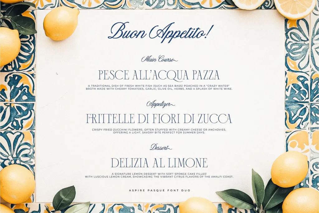
This is a duo built for the wedding-and-branding circuit, and it will do that job competently. Use the script for a couple’s names or a short headline — a word or two, not a paragraph — and let the serif carry invitation details, subheads, or body-adjacent copy where actual reading happens. That division of labour is where script/serif pairings succeed or fail, and Aspire Pasque is drawn with that split in mind rather than as an afterthought. It’ll work fine for logotypes that want a handwritten mark next to a clean wordmark, for packaging that needs a touch of warmth without going full cursive, or for editorial pull quotes where the serif can hold a paragraph while the script signs off a byline. Where it will strain is anything requiring genuine long-form text setting in the script — it’s not built for that, and nobody should try. It also won’t suit brands after something sharper or more contemporary; this is a soft, traditional register, not an edgy one. If your project already leans toward the classic-elegant end of the spectrum — think engraved stationery rather than a startup pitch deck — this duo slots in without a fight. If you need something more distinctive as a standalone display face, the script on its own is pleasant but not particularly memorable next to more idiosyncratic scripts on the market.
What we liked, and what we didn’t
Strengths
- The serif and script are genuinely drawn to complement each other rather than feeling bundled together after the fact.
- Ligatures and connecting forms in the script keep words readable at typical invitation sizes.
- European character support extends usability beyond basic English copy.
Trade-offs
- The script's personality is pleasant but fairly generic within the wedding-script category.
- Not suited to long-form text setting, particularly in the script half.
Aspire Pasque is a well-matched, dependable serif-and-script pairing for wedding and luxury-branding work, not a font that will surprise you. It does the specific job it's built for cleanly, but the script lacks a distinctive personality that would make it stand out from the crowded field of similar duos.
Verdict

Tantype reviews typefaces in depth — every font is tested in real branding, editorial and screen layouts before a word gets written. 555+ fonts reviewed and counting.