
NT Fabulous: a high-contrast serif for fashion and luxury branding
Design style
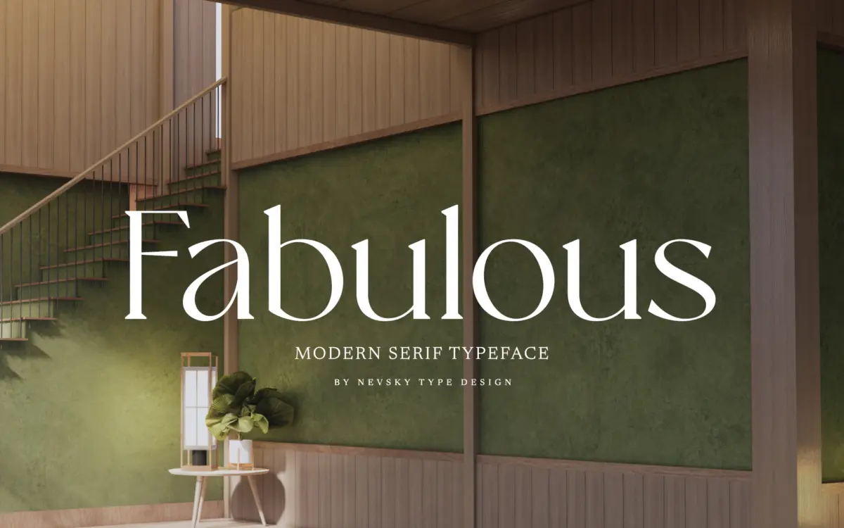
NT Fabulous belongs to the family of high-contrast serifs that draw on the didone tradition without fully committing to its severity. The thick-thin transitions are pronounced, the hairlines fine, and the serifs sit flat and unbracketed in the places you’d expect from that lineage. But the curves have a little more give than a strict didone, and the overall texture leans softer, closer to something you’d associate with editorial fashion type than with a formal book face.
It reads as a display-first design. The contrast is the whole point here, and at larger sizes it gives the letterforms a poised, slightly theatrical quality — good for a masthead or a cover line, less useful as a workhorse text face. The proportions are fairly narrow, which helps it feel current rather than merely revivalist, and keeps long headline settings from sprawling.
Character set and features
The seller states support for over 200 Latin-based languages, which suggests a genuinely broad diacritic set rather than the usual Western European coverage — worth checking against your specific language needs before committing, but a reasonable claim for a font built with international branding work in mind.
Beyond that, the brief doesn’t detail alternate characters, ligatures, or a full family of weights, so it’s best to treat NT Fabulous as a single-style serif rather than a flexible system. That’s not a flaw in itself, but it does mean the font is doing one job — a striking, high-contrast display serif — rather than several. If you need a full weight range for a complete identity system, you’ll likely need to source a companion sans or a text serif separately, since nothing here suggests NT Fabulous stretches down to body-copy duty.
Use cases
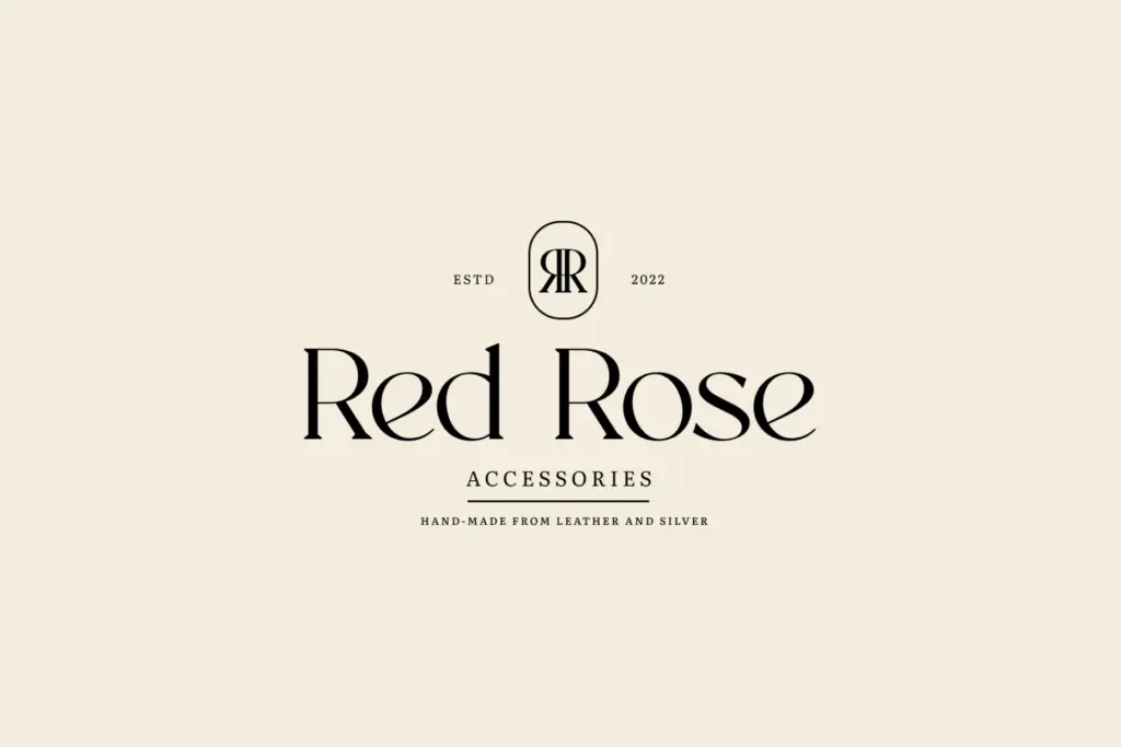
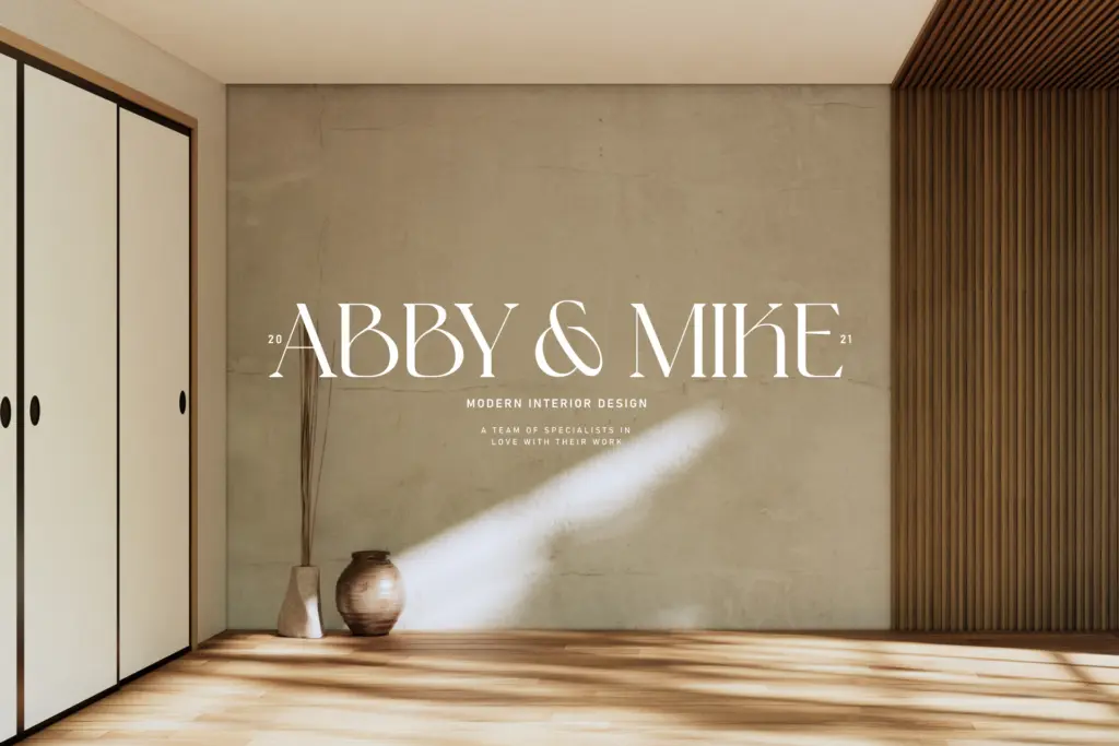
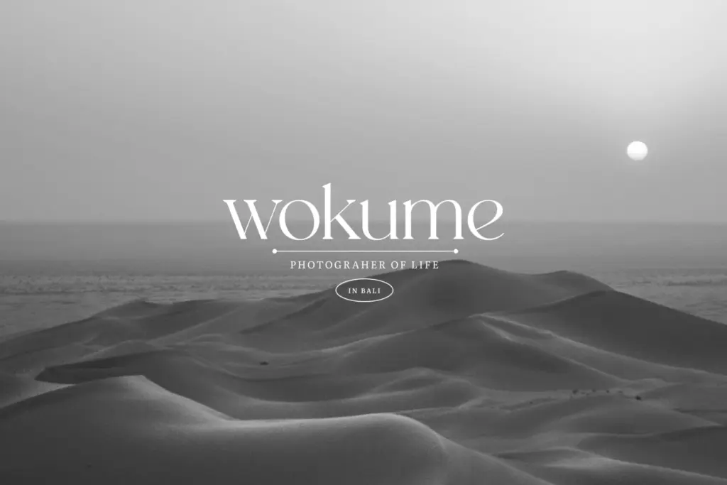
This is a font for moments, not paragraphs. Logotypes for fashion and beauty brands, magazine covers, packaging where a single elegant word carries the design, wedding stationery headlines, invitation lettering — anywhere the letterforms themselves are the visual event. The narrow proportions also make it a reasonable fit for vertical lockups on packaging or spine text on a book cover.
Where it will struggle is at small sizes. High-contrast serifs like this lose their hairlines in print at low resolution or on screens under heavy compression, so anything below display size — captions, body text, UI labels — is asking for trouble. Treat 24pt and up as the safe zone, and test at your actual output size before locking it into a layout.
For branding work, NT Fabulous is best cast as the voice of a single wordmark or headline system rather than the backbone of a full identity. Pair it with a plainer, lower-contrast typeface for supporting text, and let this one carry the moments where elegance matters more than utility.
What we liked, and what we didn’t
Strengths
- Strong thick-thin contrast gives headlines and logotypes a distinct, editorial feel
- Narrow proportions keep long titles compact without feeling cramped
- Broad claimed language support suits international branding briefs
Trade-offs
- Hairline strokes make it unreliable below display sizes, especially on screen
- No stated weight range or extended feature set, limiting it to a single display role
NT Fabulous is a confident high-contrast display serif with real presence in headlines and logotypes, but it's a single-purpose tool. Anyone expecting a full working family or small-size legibility will be disappointed.
Verdict

Tantype reviews typefaces in depth — every font is tested in real branding, editorial and screen layouts before a word gets written. 555+ fonts reviewed and counting.