
Storica: a classical roman serif built for branding and craft labels
Design style
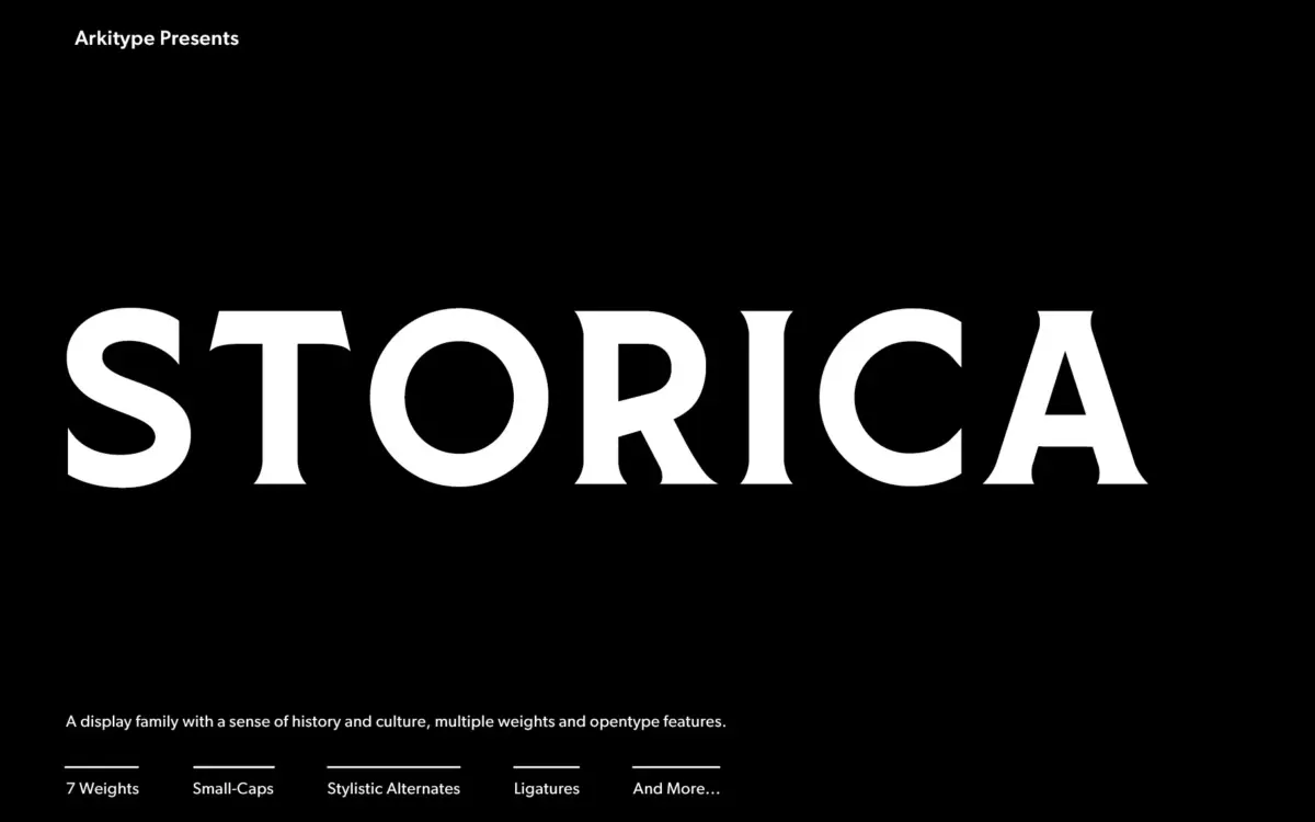
Storica leans on the proportions of classical roman lettering — the kind carved into stone rather than set in a text block. The serifs are sharp and defined, the contrast between thick and thin strokes is pronounced, and the overall structure feels monumental even at modest sizes. This is a display face first, not a workhorse text serif, and it reads that way: the letterforms want space to breathe and a headline-sized job to do.
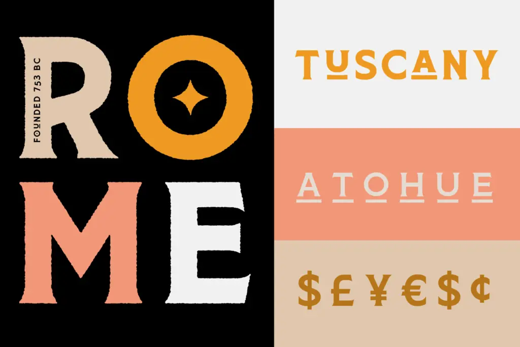
What sets it apart from a plain revival is the inclusion of Heavy Rough and Heavy Hand variants alongside five more conventional weights. The Rough cut roughens up the edges of the strokes, giving it a distressed, printed-on-old-paper feel, while the Hand version pushes further into a more irregular, crafted mark. Both are useful shorthand for the vintage-Americana look that a lot of beverage and packaging briefs ask for, without the designer having to fake wear-and-tear in Illustrator.
Character set and features
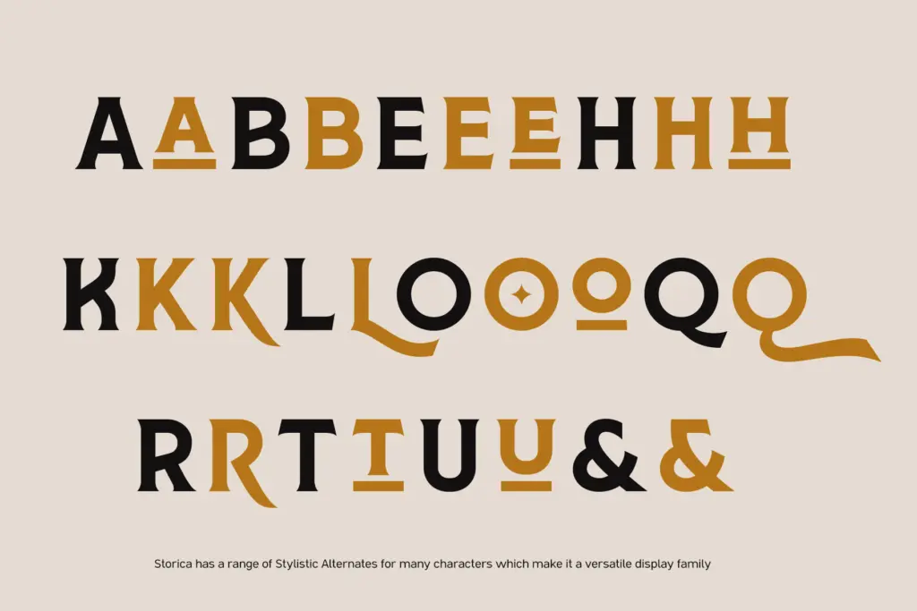
The character set is built for a designer who wants to vary the texture of a headline rather than just set it. Stylistic alternates give you options on characters that tend to define a wordmark — the R, the G, the ampersand — so you can nudge the same font in a more traditional or a more eccentric direction depending on the brief. Ligatures and old-style numerals round out the set, and small caps are included for the kind of secondary lines — taglines, dates, provenance text — that often sit under a bigger display line on a label or cover.
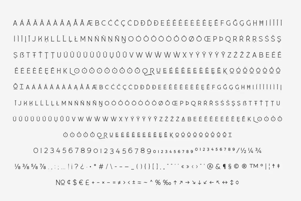
The family’s language support is broad, which matters if the branding work you’re doing needs to travel beyond a single market. None of this is unusual for a well-built display serif in this price bracket, but it’s implemented cleanly enough that switching between alternates doesn’t introduce awkward spacing or misaligned baselines, which is where a lot of ambitious OpenType sets fall down in practice.
Use cases
Storica’s most obvious home is beverage and food packaging — craft beer, whisky, small-batch anything where a brand wants to borrow authority from history. The Rough and Hand weights do a lot of the work here, giving labels a printed, artisanal quality without needing a separate texture font. It also holds up well as a book cover or book jacket face, particularly for literary fiction or nonfiction with a historical bent, and it’s a natural fit for editorial headlines and posters where a single striking display line carries the layout.
It is not a text-setting family. The contrast and the serif detail that make it compelling at 80pt will fight you at 9pt, so keep body copy in something else and reserve Storica for the line that needs to do the selling. Used that way — as a wordmark, a cover title, a headline — it does its job with conviction and without needing much dressing up.
What we liked, and what we didn’t
Strengths
- Rough and Hand weight variants add genuine textural range without extra tools
- Stylistic alternates and small caps give real flexibility for wordmarks and secondary lines
- Strong fit for beverage and packaging branding where historical weight is the goal
Trade-offs
- High contrast and sharp serifs make it unsuitable for anything below display size
- As a display-only family it needs pairing with a separate text face for longer copy
Storica is a confident display serif that does one thing well: give a wordmark or headline a sense of carved, historical authority. The Rough and Hand weights are the real differentiators here, saving the designer from faking texture elsewhere. Don't ask it to set body text, and it will reward you.
Verdict

Tantype reviews typefaces in depth — every font is tested in real branding, editorial and screen layouts before a word gets written. 555+ fonts reviewed and counting.