
Granada: an uppercase-only editorial serif with high-contrast poise
Design style
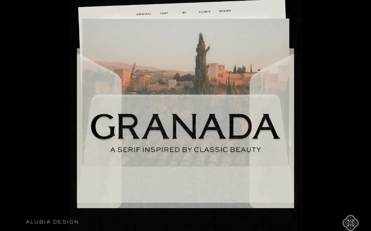
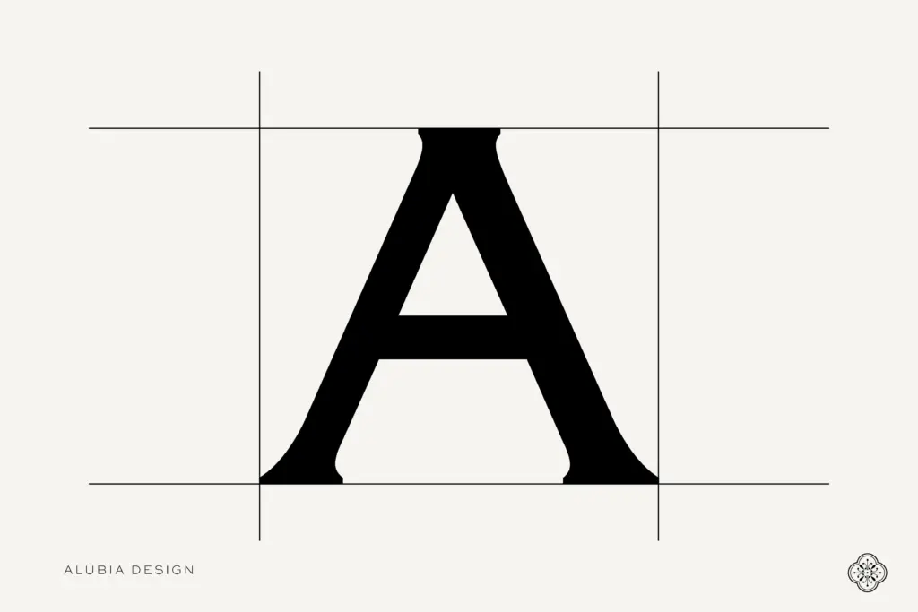
Granada is a serif built for headlines, not paragraphs, and it makes that intention obvious from the first glance. The contrast between thick and thin strokes is pronounced, closer to a modern didone than a transitional serif, and the serifs themselves are fine and slightly bracketed, which gives the letters a crisp, almost etched quality. There is a rhythm to the spacing that feels deliberate: wide-set capitals with generous side bearings, which keeps the high contrast from turning brittle at smaller display sizes.
The overall mood sits somewhere between heritage type foundry revival and current editorial fashion serif. It reads as considered rather than showy. Curves like the O and C are drawn with real tension rather than mechanical roundness, and the diagonal strokes in letters like K and R have a confident, slightly extended finish. It is a typeface that wants space around it. Cramp it into a tight column and the contrast starts to fight the eye; give it air and it looks expensive.
Character set and features
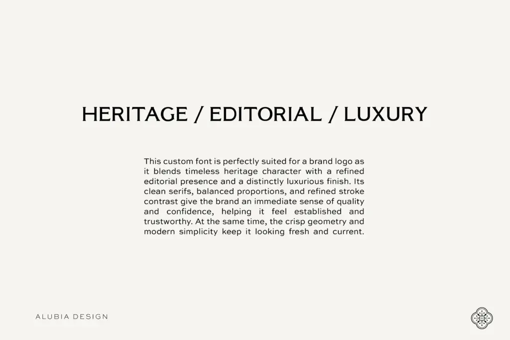
This is a single-style release: uppercase only, one weight, no italic. That is a real constraint, not a footnote. There is no lowercase companion, so anyone expecting a full text face for running copy will need to pair Granada with something else entirely. What is here is built out properly for its scope — multilingual character support, numerals, and a full punctuation set, so it can carry headlines, mastheads, and short-form copy in more than one language without falling back to a default font for accented characters.
Because there is no bold or italic, hierarchy within a Granada-only layout has to be built through size, spacing, and colour rather than weight changes. That is a limitation for anyone used to leaning on a bold cut to separate a headline from a subhead, and it means the typeface asks more of the person setting it than a full family would.
Use cases
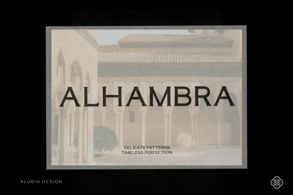
Granada’s natural home is editorial: magazine covers, section headers, pull quotes set entirely in caps, and mastheads where a single strong statement is more valuable than a paragraph of body text. The high contrast and generous tracking also suit branding work — wordmarks, packaging headlines, and luxury or lifestyle labelling where a few uppercase words need to carry the whole visual weight of a product.
It is less useful anywhere lowercase reading matter is required, which rules it out for body copy, long captions, or anything that needs a full working type system on its own. Small-size use is also a poor fit; the thin strokes thin out further and lose crispness below a certain point size, so this is a face for headline sizes and above. Treated within that scope, it does its job cleanly: a display serif for short, high-impact moments rather than a general-purpose workhorse.
What we liked, and what we didn’t
Strengths
- High-contrast strokes with fine, bracketed serifs give it a genuinely editorial, upmarket look
- Generous letter spacing keeps the contrast readable at display sizes rather than fussy
- Full multilingual, numeral and punctuation support despite the narrow single-style release
Trade-offs
- No lowercase, bold or italic means it cannot function as a complete text family on its own
- Fine strokes thin out and lose crispness below headline sizes, so it is unsuited to small text
Granada is a confident, high-contrast display serif that looks genuinely refined at headline sizes, but its uppercase-only, single-weight scope limits what it can do on its own. Buy it for short, editorial-style statements, not as a text system.
Verdict

Tantype reviews typefaces in depth — every font is tested in real branding, editorial and screen layouts before a word gets written. 555+ fonts reviewed and counting.