Serif
3.9
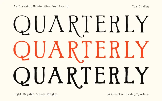
Quarterly: a hand-drawn serif with weight and a bit of mischief
Design style Quarterly sits at the intersection of hand lettering and serif structure, and it wears that tension well. The…
 Tantype

Design style Quarterly sits at the intersection of hand lettering and serif structure, and it wears that tension well. The…
Tantype
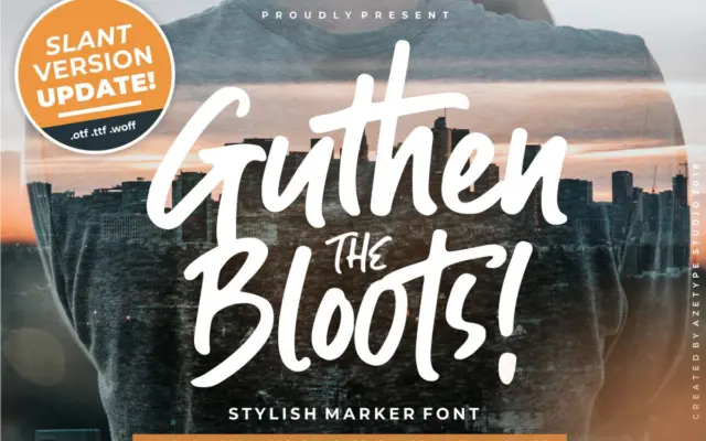
Design style Guthen Bloots sits in the thick-marker school of script lettering — the kind that looks like it was…
Tantype
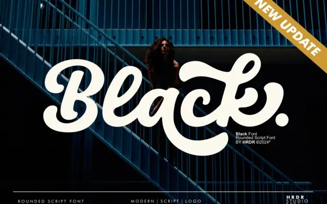
Design style Black is a heavy, rounded script that leans into thickness rather than the usual script contrast between thin…
Tantype
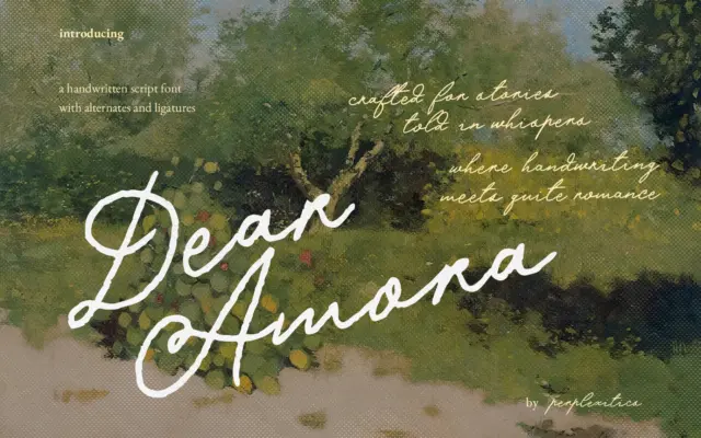
Design style Dear Amora sits in the crowded field of romantic, low-contrast handwritten scripts built for invitations and journaling. The…
Tantype
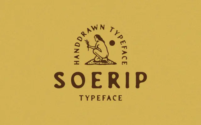
Design style Soerip takes its cue from London street life in 1877, and it reads like the kind of lettering…
Tantype
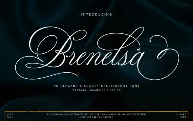
Design style Brenelsa sits in the well-populated field of connected calligraphy scripts, the kind built around a monoline-leaning pen but…
Tantype
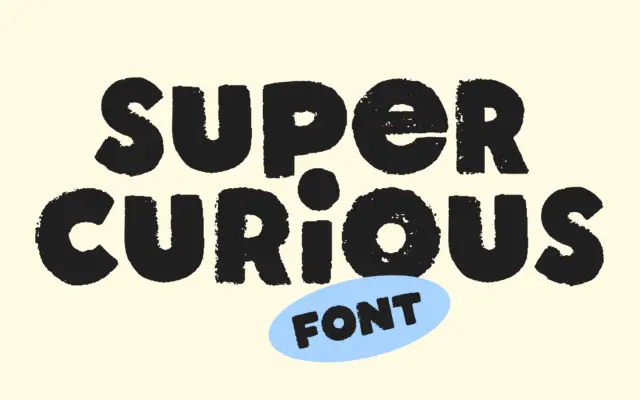
Design style Super Curious sits at the crossroads of hand-lettering and old print work. The letters are unicase, meaning there…
Tantype
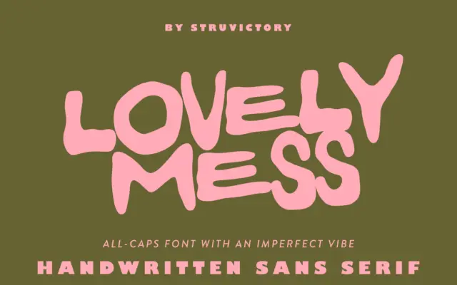
Design style Lovely Mess is an all-caps, hand-drawn sans built on a loose, wobbly skeleton. Strokes vary in thickness within…
Tantype
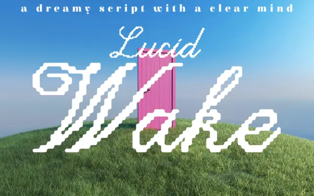
Design style Lucid Wake sits at an odd but interesting junction: a handwritten script drawn with a pixel-conscious hand. The…
Tantype