
Lovely Mess: a hand-drawn all-caps sans for scrappy, Gen Z-facing branding
Design style
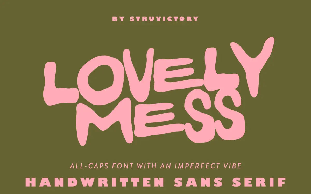
Lovely Mess is an all-caps, hand-drawn sans built on a loose, wobbly skeleton. Strokes vary in thickness within the same letter, baselines drift, and corners round off unevenly, as if drawn quickly with a thick marker and left uncorrected. That’s the point: nothing here is meant to look plotted or vectorised into submission. The letterforms keep the gestures of the hand, including the small hesitations and overshoots you’d expect from real lettering rather than a font built to imitate it convincingly.
It sits closer to graffiti-adjacent street lettering than to classic script or brush families. There’s no attempt at rhythm or repeatable structure between letters — each character seems to have its own personality, its own slight lean, its own weight. That inconsistency is a style choice, and it reads as intentional rather than sloppy, but it does mean the face has one mood and one mood only. There’s no restrained version of Lovely Mess.
Character set and features
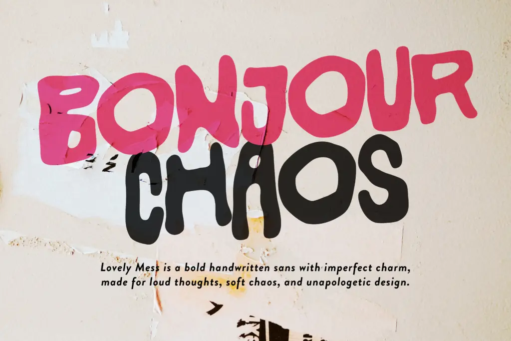
The set covers the standard Latin character range, with support described as covering popular Latin-based languages, so accented characters for major European markets are likely included, though it’s worth checking your specific diacritics in a preview before committing. Being all-caps, there’s no lowercase to worry about matching in weight or width, which simplifies things, but also means every application defaults to a shouty, poster-style register. Numerals and basic punctuation appear to follow the same rough-edged treatment as the letters, keeping the set visually consistent even if it’s consistently uneven.
Because the forms are irregular by design, kerning and spacing take on outsized importance. Words set in Lovely Mess need generous letter-spacing and careful line management to avoid collisions between adjacent strokes that jut out further than expected. This isn’t a plug-and-play body font — it needs a hands-on approach every time it’s used, checking each word for awkward overlaps rather than trusting default settings.
Use cases
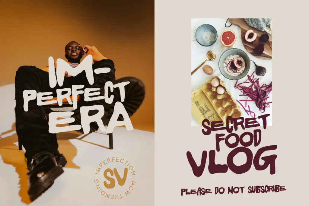
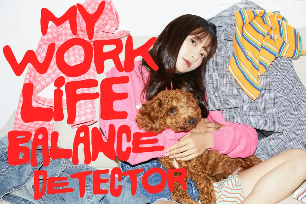
This is a font for short bursts of text: a logotype, a poster headline, a single line on packaging, a sticker, a T-shirt print. It’s suited to brands leaning into an unpolished, DIY aesthetic — streetwear, youth-culture campaigns, indie zines, cafés or products aiming for a hand-lettered, personal feel rather than a corporate one. The seller’s mention of a Gen Z audience is fair; the texture and irregularity read as deliberately anti-slick, which lands well with audiences fatigued by overly refined branding.
It’s a poor fit for anything requiring sustained reading, formal tone, or multilingual body copy at small sizes — the irregularity that gives it character becomes a legibility tax past a few words. Treat it as a flavour typeface: strong in short, high-impact placements, and best paired with a plain, quiet sans or serif for any supporting text so the chaos stays confined to where it’s wanted.
What we liked, and what we didn’t
Strengths
- The irregular, hand-drawn strokes feel genuinely gestural rather than digitally faked
- Strong fit for streetwear, zine, and DIY-branding aesthetics aimed at younger audiences
- All-caps consistency keeps the chaotic style from feeling arbitrary
Trade-offs
- Legibility drops fast beyond short headlines or single words
- Requires manual kerning and spacing checks on nearly every use due to irregular letter widths
Lovely Mess is a confident, single-mood display font that nails a scrappy, hand-drawn feel for short bursts of text. It's not built for reading at length or for polished, formal work, and it demands manual spacing attention every time it's used, but for logos, posters and packaging aimed at a youth-culture audience it does its job with personality.
Verdict

Tantype reviews typefaces in depth — every font is tested in real branding, editorial and screen layouts before a word gets written. 555+ fonts reviewed and counting.