
Gerald and Margaret: A Loose, Warm Script for Casual Branding Work
Design style
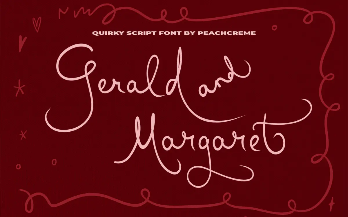
Gerald and Margaret sits in the casual end of the script spectrum, closer to a quick handwritten note than to formal calligraphy. The strokes have some flow and connection between letters, but the baseline wobbles a bit and the joins aren’t perfectly smooth — which reads as intentional here rather than sloppy. Letters lean slightly, x-height is generous for a script, and the overall feel is friendly rather than polished. It doesn’t try to look like it came from a pointed pen; it looks like it came from a felt-tip marker held by someone with good handwriting and no interest in being precious about it.
The charm is real but it’s a specific kind of charm. This isn’t a script for anything that needs to look expensive or restrained. It’s built for warmth, and it delivers that consistently, but the drawing doesn’t have the tension or contrast you’d get from a more disciplined calligraphic script. Strokes stay fairly even in weight throughout, so there’s less of that thick-thin rhythm that gives scripts their sense of movement. What you get instead is consistency and approachability.
Character set and features
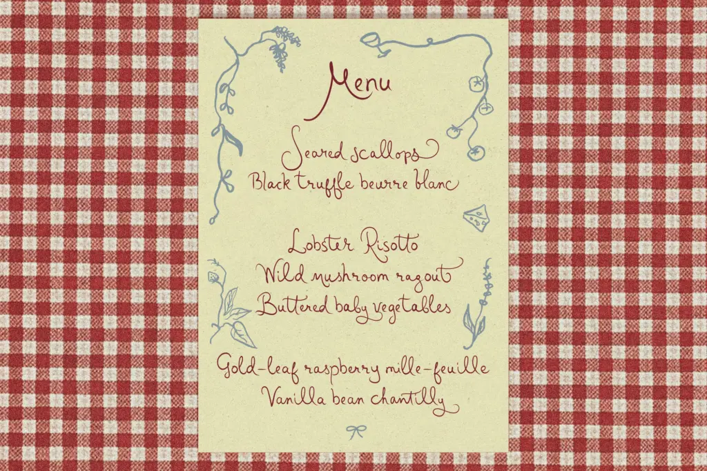
The font includes alternate letters and ligatures, though the seller is upfront that coverage is uneven — some letters have multiple alternates, others have none, and you’re meant to check the reference images rather than assume every glyph has options. That’s a fair way to describe it, and it’s worth taking seriously before you commit to a layout that depends on swapping in alternates for variety. In practice this means the font rewards a bit of manual assembly: setting a word, then hunting through the alternate set to see what actually improves it, rather than expecting an OpenType-savvy layout program to cycle through contextual alternates automatically.
The ligatures do their job of smoothing over awkward letter pairs and adding some of that handwritten continuity scripts rely on to feel authentic. But because not every combination is covered, longer passages of text can start to show repetition in letterforms that don’t have alternates. This is a font best used in short bursts — a name, a word, a line of text — where you can hand-pick which characters to swap and control the outcome, rather than setting paragraphs and trusting the font to vary itself.
Use cases
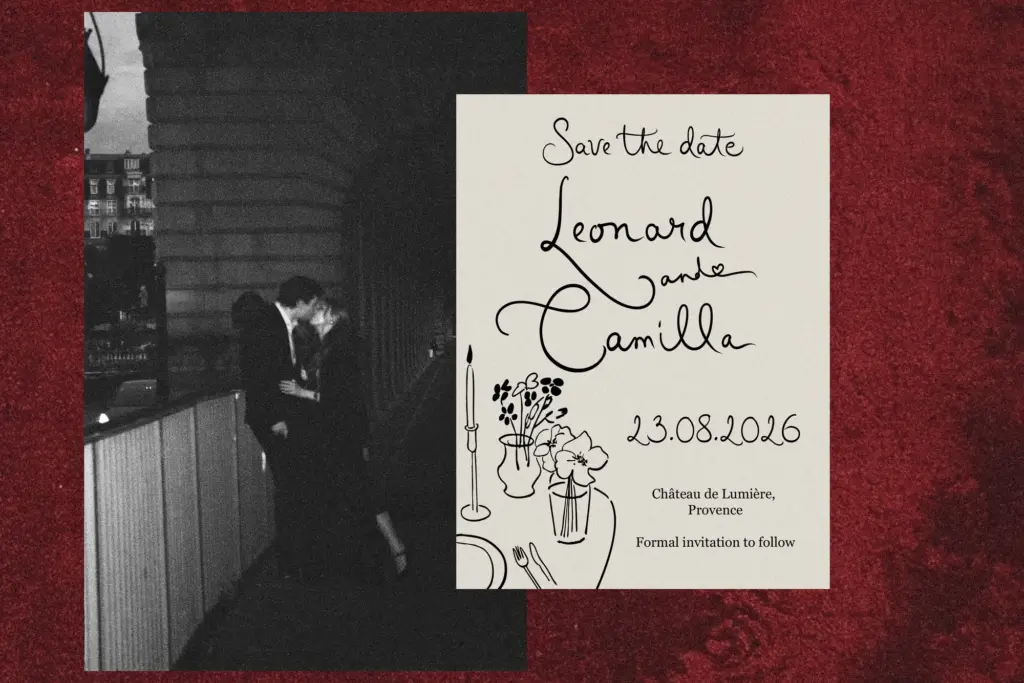
This is a script built for identity work with a personal, unfussy tone: hand-lettered-style logotypes, boutique packaging, invitation lettering for casual events, social posts that need a bit of handwritten texture. It works well as a display element paired with a plain sans or serif for body copy, since it’s not meant to carry long text itself.
It’s less suited to anything that needs formality — weddings with a black-tie dress code, luxury packaging, editorial mastheads looking for gravitas. The looseness that makes it likeable also makes it read as informal no matter how it’s set. If your brand voice is warm, small-scale, and a little playful, this earns its place in the toolkit. If you need elegance or restraint, look elsewhere.

What we liked, and what we didn’t
Strengths
- Warm, unforced handwritten character that reads as genuine rather than manufactured
- Generous x-height keeps short words legible at display sizes
- Ligatures smooth over awkward joins and add authentic handwritten texture
Trade-offs
- Alternate letter coverage is inconsistent, so longer text can look repetitive
- Even stroke weight means it lacks the contrast and movement of more calligraphic scripts
Gerald and Margaret is a friendly, loosely drawn script suited to short-form branding, packaging, and invitation work. Its charm is genuine but narrow — the uneven alternate coverage and informal tone limit it to casual applications rather than anything polished or text-heavy.
Verdict

Tantype reviews typefaces in depth — every font is tested in real branding, editorial and screen layouts before a word gets written. 555+ fonts reviewed and counting.