
Lucid Wake: a pixel-textured script for soft, dreamy branding work
Design style
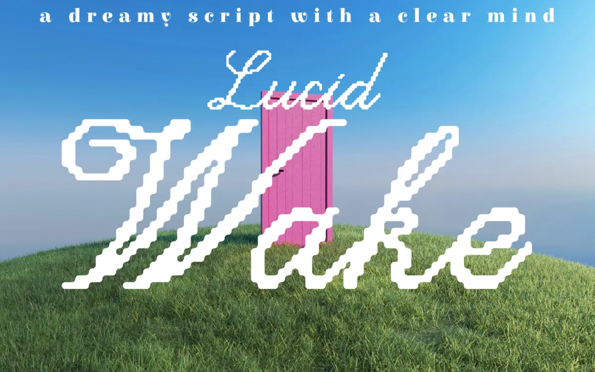
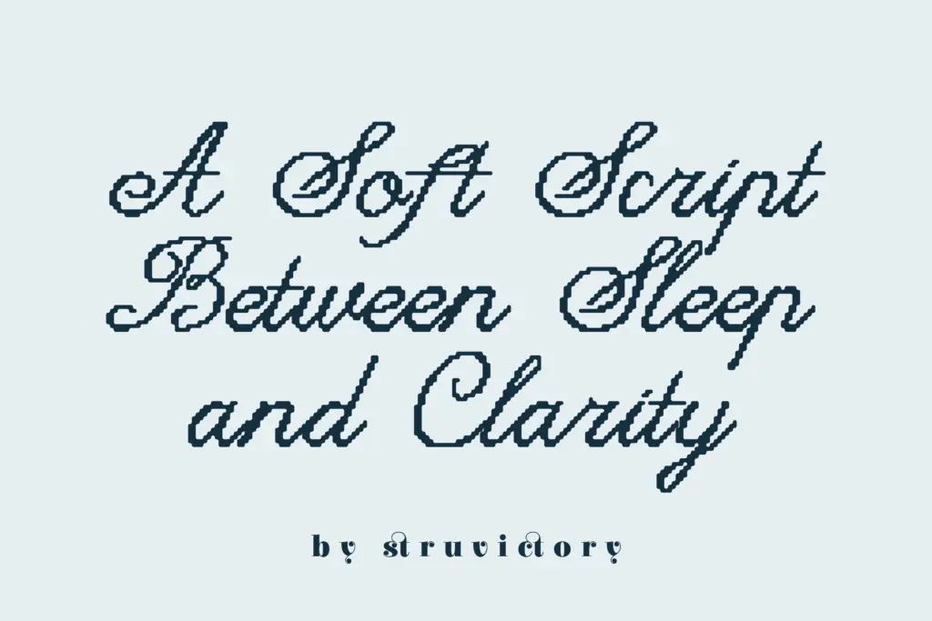
Lucid Wake sits at an odd but interesting junction: a handwritten script drawn with a pixel-conscious hand. The strokes have the loose, connected rhythm of casual calligraphy, but the edges carry a faint stepped or gridded quality rather than a smooth brush taper. It reads less like a font trying to look digital for effect and more like someone drew a script and let the pixel logic show through in the finish of each curve.
The letter shapes themselves are calm. There’s no aggressive slant, no exaggerated swash energy. Ascenders and descenders loop gently rather than flourish, and the baseline holds a fairly even, unhurried pace. This restraint is the font’s real design decision — it could have leaned harder into either the ‘pixel’ novelty or the ‘dreamy script’ softness, and instead it splits the difference, favouring quiet over spectacle.
Where it loses a bit of conviction is in the ambiguity of that split. At larger sizes the pixel texture is charming and specific, a small textural signature that separates it from the dozens of generic soft scripts on the market. At smaller sizes, that same texture reads as slight roughness rather than intentional grain, and some of the personality flattens out.
Character set and features
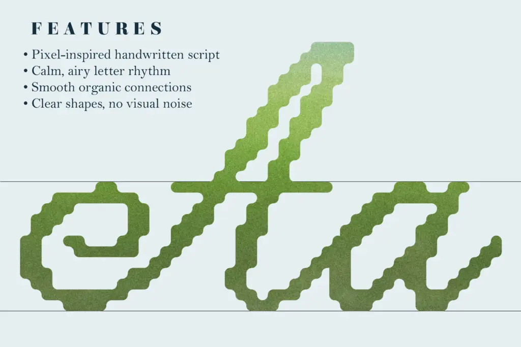
The joins between letters are close and even, which keeps words looking like single gestures rather than a string of disconnected marks — important for a script that wants to feel handwritten rather than assembled. Letterspacing has been kept tight by default, which suits the calm mood but means longer headlines need a manual nudge to avoid the loops crowding each other.
Curves and terminals are consistently rounded, with no sharp entry or exit strokes, reinforcing the ‘gentle’ character the designer describes. There’s no visible attempt at extreme contrast between thick and thin strokes, so the script stays legible even where flourishes might otherwise obscure a letter’s structure. This is a font built for mood over drama, and the glyph construction backs that up.
Without confirmed figures on language coverage or alternate character sets in the brief, it’s safest to say the font behaves as a standard script build: reliable for short-form Latin text, with the pixel detailing consistent across the alphabet rather than isolated to a few showpiece letters.
Use cases
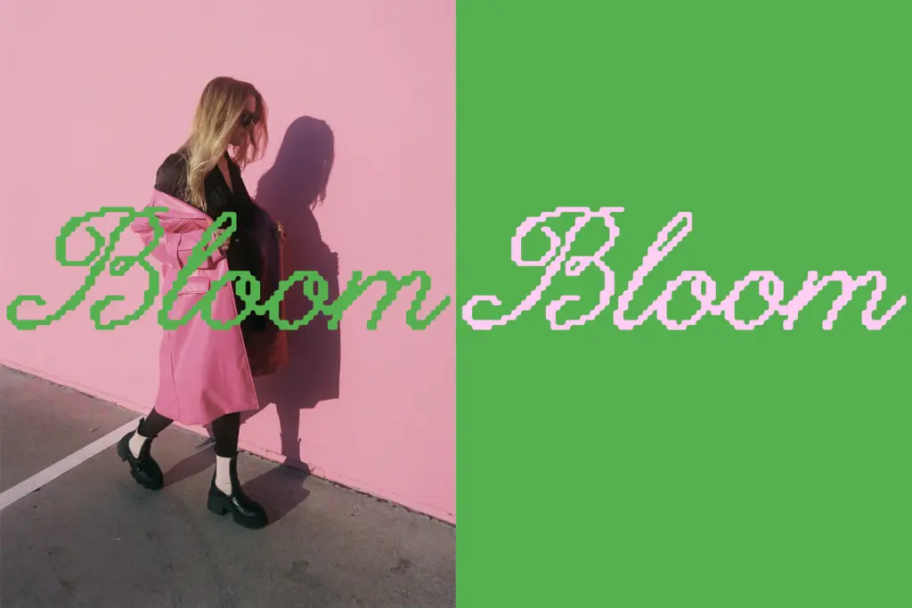
Lucid Wake is best suited to work where a few words carry emotional weight rather than paragraphs of copy — book covers, editorial pull-quotes, poster headlines, packaging labels for softer, more contemplative brands. Its calm rhythm makes it a good fit for anything positioning itself as reflective or slightly nostalgic without going fully vintage.
It’s less useful as a workhorse text face. Body copy, long taglines, or dense layouts will expose the tight spacing and the textural softness that reads better as a headline gesture than as sustained reading. Treat it as a mood-setting display script, used sparingly against plenty of negative space, and it does its job well.
What we liked, and what we didn’t
Strengths
- The subtle pixel texture gives an otherwise soft script a distinct visual signature.
- Rounded, even terminals keep the letterforms calm and legible rather than fussy.
- Tight, consistent joins make short words read as single confident gestures.
Trade-offs
- Default letterspacing is tight enough that longer headlines need manual adjustment.
- The pixel texture that reads as charming at large sizes can look like unintended roughness when scaled down.
Lucid Wake is a quietly distinctive script that uses a light pixel texture to set itself apart from generic dreamy-script fonts. It works well as a headline or cover typeface but isn't built for sustained reading or dense layouts.
Verdict

Tantype reviews typefaces in depth — every font is tested in real branding, editorial and screen layouts before a word gets written. 555+ fonts reviewed and counting.