
Pink Queen: a soft romantic script for wedding and boutique branding
Design style
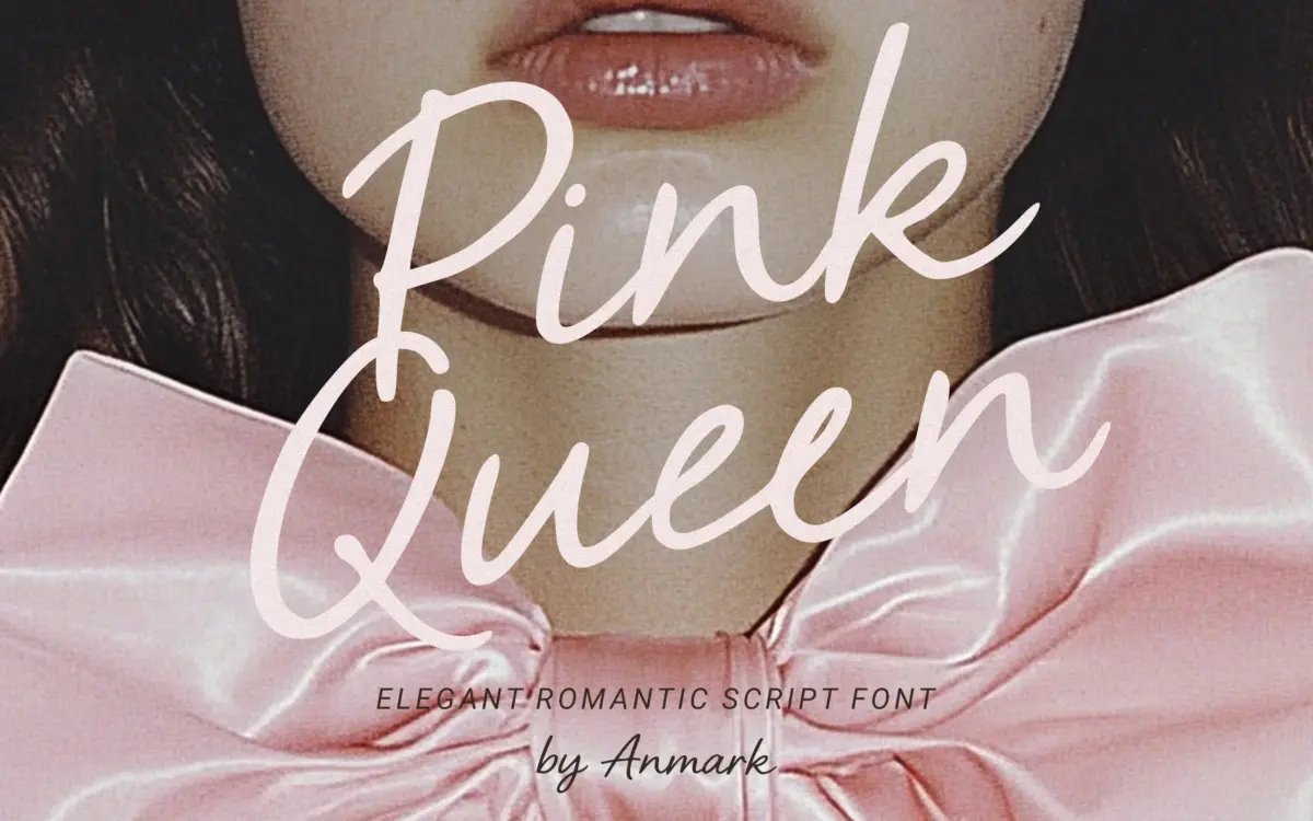
Pink Queen belongs to the crowded family of soft, low-contrast romantic scripts built to read as handwriting rather than as formal calligraphy. The strokes are fairly uniform in weight, with only gentle thickening at the joins, and the baseline dips and rises slightly from letter to letter, which is what gives it its handwritten claim. The slant is moderate rather than steep, and the x-height sits on the taller side for a script, so words don’t feel as cramped as some of the tighter bridal scripts on the market.
What separates a decent script from a forgettable one is usually the connections, and Pink Queen mostly gets these right. Entry and exit strokes are drawn so that consecutive letters flow without obvious pasted-together seams, though a handful of combinations — anything with a round letter followed by a tall ascender — show a slightly abrupt handoff if you look closely at large sizes. It’s not a deal-breaker, but it means this is a font you should proof letter-by-letter before locking in a headline word, not one you can type and trust blind.
Character set and features
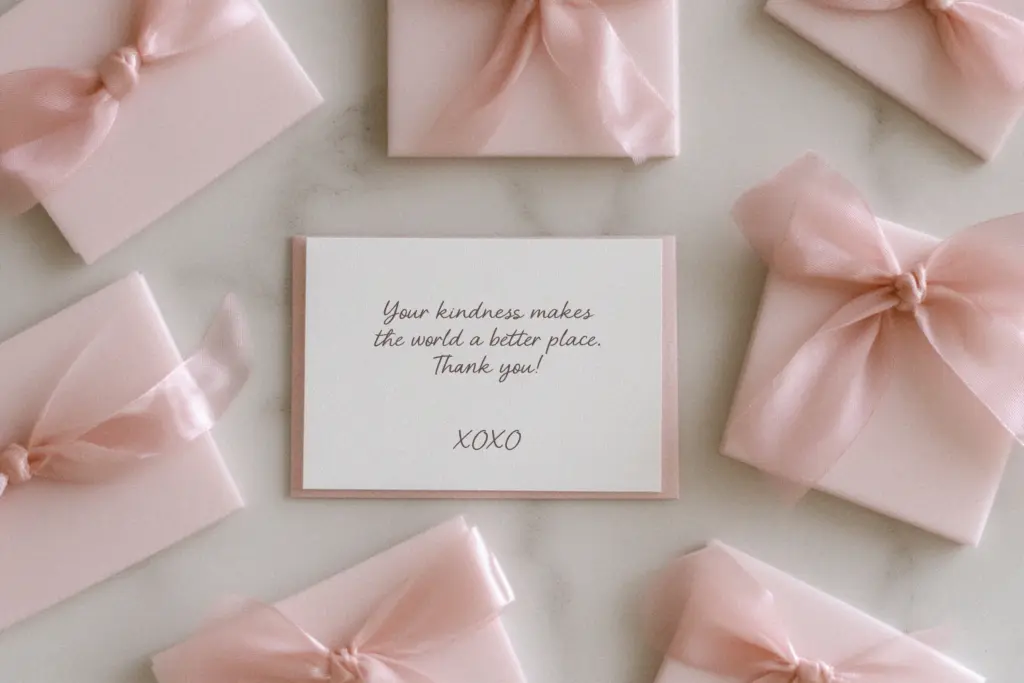
The font includes ligatures, which is standard for the category now but still worth noting because they’re what stop repeated letter pairs from looking mechanically identical. Used well, they’re the difference between a script that reads as written and one that reads as typed-in-cursive. The seller also claims multilingual support, which broadens the font’s usefulness beyond English-only projects, though as with any script, extended characters and accents are worth checking against your specific language before you commit a layout to them.
There’s no indication of multiple weights or a companion sans in this release, so what you get is a single voice: soft, feminine, unhurried. That’s fine for its intended niche, but it means you’ll need to supply your own contrast — a plain sans or serif for body copy, sourced elsewhere — because Pink Queen is not built to do the heavy lifting of running text. Nor should it try; scripts like this lose their charm and their legibility fast below headline size.
Use cases
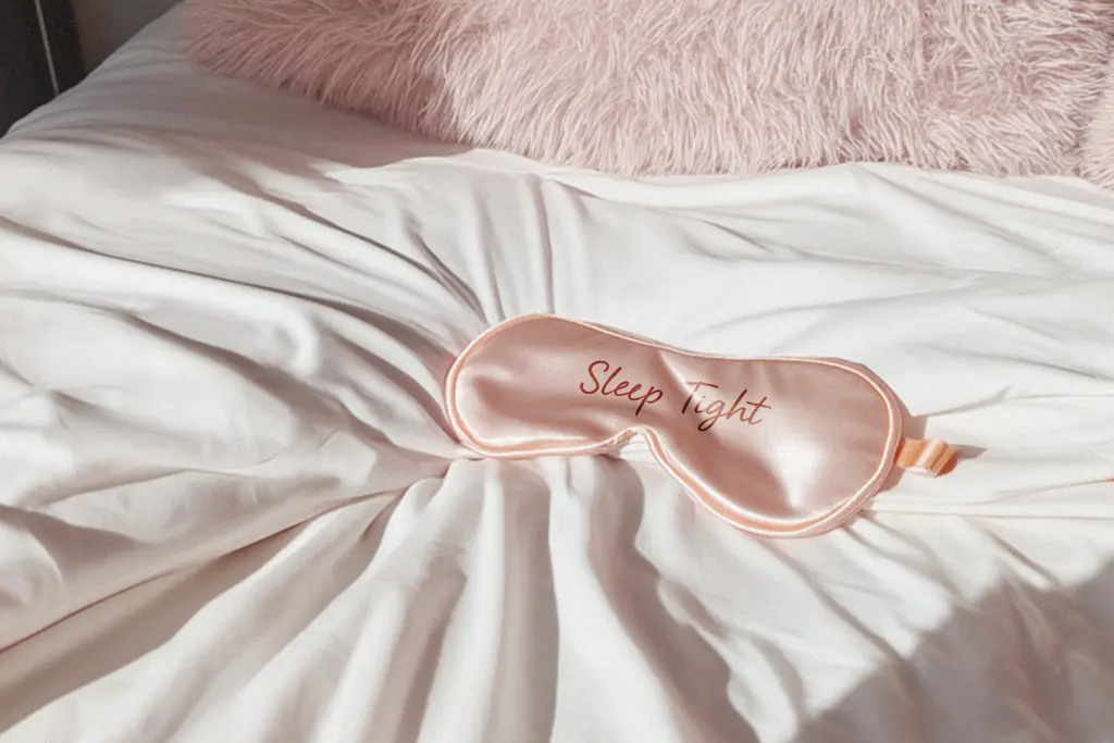
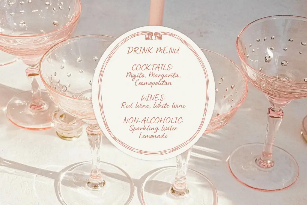
This is a font for the moment in a design where you want warmth rather than authority: the bride and groom’s names on an invitation, a boutique’s logotype, a
What we liked, and what we didn’t
Strengths
- Ligatures smooth over repeated letter pairs so words don't look stamped together.
- Moderate slant and taller x-height keep it more legible than tighter, steeper bridal scripts.
- Multilingual support extends its use beyond English-only projects.
Trade-offs
- A handful of letter combinations show slightly abrupt joins at large display sizes.
- Single weight, single style — you'll need to source a separate typeface for body copy or contrast.
Pink Queen is a competent, softly feminine script that does its intended job — wedding names, boutique logotypes, packaging accents — without trying to be anything more ambitious. It won't surprise anyone who has looked at romantic scripts before, but the joins are handled with enough care that it holds up at display sizes.
Verdict

Tantype reviews typefaces in depth — every font is tested in real branding, editorial and screen layouts before a word gets written. 555+ fonts reviewed and counting.