
Guthen Bloots: a marker-style script for quotes, packaging and casual branding
Design style
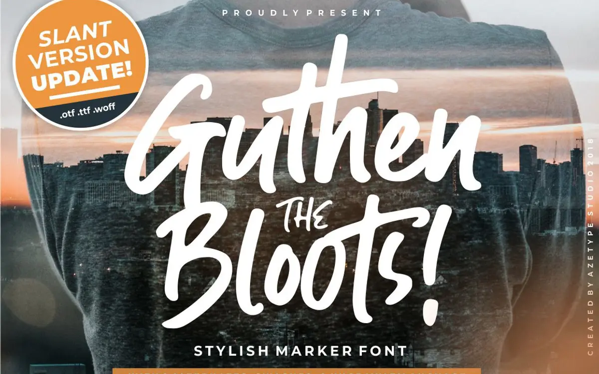
Guthen Bloots sits in the thick-marker school of script lettering — the kind that looks like it was drawn with a chisel-tip pen rather than a brush or a pointed nib. Strokes are heavy and fairly consistent in width, with only mild contrast between thick and thin, which gives the face a blunt, confident weight on the page rather than the flourish-driven elegance of a copperplate script. Letters lean slightly forward and connect loosely, more like fast handwriting than formal calligraphy.
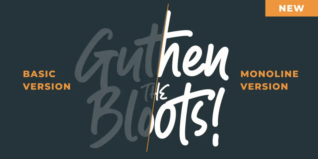
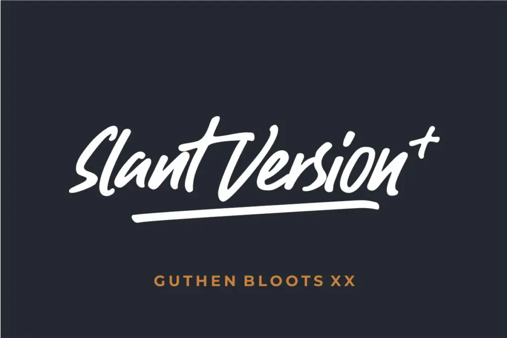
The updates add range: a monoline version strips out the marker texture for a cleaner, more even line, and a slant version tilts the whole system further into casual, energetic territory. That gives buyers three distinct moods from one skeleton, which is more useful than it sounds — the base weight reads as friendly and a bit rough, the monoline reads as tidier and more contemporary, and the slant pushes toward youthful and loud.
Character set and features
The alternates are the real workhorses here. Rather than one fixed shape per letter, Guthen Bloots offers stylistic swaps so a word can be rebuilt letter by letter until the spacing and rhythm look intentional rather than automated — a common weakness in marker scripts, where repeated letters can start to look mechanically identical. A handful of ligatures (th, tt, ck, ff, xi) smooth over awkward joins in common combinations, which matters more in a script this loose, since without them certain pairs can look disconnected rather than deliberately spaced.
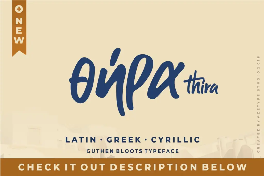
The Latin-Greek-Cyrillic version extends the family beyond a single-language product, which is a genuine point of difference in a category where most scripts ship Latin-only. Whether the Greek and Cyrillic sets carry the same personality as the Latin — same weight, same looseness — isn’t something the brief confirms, so treat that expansion as a bonus rather than a guarantee of equal polish.
Where the set is thinner is punctuation and numerals; marker scripts like this tend to treat them as an afterthought, and buyers doing anything numeral-heavy (pricing, dates, invitations with details) should check those glyphs before committing to a layout.
Use cases
This is a font for short bursts of text, not paragraphs. A quote card, a logotype, a t-shirt graphic, a jar label — anywhere the type is the design rather than a vehicle for reading long copy. The marker texture and the alternates work hardest at display sizes, where the individual strokes and swashes have room to be seen; shrink it down and the looseness that makes it charming starts to blur.
Packaging and personal branding are sensible fits, especially where a brand wants a handwritten, unpolished signature rather than a slick script. The slant version suits anything aimed at a younger or more casual audience — event graphics, social posts — while the monoline version is the one to reach for if the brand needs restraint, since it drops the marker grain in favour of a cleaner line. Wedding work is possible but not the obvious lane; this reads more workshop than formal.
What we liked, and what we didn’t
Strengths
- Stylistic alternates let you rebuild repeated letters so words don't look mechanically stamped
- Ligatures for common pairs (th, tt, ck, ff, xi) smooth over awkward joins typical of marker scripts
- Monoline and slant versions offer three distinct moods from one base design
Trade-offs
- Loose joins and even stroke weight mean it loses definition fast at small sizes
- Punctuation and numeral support isn't confirmed to match the care given to the alphabet
Guthen Bloots is a solid, workmanlike marker script that earns its keep through alternates and ligatures rather than raw novelty. It won't surprise anyone who's used a similar face before, but the monoline and slant variants give it more range than most single-mood scripts in this category.
Verdict

Tantype reviews typefaces in depth — every font is tested in real branding, editorial and screen layouts before a word gets written. 555+ fonts reviewed and counting.