
Dear Amora: a soft connecting script for wedding and stationery work
Design style
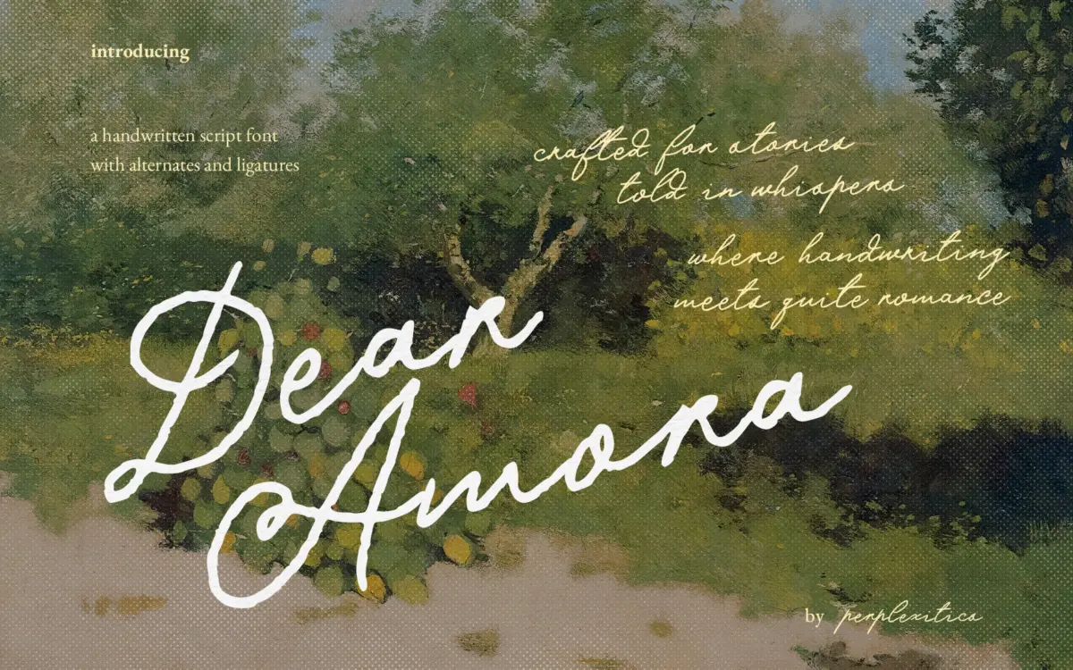
Dear Amora sits in the crowded field of romantic, low-contrast handwritten scripts built for invitations and journaling. The strokes are narrow and fairly even in weight, with a light pressure change rather than dramatic swelling, which gives it a pencil-and-ink feel rather than the broad-nib look of formal calligraphy. Letters lean gently and connect through the baseline, so words read as continuous strands rather than a chain of separate glyphs. The x-height is generous for a script of this kind, which keeps it from collapsing into illegibility at small sizes, though it also means the ascenders and descenders don’t get much room to flourish.
Nothing here is aggressively decorative. The curves are round rather than angular, the loops are modest, and the overall mood is closer to a handwritten note than a wedding monogram. That restraint is the font’s identity: it reads as sincere and a little understated, not showy.
Character set and features
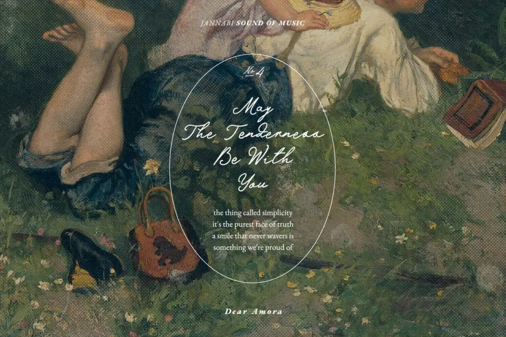
The set covers uppercase and lowercase, numerals, punctuation, alternate letterforms, and ligatures, with the connecting glyphs doing the actual work of making the script look continuous. The alternates are useful for breaking up repeated letters in a word or softening awkward joins, though as with most scripts of this type, getting the best results means working letter by letter in OpenType-aware software rather than trusting autocorrect-style typing. The seller’s extended Latin character list covers a broad range of accented characters, which is worth noting for anyone setting text beyond English, though how well the ligatures behave across those extra characters isn’t something a spec sheet can confirm.
There’s a single weight, delivered in both OTF and TTF. That’s typical for a script at this price point, but it does mean there’s no built-in way to shift emphasis within a layout — italics, bold, or a companion sans have to come from elsewhere.
Use cases
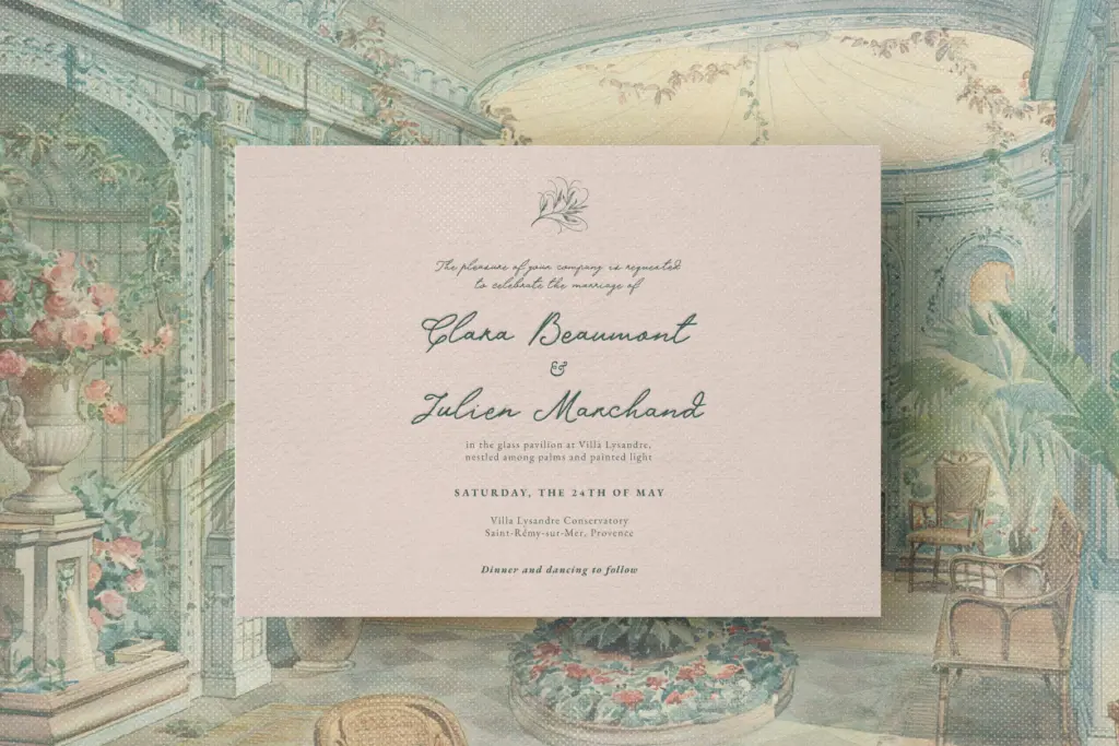
This is a font for short, emotionally loaded lines: a couple’s names on a save-the-date, a line of vows, a monogram, a journal cover, a product label that wants to feel handwritten and personal. It handles single words and short phrases well, where the connecting strokes and alternates can be tuned by eye. It’s less suited to long-form text — paragraph-length copy in a script this connected gets tiring to read and starts to lose the letterforms in the joins.
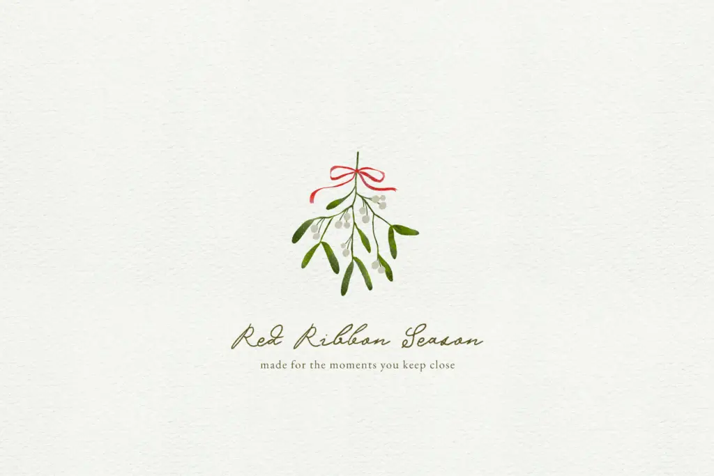
For branding, it works best as an accent rather than a workhorse: a signature-style logotype, a tagline, a card insert. Because the weight is fixed and the contrast is low, it holds up reasonably well at small sizes on packaging or stationery, though very fine details in the alternates may soften when printed small or engraved. Anyone building a full identity system will need to pair it with a separate sans or serif for body copy, since Dear Amora isn’t built to carry that load itself.
What we liked, and what we didn’t
Strengths
- Even, low-contrast strokes keep it legible at small sizes for a connecting script.
- Alternates and ligatures give real control over repeated letters and awkward joins.
- Extended Latin character support suits multilingual stationery work.
Trade-offs
- Single weight with no italic or bold means no built-in hierarchy for layouts.
- Loses clarity in longer passages, so it's best kept to short lines rather than paragraphs.
Dear Amora is a competent, quietly romantic script that does one job well: short, sincere lines on stationery and invitations. It isn't distinctive enough to anchor a full brand system on its own, and it needs a companion typeface for anything longer than a phrase.
Verdict

Tantype reviews typefaces in depth — every font is tested in real branding, editorial and screen layouts before a word gets written. 555+ fonts reviewed and counting.