Serif
3.9
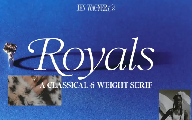
Royals Serif: a soft, editorial serif family for headers and quotes
Design style Royals Serif sits in that well-populated but still useful territory between classic serif and editorial display face. The…
 Tantype

Design style Royals Serif sits in that well-populated but still useful territory between classic serif and editorial display face. The…
Tantype
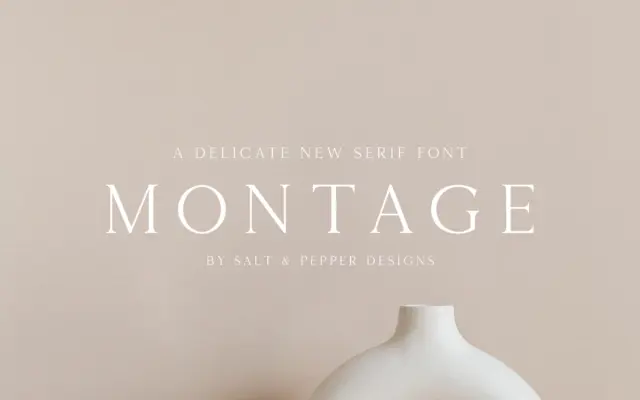
Design style Montage Serif sits in familiar territory for a formal text serif: moderate contrast, restrained bracketed serifs, and a…
Tantype
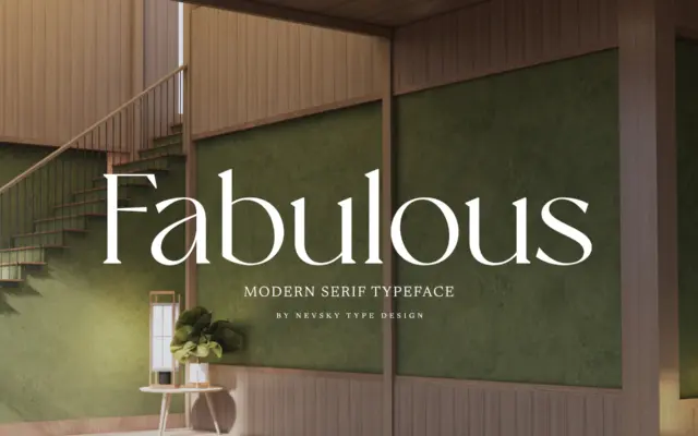
Design style NT Fabulous belongs to the family of high-contrast serifs that draw on the didone tradition without fully committing…
Tantype
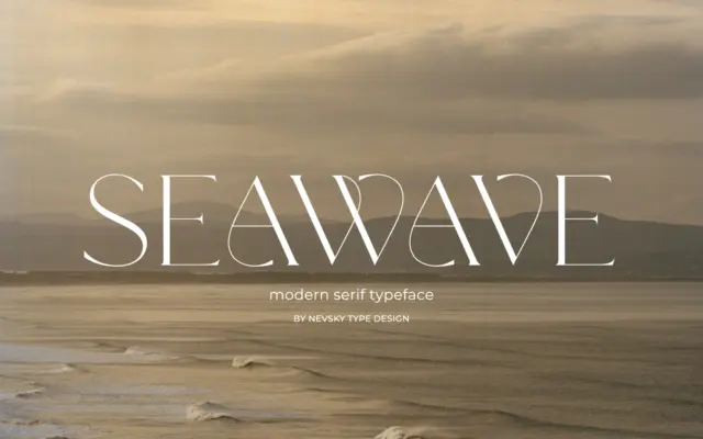
Design style NT Seawave sits in the modern serif tradition: sharp contrast between thick and thin strokes, unbracketed or minimally…
Tantype
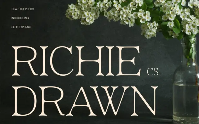
Design style CS Richie Drawn sits in that increasingly crowded corner of the market where a minimalist modern serif is…
Tantype
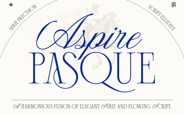
Design style Aspire Pasque pairs two fonts built to sit on the same page without competing for attention. The script…
Tantype
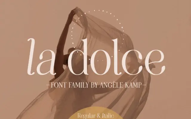
Design style La Dolce sits in the modern serif camp that has become a staple of feminine branding: moderate stroke…
Tantype
Design style TAN-SUNSET sits in serif territory but leans hard into personality rather than restraint. The strokes carry noticeable contrast,…
Tantype
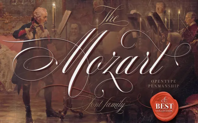
Design style The Mozart Script sits in the penmanship tradition — Spencerian and copperplate-adjacent letterforms with a formal backbone but…
Tantype