
Royals Serif: a soft, editorial serif family for headers and quotes

Design style
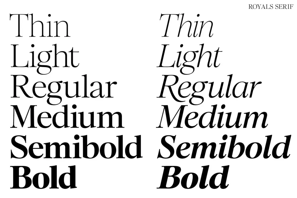
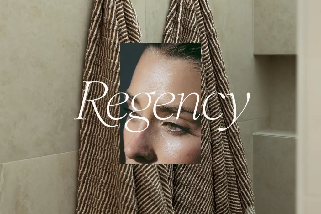
Royals Serif sits in that well-populated but still useful territory between classic serif and editorial display face. The cap serifs are rounded rather than bracketed sharp, which softens the whole family and keeps it from reading as stiff or institutional. Curves in the lowercase are organic rather than mechanical — bowls breathe a little unevenly, in the way that reads as drawn rather than plotted. The italics carry most of the romance the seller promises: soft entry strokes, a gentle slant, and swash capitals on select letters (B, D, E, F, K, P, R) that push the family toward invitation and editorial work without tipping into full calligraphic script.
Six weights, from thin to bold, each with a matching italic, is a reasonable spread for a serif family pitched at headline use. The thin and light weights are clearly built for large sizes — hairline strokes disappear at anything modest — while medium through bold carry enough stroke contrast to hold up as short-copy text. This is a display-leaning serif dressed in text-family clothing, and it is honest about which end of that spectrum it favours.
Character set and features
The set covers numbers, punctuation, and Latin language support, which is the baseline expected of a family sold as multilingual-friendly rather than a genuine claim of broad script coverage. The swash alternates are the more interesting feature here: they’re limited to a handful of capitals rather than a full alternate set, which keeps them from feeling gimmicky but also means you can’t lean on them for every word.
The inclusion of Canva-friendly kerning alternates for troublesome pairs like VA and Aw is a practical touch that acknowledges where a lot of buyers of a font like this actually work. It’s a small thing, but it saves the fiddly manual kerning that thin serifs especially tend to need at large display sizes. Ligatures are present but modest in scope, more finishing touch than feature set.
Use cases
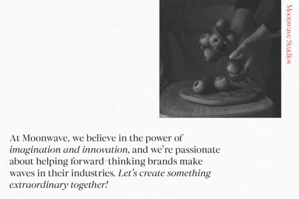
This is a font built for moments, not paragraphs. Large-scale headers, pull quotes, a single line on a wedding invitation, a logotype for a boutique or beauty brand — anywhere the letterforms get room to be looked at rather than read quickly. The thin and light weights in particular need generous size and negative space; drop them into a dense paragraph or a small caption and the delicacy that makes them appealing at 80pt turns to visual noise at 10pt.
The heavier weights are more forgiving and could plausibly carry short subheads or product labelling, but this isn’t a family built to compete as a body-text workhorse. Treat it as a display and accent serif — the kind of typeface you reach for on a title slide, a quote graphic, or packaging where the brand name itself is the design element — and it does that job with some genuine character rather than the generic elegance so many serif families settle for.
What we liked, and what we didn’t
Strengths
- Rounded cap serifs and organic curves give it more personality than a generic elegant serif
- Swash alternates on select capitals add flourish without overcomplicating the set
- Canva-friendly kerning pairs are a genuinely practical inclusion for casual users
Trade-offs
- Thin and light weights lose legibility quickly below large display sizes
- Alternate and ligature coverage is modest, limiting how far the romantic styling can be pushed
Royals Serif is a competent romantic display serif that knows its lane: headlines, quotes, and short branding moments rather than paragraphs. The swash alternates and Canva-friendly kerning are practical, useful additions, but the thinner weights are fragile below display sizes.
Verdict

Tantype reviews typefaces in depth — every font is tested in real branding, editorial and screen layouts before a word gets written. 555+ fonts reviewed and counting.