
The Mozart Script: A Formal Penmanship Script With Real Range
Design style
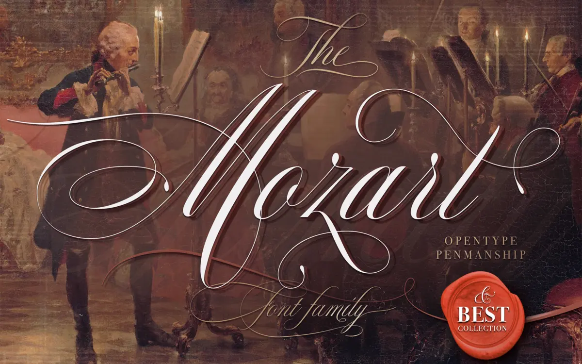
The Mozart Script sits in the penmanship tradition — Spencerian and copperplate-adjacent letterforms with a formal backbone but a lighter hand than most engraved scripts. The joins are continuous, the stroke contrast is moderate rather than extreme, and the ascenders and descenders carry the kind of looping flourish you’d expect from a script built for invitations and certificates rather than body text. It reads as trained handwriting, not casual scribble — closer to a fountain pen exercise than a marker.
What separates it from a lot of script releases in this space is the width axis. Four widths means the same letterforms can be pulled tighter for a headline or opened up for a more generous, airy feel without swapping to a visually unrelated alternate. That’s a genuinely useful structural decision, and it shows some thought about how scripts actually get used in layout, where kerning a single-width script into a tight space usually breaks the joins.
Character set and features
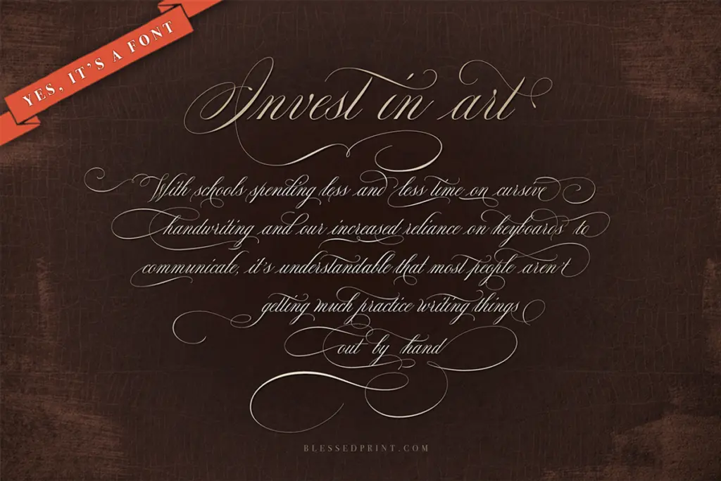
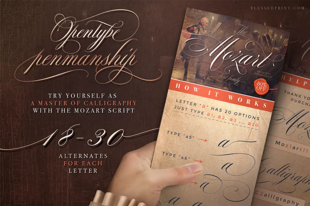
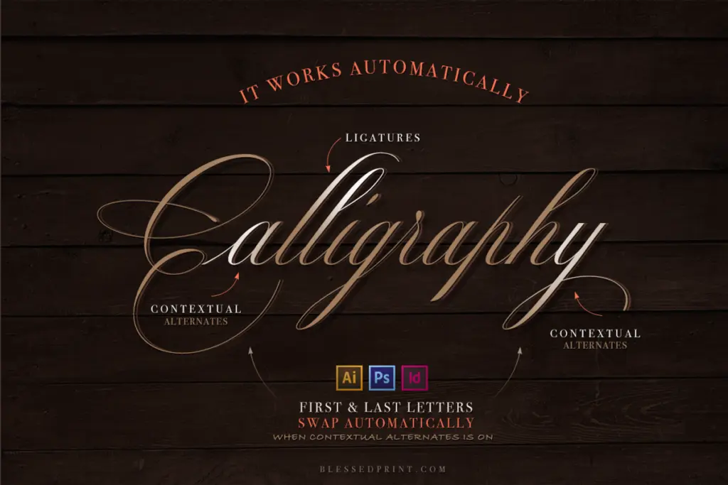
The pitch here is six hundred-plus alternate glyphs, and OpenType script fonts live or die by whether those alternates are wired up sensibly. Used well, a set that size lets you avoid the repeated-letter problem that plagues connected scripts — the same lowercase ‘e’ appearing four times in one word looking obviously cloned. Used badly, it’s just a glyph panel nobody opens. The font positions itself as multilingual, which matters if your work touches accented Latin languages; script fonts frequently fumble diacritics because the accent collides with a neighbouring swash, so it’s worth proofing your specific language before committing to a full run of stationery.
The swash capitals are the showpiece letters — expect the initial-letter treatment on names and monograms to be where this font earns its keep, more than in-line lowercase pairs. Formal scripts like this tend to need generous tracking and careful line-spacing to keep the loops from colliding, so budget time for manual kerning passes rather than expecting drag-and-drop perfection at every size.
Use cases
Wedding invitations are the obvious home for this — the formality and the penmanship pedigree suit save-the-dates, place cards, and certificate-style stationery where a slower, more deliberate script reads as considered rather than default. It also works for monogram-driven branding: logotypes for bakeries, boutiques, or personal brands that want handwriting warmth without tipping into casual.
It’s not a script built for paragraphs or long-form copy — connected penmanship scripts rarely are, and legibility drops fast below display sizes. Keep it to headlines, names, short quotes, and packaging accents, and pair it with a plain sans or serif for anything that needs to be read quickly. If you need a script that can also carry a paragraph of copy, look elsewhere; this one is built for occasions, not for reading.
What we liked, and what we didn’t
Strengths
- Four-width axis lets the same script tighten or loosen without losing its letterforms
- Swash capitals are strong enough to carry monograms and initials on their own
- Moderate stroke contrast keeps it legible at display sizes where heavier scripts clog up
Trade-offs
- Connected joins mean it strains below headline size and shouldn't carry body copy
- Multilingual diacritics need individual checking since accents can collide with swashes
The Mozart Script is a well-drawn formal penmanship script that earns its keep on invitations and monogram-led branding, with a width axis that adds real flexibility. It's not built for reading at length, and the huge alternate set demands manual attention to look intentional rather than random.
Verdict

Tantype reviews typefaces in depth — every font is tested in real branding, editorial and screen layouts before a word gets written. 555+ fonts reviewed and counting.