
Montage Serif: A Tidy, Formal Serif for Understated Branding
Design style
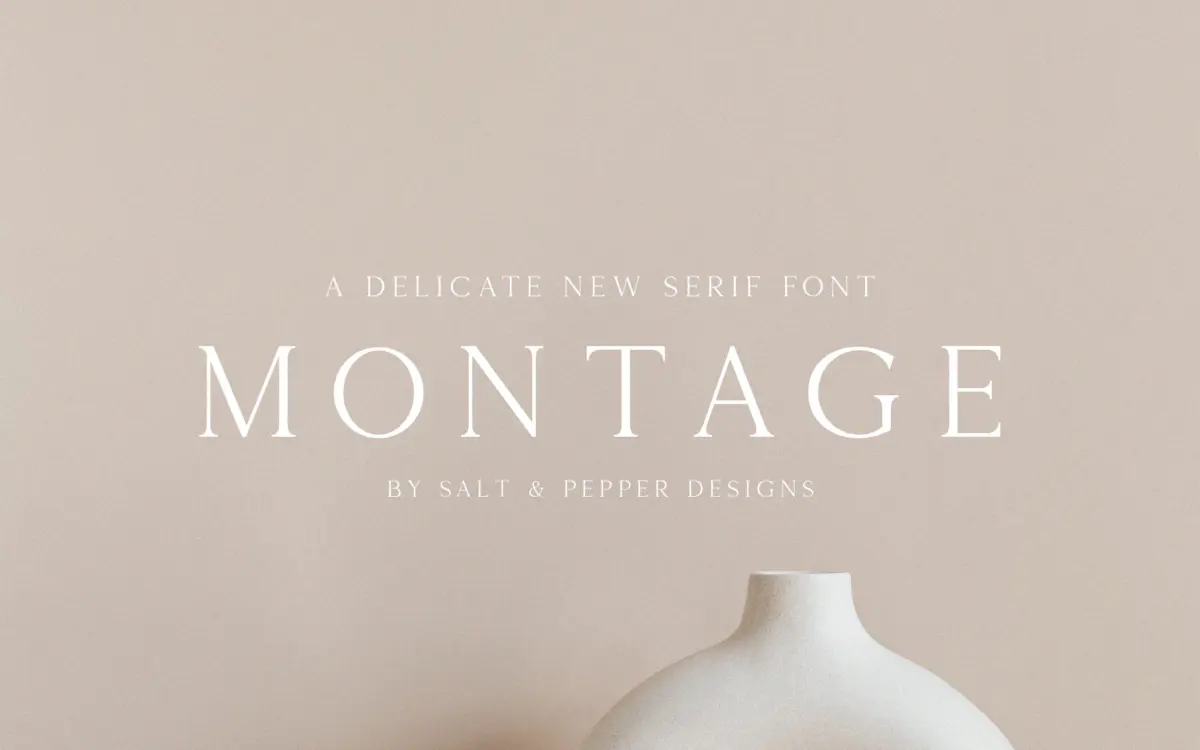
Montage Serif sits in familiar territory for a formal text serif: moderate contrast, restrained bracketed serifs, and a vertical stress that keeps the letters upright and composed. There’s nothing experimental in the skeleton — the bowls are even, the x-height is comfortable rather than assertive, and the overall posture reads as tidy rather than expressive. It’s the kind of serif that wants to disappear into the message rather than announce itself, which is a legitimate design choice, but it also means the typeface doesn’t have a strong signature stroke or terminal detail that would make it memorable on its own.
Where it does show some personality is in the slightly narrowed counters and the crisp cut of the serifs, which give it a printed, almost stationery-adjacent feel. It leans closer to a formal invitation face than an editorial workhorse, but it doesn’t commit hard enough in either direction to feel purpose-built for one job.
Character set and features
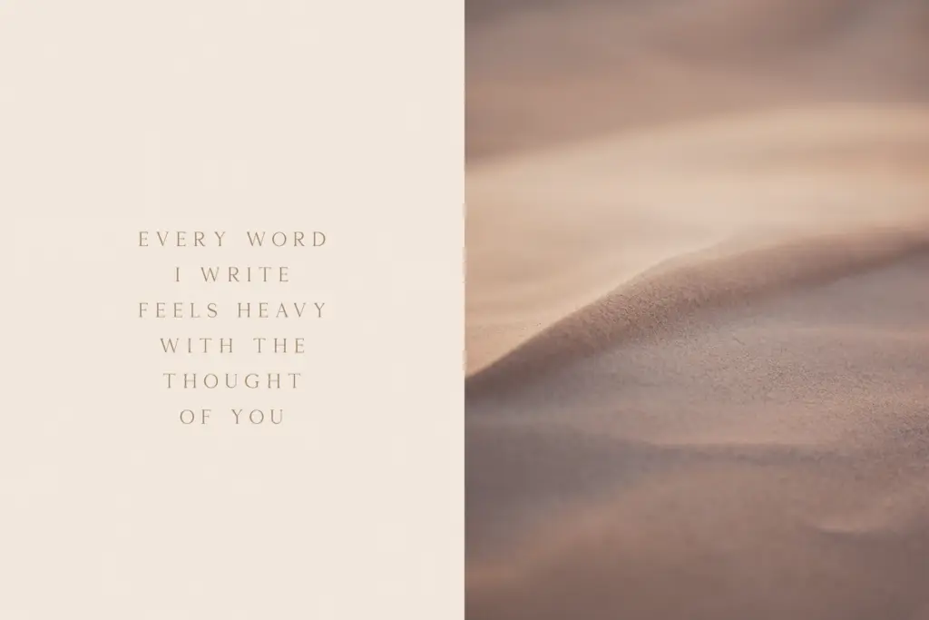
The font comes in OTF and TTF formats, which covers the basics for both design software and general use. Beyond that, the brief doesn’t specify weight variations, italics, or an extended language character set, so buyers working in multiple languages or needing a range of weights for hierarchy should confirm support before committing a project to it. A single-weight serif like this is workable for short-form work — headlines, wordmarks, short paragraphs — but it puts pressure on the designer to build contrast through size and spacing rather than through the font’s own range.
Kerning and spacing appear even at display sizes, without obvious collisions in common letter pairs, which is the baseline expectation for a serif marketed toward branding use. There’s no indication of small caps, old-style figures, or ligatures, features that would normally distinguish a serif aimed at the more editorial or luxury end of the market from one meant for general-purpose use.
Use cases
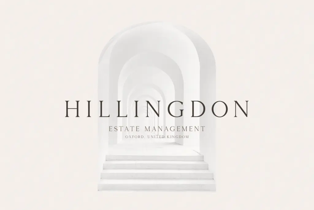
Montage Serif does its best work at moderate sizes: subheads, short taglines, product labels, and wordmarks where a handful of words need to read as considered rather than casual. It has enough polish for a boutique logotype or a stationery suite, and the even rhythm of the letterforms makes it a reasonable choice for packaging copy that needs to sit quietly next to an image or a product shot.
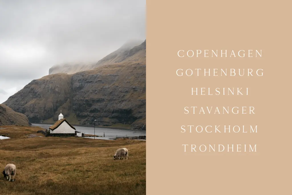
It’s less convincing as a body text face for long-form reading — the moderate contrast and even x-height don’t offer much rhythm variation across a paragraph, so pages set entirely in it can feel flat. Designers looking for a serif with more character for editorial spreads or a wider stylistic range for multi-language branding will want to look elsewhere or pair this with a more expressive display companion. Used within its actual lane — short-form, brand-facing, single-weight — it holds up fine.
What we liked, and what we didn’t
Strengths
- Even, tidy letterforms that read cleanly at moderate display sizes
- Formal, restrained tone suits stationery and short brand copy
- Available in both OTF and TTF for standard workflow compatibility
Trade-offs
- No indicated weight range or italic, limiting hierarchy options within a single project
- Flat rhythm across longer paragraphs makes it a weak choice for body text
Montage Serif is a competent, quiet serif suited to short branding copy and formal stationery rather than long-form reading. It lacks the weight range and distinctive detailing that would make it stand out, but it's dependable for the narrow lane it occupies.
Verdict

Tantype reviews typefaces in depth — every font is tested in real branding, editorial and screen layouts before a word gets written. 555+ fonts reviewed and counting.