Serif
3.9
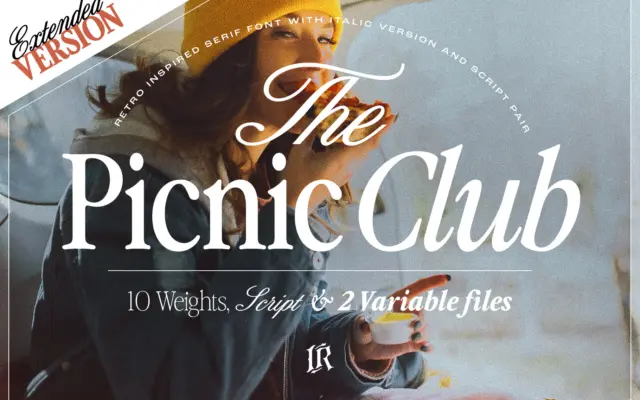
The Picnic Club: a groovy serif system for retro-leaning branding
Design style The Picnic Club reads as a display serif with its roots firmly in late-1970s and 1980s lettering: slightly…
 Tantype

Design style The Picnic Club reads as a display serif with its roots firmly in late-1970s and 1980s lettering: slightly…
Tantype
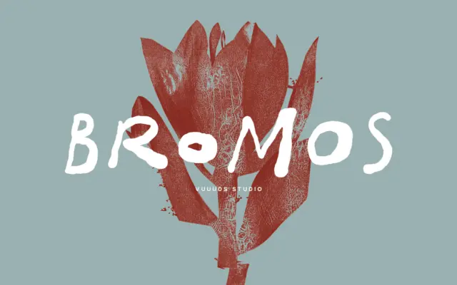
Design style Bromos sits in the brush-grunge corner of handwritten lettering: strokes look pulled quickly with a dry brush, edges…
Tantype
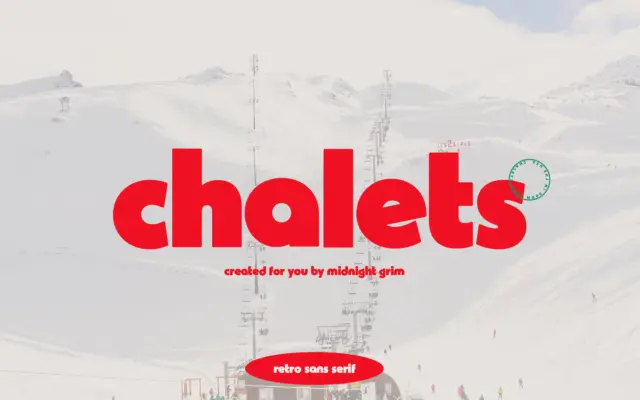
Design style Chalets pulls from mid-century ski resort signage — the kind of lettering you’d find painted on a lodge…
Tantype
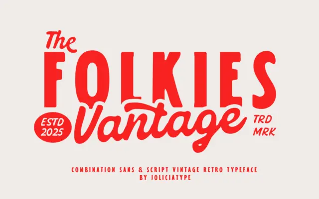
Design style Folkies Vantage pairs two faces built around one idea: age. The sans half carries the weight of the…
Tantype
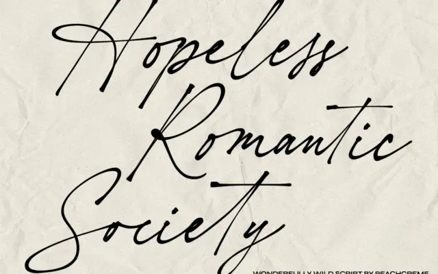
Design style Hopeless Romantic Society sits in the well-populated category of scripts built to imitate real handwriting rather than formal…
Tantype
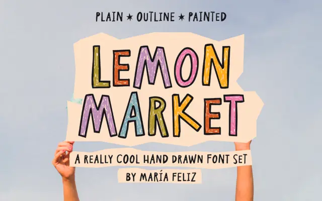
Design style Lemon Market is a handwritten display font built around deliberate irregularity. Letters wobble slightly off baseline, strokes vary…
Tantype
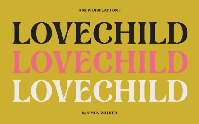
Design style Lovechild reads as a hand-lettered script, the kind built from actual brush or pen strokes rather than a…
Tantype
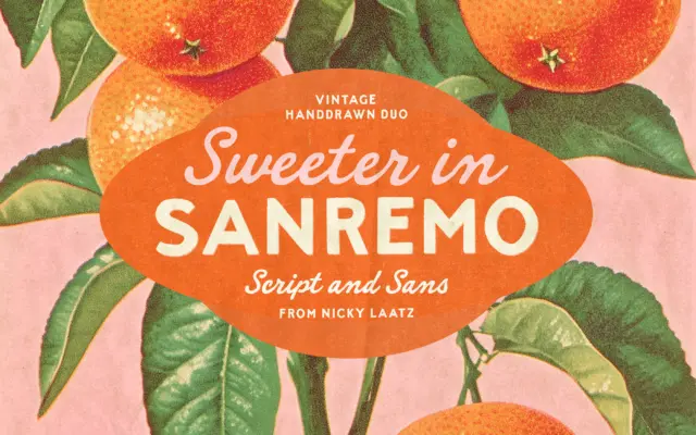
Design style Sanremo takes its cues from hand-painted signage and old matchbook printing — the kind of lettering you’d find…
Tantype
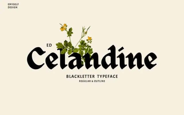
Design style ED Celandine takes the bones of traditional blackletter and strips away a lot of the density that usually…
Tantype