
Bromos: a brush-grunge handwritten font for raw, textured branding
Design style
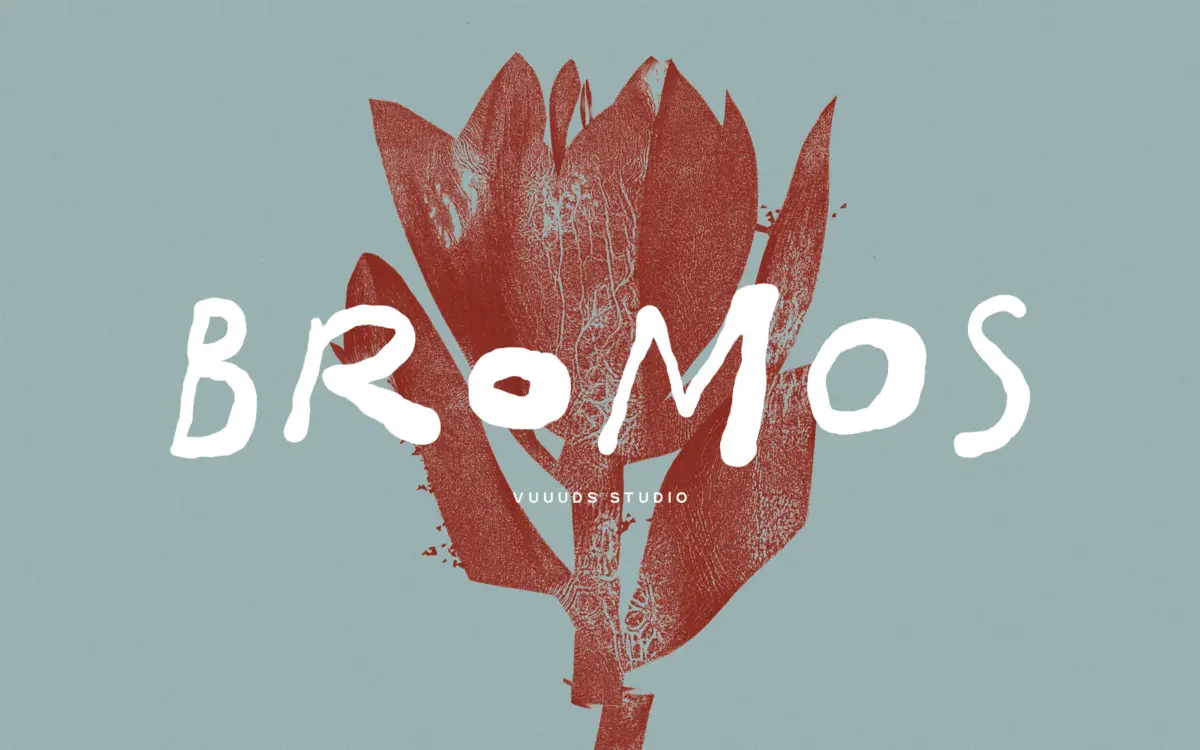
Bromos sits in the brush-grunge corner of handwritten lettering: strokes look pulled quickly with a dry brush, edges are rough rather than smoothed off, and the baseline wanders the way real handwriting does. Nothing here is trying to look polished. The letters carry visible texture in the stroke edges, small breaks and inconsistencies that read as ink running out mid-stroke rather than as a clean vector outline. That grunge quality is the whole point of the design, and it’s drawn with enough consistency that the roughness feels intentional rather than accidental.
Each character has been drawn individually rather than built from repeated modular strokes, which shows in the variation from letter to letter — the same letter doesn’t look mechanically identical every time it appears, which suits the handwritten premise. The overall rhythm leans loose and gestural, with connections between letters that feel more like a fast marker than a formal script.
Character set and features
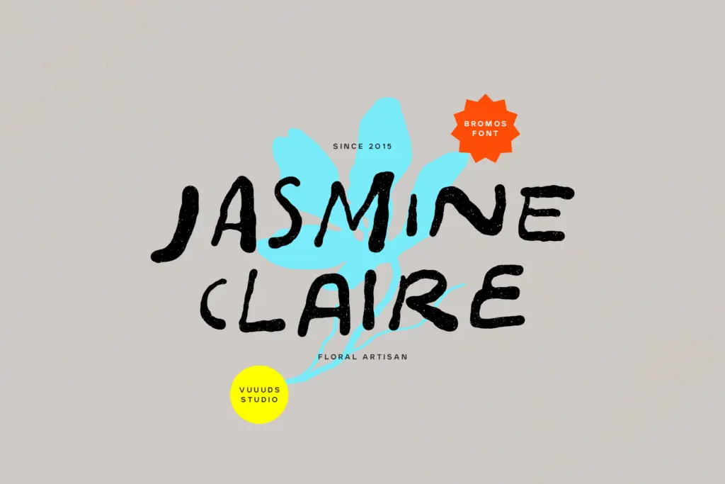
The set includes alternate glyphs, accessed through Font Book on Mac or Character Map on Windows, which gives some room to break up repeated letters within a word or across a layout — useful given how distinctive each letterform is. Diacritic support covers a broad range of accented Latin characters (À, Ä, Æ, Ø, Ñ, Ÿ and their lowercase equivalents among them), so the font should carry across several European languages without falling back to a default glyph. Files are supplied as OTF and WOFF, covering desktop layout work and web use.
What isn’t in the brief is a weight range or a companion sans — this reads as a single-style display face, not a family with light and bold variants to mix. Treat it as one voice, not a system.
Use cases
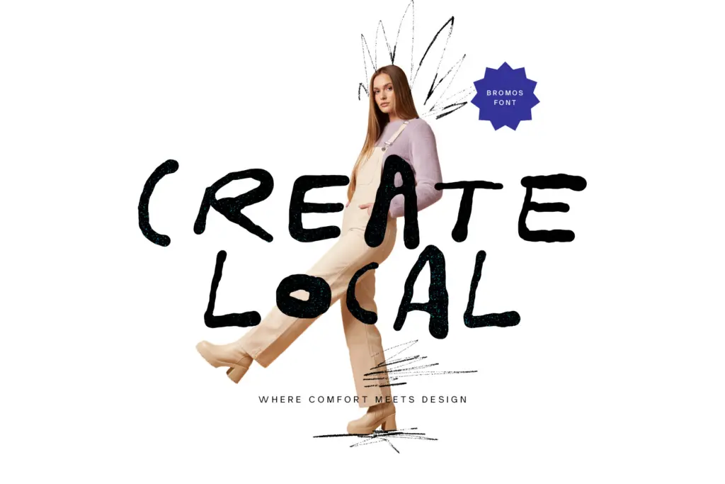
Bromos is built for moments where a brand or a piece of packaging wants to look handmade, worn-in, or a little rebellious — think craft beverage labels, streetwear branding, gig posters, or any packaging design that wants to signal small-batch rather than factory-made. The grunge texture reads best at display sizes: headlines, logotypes, short product names, hand-lettered-style taglines. It is not a font for paragraphs or body copy; the roughness and irregular baseline that make it expressive at large sizes will just look messy and hard to parse if it’s dropped into a sentence at 11pt.
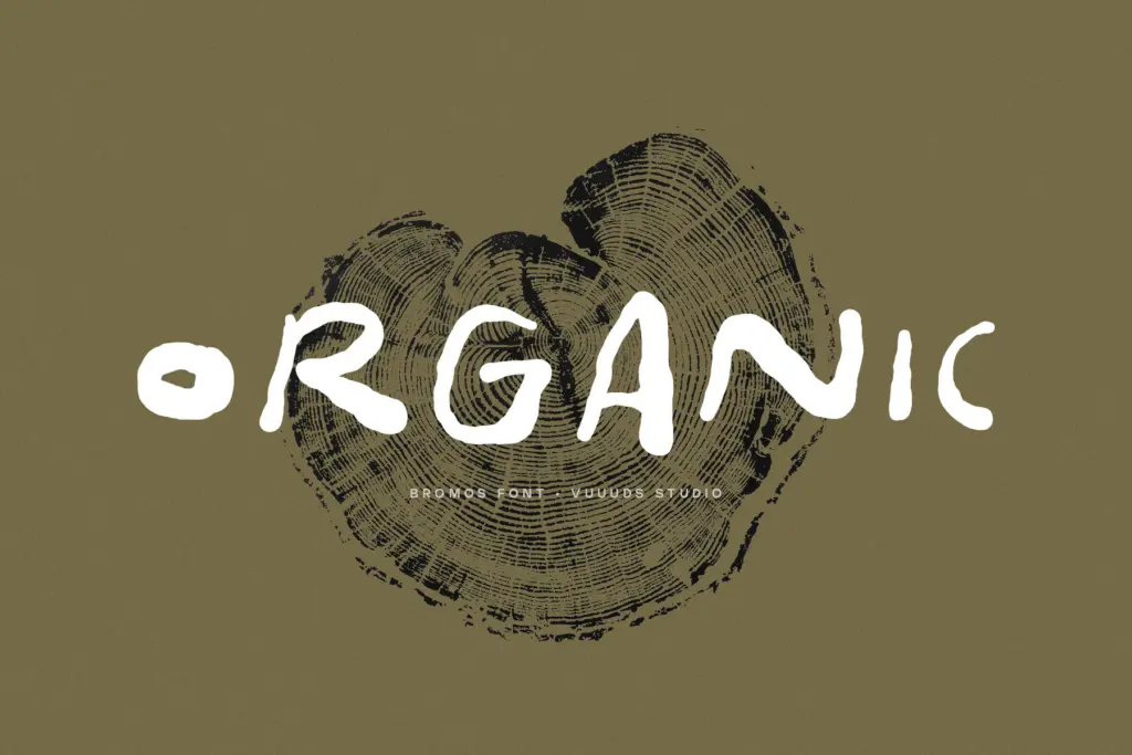
It also pairs naturally with photography or texture-heavy backgrounds — the letterforms already look weathered, so they sit comfortably over grain, paper stock, or distressed surfaces rather than fighting them. For anyone building a brand mark or short lockup that wants some grit and personality without leaning into full calligraphic elegance, Bromos does that job directly. For anything needing restraint, formality, or long-form reading, look elsewhere.
What we liked, and what we didn’t
Strengths
- Individually drawn letterforms give it a genuinely handmade, non-repetitive texture
- Alternate glyphs let you break up repeated letters within a word
- Broad accented-character support extends its use beyond English-only branding
Trade-offs
- No weight variation or companion styles, so it can't flex beyond a single grunge voice
- Irregular baseline and rough edges make it unsuitable for anything beyond short display text
Bromos delivers a convincing rough, brush-drawn texture that suits gritty branding and packaging work. It's a one-note display face, though — no weight range, and not built for anything beyond short lockups.
Verdict

Tantype reviews typefaces in depth — every font is tested in real branding, editorial and screen layouts before a word gets written. 555+ fonts reviewed and counting.