
Hopeless Romantic Society: a loose, ligature-heavy script for wedding and note-writing work
Design style
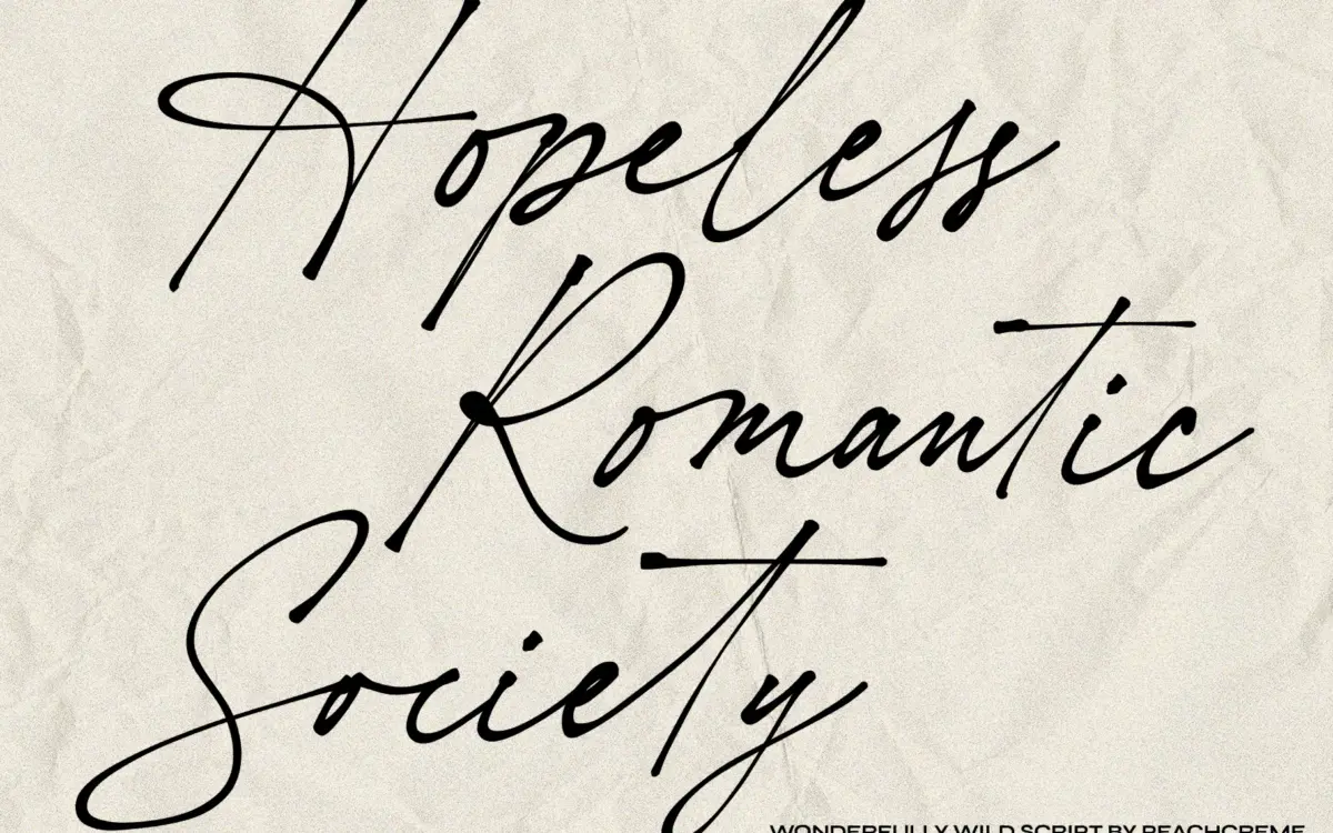
Hopeless Romantic Society sits in the well-populated category of scripts built to imitate real handwriting rather than formal calligraphy. The strokes wobble slightly, baselines drift, and letter widths are inconsistent in the way an actual pen produces when someone is writing quickly rather than carefully. That’s the point of the design: it reads as a note scrawled to someone rather than a font chosen from a catalogue.
The contrast is modest and even across the letterforms, with no dramatic thick-thin swing to suggest a broad-nib pen. This keeps the overall texture soft rather than showy, closer to a rollerball or fine felt-tip than a brush. Terminals are rounded and unfussy, and the general angle of the slant leans forward at a comfortable, conversational pitch rather than the steep rake you get in more theatrical scripts.
Character set and features
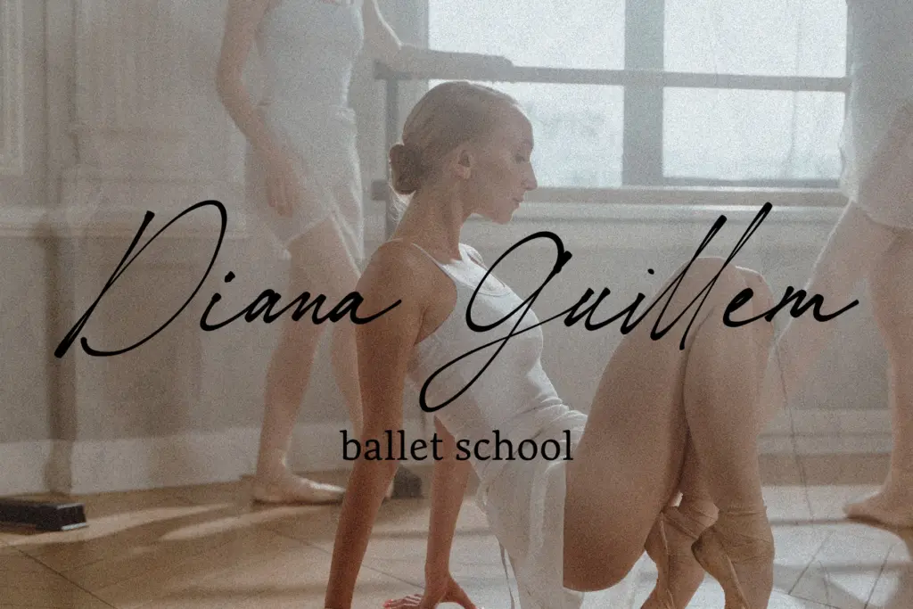
The headline feature here is the set of 55 ligatures, and they matter more than usual for this style because the whole appeal of the font rests on avoiding the mechanical look of repeated letter shapes. Common pairs and troublesome sequences get alternate joins, which helps break up the rhythm of longer words and stops the script from looking like it was typed one character at a time.
Because this is a connecting script, spacing and kerning carry a lot of weight, and the font is clearly built with that connection in mind — letters meet at consistent heights without odd gaps or overlaps in ordinary use. Where scripts like this tend to fall apart is in unusual letter combinations or all-caps settings, and that risk is present here too; a script this loose is not going to behave predictably in a headline set entirely in capitals; it’s built for lowercase, sentence-style use, and using it that way is what makes the ligatures earn their keep.
Standard punctuation and basic diacritics appear to be covered, though the brief doesn’t specify full language support, so anyone setting text beyond basic Latin characters should check the character map before committing.
Use cases
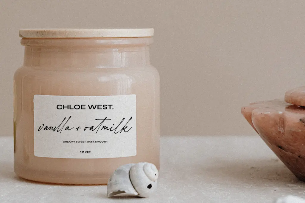
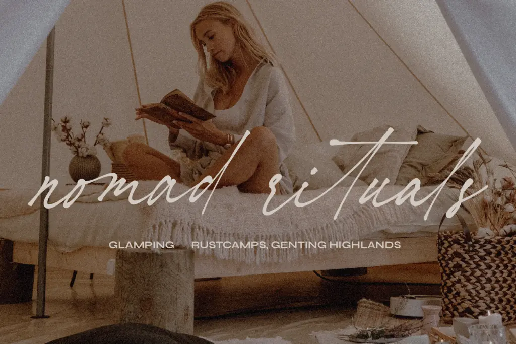
This is a font for short, warm pieces of text rather than long-form reading. Wedding invitations are the obvious fit — envelope addressing, names on a save-the-date, a line of vows or a quote on a menu card. It also works for anything that wants to feel personally written: a card insert, a signature line, a small brand mark that wants to suggest a handwritten note rather than a corporate one.
At small sizes the looseness that makes it charming at display size will start to work against legibility, so keep it to headline and accent roles rather than body copy or anything that needs to be scanned quickly. It also isn’t a font for high-formality luxury branding — the intentional sloppiness reads as friendly and casual, not polished, so it suits playful or romantic-leaning projects better than anything aiming for restraint.
Pair it with a plain, quiet secondary typeface for actual reading text; the script should carry the emotional weight of a design while something calmer handles the details.
What we liked, and what we didn’t
Strengths
- 55 ligatures genuinely break up repetition in longer words
- the wobble and drift read as authentic handwriting rather than a generic script template
- suits short, warm applications like invitations and note-style branding without extra dressing
Trade-offs
- the looseness that gives it charm hurts legibility at small sizes
- not suited to all-caps or highly formal branding contexts
Hopeless Romantic Society does one job well: it looks like someone actually wrote it, ligatures and all. It's not built for long text or formal branding, but for short romantic and personal-feeling pieces it delivers real charm.
Verdict

Tantype reviews typefaces in depth — every font is tested in real branding, editorial and screen layouts before a word gets written. 555+ fonts reviewed and counting.