
Lovechild: a loose, hand-drawn script for branding with personality
Design style
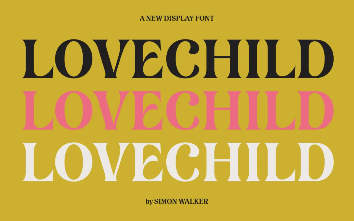
Lovechild reads as a hand-lettered script, the kind built from actual brush or pen strokes rather than a rigid connecting system. The name itself signals intent: something stitched together from more than one influence, part casual signature, part considered lettering. Strokes vary in weight as they would under a real hand, thickening on downstrokes and thinning where the tool lifts, giving the face a warmth that mechanically generated scripts rarely manage.
What stands out is the looseness. Letters don’t sit in perfectly even baselines or uniform slants — there’s a deliberate wobble to the rhythm, the sort of imperfection that reads as human rather than sloppy when it’s controlled well. That’s a hard balance to strike in a script typeface, and it’s the main thing worth checking closely in the specimen before committing a project to it: does the irregularity feel intentional at the sizes and word lengths you actually need, or does it start to look uneven in a way that undermines trust in the mark.
Character set and features
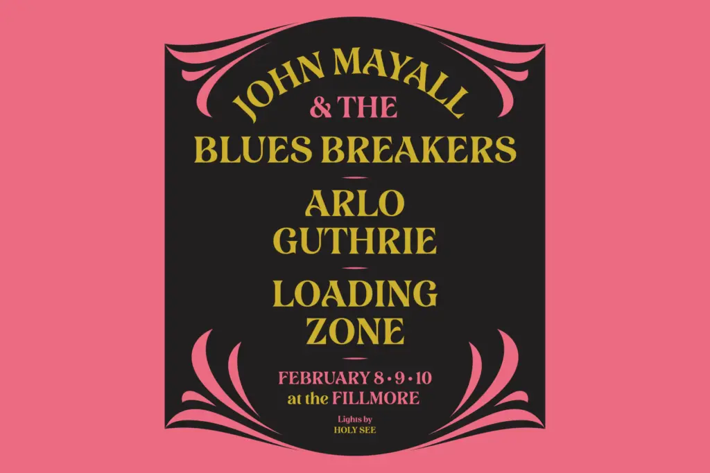
As a hand-drawn script, Lovechild likely leans on alternates and ligatures to keep repeated letter combinations from looking mechanically repeated — a common and necessary strategy for this kind of face, since a script with only one form per letter starts to reveal its digital scaffolding fast. Whether it includes swash capitals, contextual alternates triggered automatically, or a more manual set of stylistic variants a designer has to select by hand matters a lot in practice, and is worth confirming against the specimen rather than assuming.
Scripts like this tend to work best set large — headlines, wordmarks, short phrases — rather than as body copy, since the character-to-character variation that gives them personality also slows reading at small sizes or in long passages. If Lovechild follows that pattern, it’s not a shortcoming so much as a category trait: this isn’t a typeface built for paragraphs.
Use cases
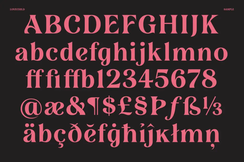
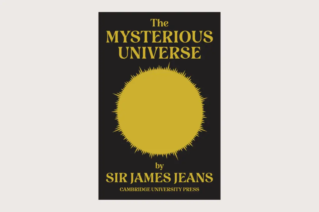
A script with this much apparent personality suits branding work that wants to feel personal rather than corporate — logotypes for small businesses, packaging that leans handmade or artisanal, wedding stationery, greeting cards, anything where the brief calls for warmth over polish. It’s less suited to contexts that need neutrality or restraint; a script this expressive will always announce itself, which is exactly the point for the right client and a liability for the wrong one.
Designers should pair it with a plain, quiet sans or serif for supporting text — the script should carry the voice, not compete with itself. Anyone considering Lovechild for a project should look closely at the full specimen for word-length behaviour, kerning consistency, and language support before locking it into a final layout, since scripts this loose can vary in how well they perform outside short display settings.
What we liked, and what we didn’t
Strengths
- Visible hand-drawn quality with genuine stroke-weight variation, not a flattened vector script
- Loose, human rhythm gives it personality suited to artisanal and personal branding
- Strong candidate for short display settings like logotypes and headline lettering
Trade-offs
- Likely struggles at small sizes or in long text given its irregular, expressive letterforms
- Its strong personality limits it to specific branding contexts and works against neutral or corporate use
Lovechild is a hand-drawn script with real warmth and a deliberately uneven rhythm that suits branding and stationery work wanting a personal touch. It's not built for body text or neutral contexts, and its success depends heavily on how well the alternates and spacing hold up across real words rather than isolated letters. Worth close inspection of the specimen before committing to a layout.
Verdict

Tantype reviews typefaces in depth — every font is tested in real branding, editorial and screen layouts before a word gets written. 555+ fonts reviewed and counting.