
ED Celandine: a pared-back blackletter for logos and streetwear
Design style
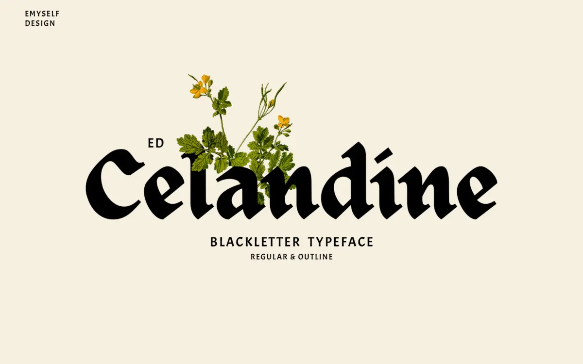
ED Celandine takes the bones of traditional blackletter and strips away a lot of the density that usually comes with it. The strokes are simplified, the counters opened up, and the overall texture reads lighter on the page than a classic Fraktur or Textura. It’s the kind of blackletter that’s been filtered through contemporary streetwear and logo design rather than manuscript history, and that shows in the way the letters sit apart from each other rather than locking into a dense woven wall of text.
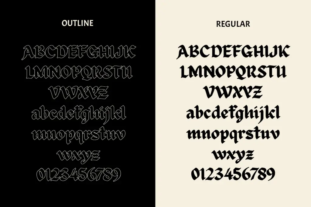
The regular style keeps a solid stroke with the diamond-shaped terminals and angular breaks you expect from the genre, but the contrast between thick and thin is dialed down compared to older blackletter revivals. The outline companion strips the same shapes down to a clean line, which changes the character of the face considerably — it reads more like a badge or stencil treatment than a manuscript face. Neither style tries to be ornate. There’s no excess flourish on the ascenders or descenders, and the overall impression is closer to a modern logotype than a historical pastiche.
Character set and features
Both styles include stylistic sets, ligatures, and support for multiple languages, which matters for a display face pitched at branding work — clients rarely stick to English-only copy. The ligatures differ between the regular and outline versions, which is a nice touch: it means the outline isn’t just a hollowed-out clone of the regular but has its own set of connecting shapes, so pairing the two together doesn’t feel redundant.
Where blackletter faces often fall apart is in the lowercase, where letters like n, m, and u start to look identical at a glance. ED Celandine’s simplification helps here — because the strokes are lighter and the counters more open, individual letters are easier to tell apart than in denser blackletter designs. That said, this is still a script built on historical letterforms, and readers unfamiliar with the convention will need a beat to parse words, especially in all-caps settings or dense paragraphs.
Use cases
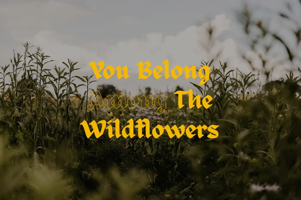
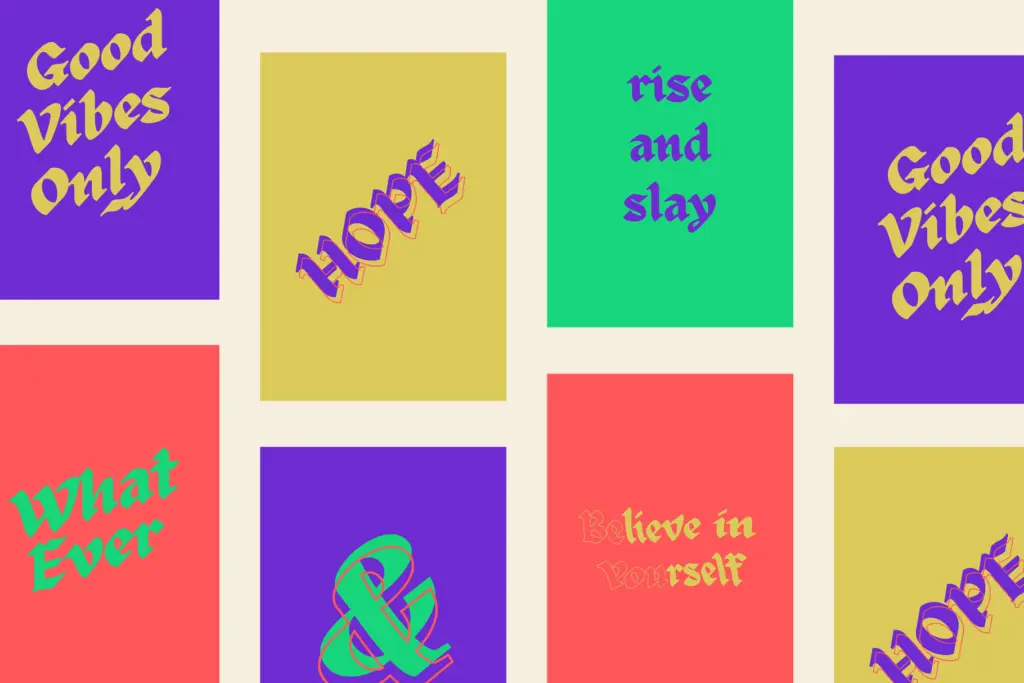
This is a display face, not a text face, and it knows it. At poster size, on a badge, or set large across a t-shirt front, the simplified structure holds up cleanly and photographs well — useful for anything that ends up on a screen or social feed rather than in hand. The outline style works especially well for tattoo flash, apparel prints, and any application where a single-color linear mark is needed rather than a filled shape.
Logo work is the obvious fit: short words, wordmarks, badge lockups where the blackletter reference signals heritage or edge without demanding a reader parse a full sentence. It’s less suited to anything requiring long-form reading — a paragraph set in this face will fight the reader more than it should. Keep it to headlines, single words, and short phrases and it does its job well.
What we liked, and what we didn’t
Strengths
- Simplified strokes and open counters make it easier to read than dense traditional blackletter
- The outline style has its own distinct ligatures rather than just being a hollow version of the regular
- Stylistic sets and multi-language support make it practical for real branding work
Trade-offs
- Still unsuited to any extended text setting beyond short phrases or headlines
- The minimalist approach sacrifices some of the ornamental character that draws people to blackletter in the first place
ED Celandine takes blackletter's ornamental weight off and hands back a cleaner, more usable display face suited to branding and streetwear. It won't replace a historical blackletter for anyone chasing manuscript authenticity, but as a logo and badge tool it's a solid, well-considered option.
Verdict

Tantype reviews typefaces in depth — every font is tested in real branding, editorial and screen layouts before a word gets written. 555+ fonts reviewed and counting.