Serif
3.9
Northlake: A Rustic Serif with Rounded Edges for Vintage-Leaning Branding
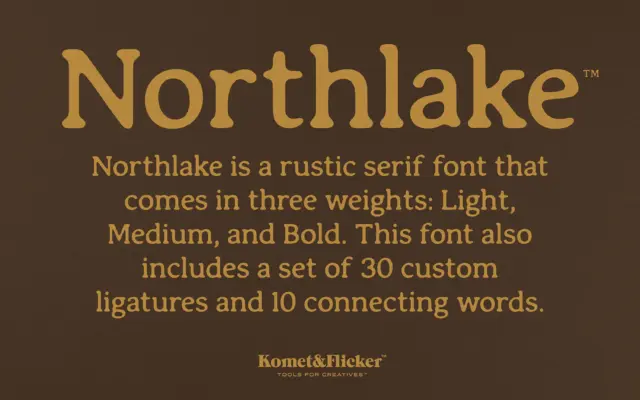
Design style Northlake is a serif built on soft geometry. The serifs are present and sturdy, but their corners have…
 Tantype

Design style Northlake is a serif built on soft geometry. The serifs are present and sturdy, but their corners have…
Tantype
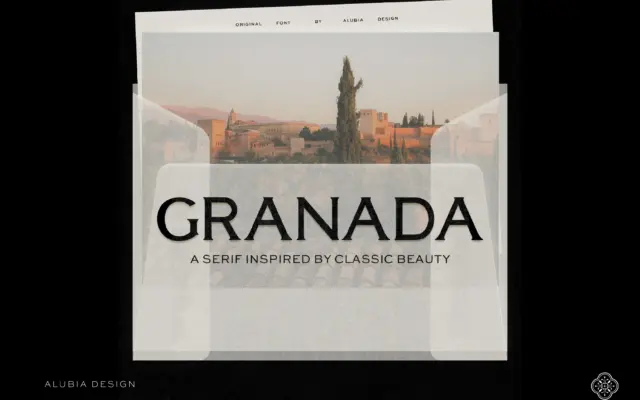
Design style Granada is a serif built for headlines, not paragraphs, and it makes that intention obvious from the first…
Tantype
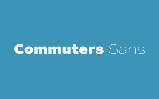
Design style Commuters Sans sits in that familiar territory of contemporary grotesques built for utility rather than personality. The proportions…
Tantype
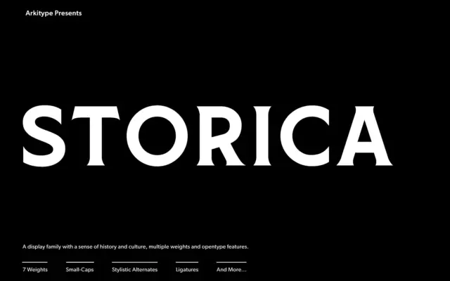
Design style Storica leans on the proportions of classical roman lettering — the kind carved into stone rather than set…
Tantype
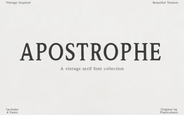
Design style Apostrophe leans hard into the look of old letterpress and antique type specimens. The strokes carry visible texture…
Tantype
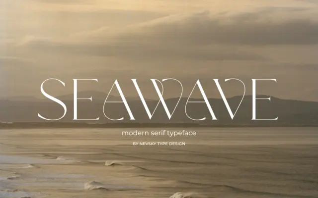
Design style NT Seawave sits in the modern serif tradition: sharp contrast between thick and thin strokes, unbracketed or minimally…
Tantype
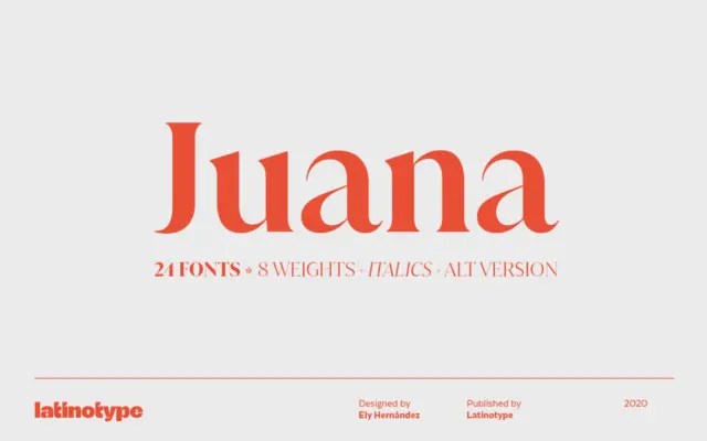
Design style Juana belongs to the family of high-contrast serifs that trade the calm rhythms of text faces for something…
Tantype
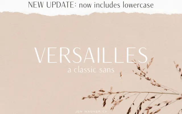
Design style Versailles sits in a small but useful corner of the sans serif world: letterforms with a visible stroke…
Tantype
Design style PS Badge Monogram is not a typeface in the usual sense — it’s a monogram-building system dressed up…
Tantype