
Versailles: A Contrast Sans for Logos and Web Headings
Design style
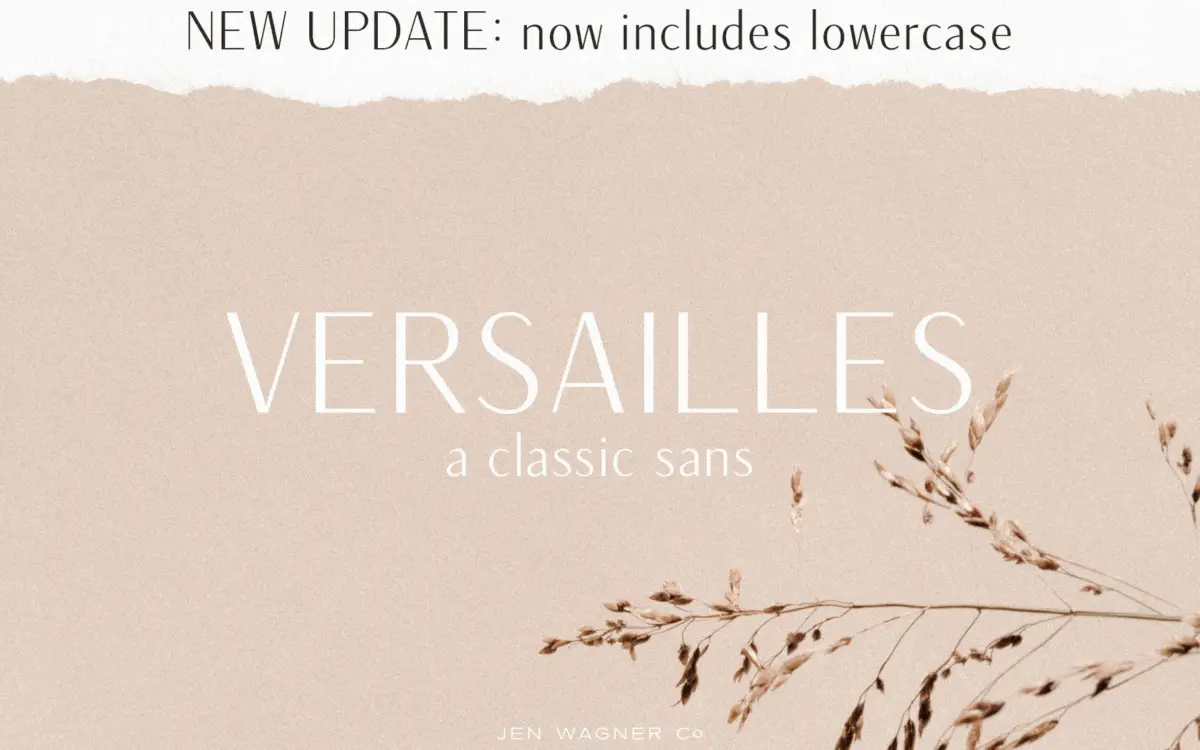
Versailles sits in a small but useful corner of the sans serif world: letterforms with a visible stroke contrast, borrowed from serif construction, applied to a sans skeleton. The verticals carry more weight than the horizontals, which gives the face a sense of formality without adding actual serifs. Curves are kept smooth and even, with no flare or brush texture, so the contrast reads as structure rather than decoration.
The overall feel is restrained. Nothing about the drawing draws attention to itself the way a display face might — there are no swashes, no ligatures, no eccentric terminals. That restraint is the point. Versailles is built to look considered rather than characterful, closer to a refined studio wordmark than a personality font. Whether that reads as classic or simply cautious will depend on the job.
Character set and features
The set now includes both cases, following an update that added lowercase — worth checking if you already own an older version and were working uppercase-only. Numbers and standard punctuation are covered, along with extended non-English character support, which broadens its use beyond English-only branding work.
There’s no mention of alternate glyphs, ligatures, or stylistic sets, and nothing here suggests OpenType features beyond the basics. That’s consistent with what the font is trying to do — this isn’t a face built for typographic flourishes, it’s built to hold a line of text cleanly at a fixed weight. Designers looking for small caps, oldstyle figures, or contextual alternates will need to look elsewhere.

Use cases
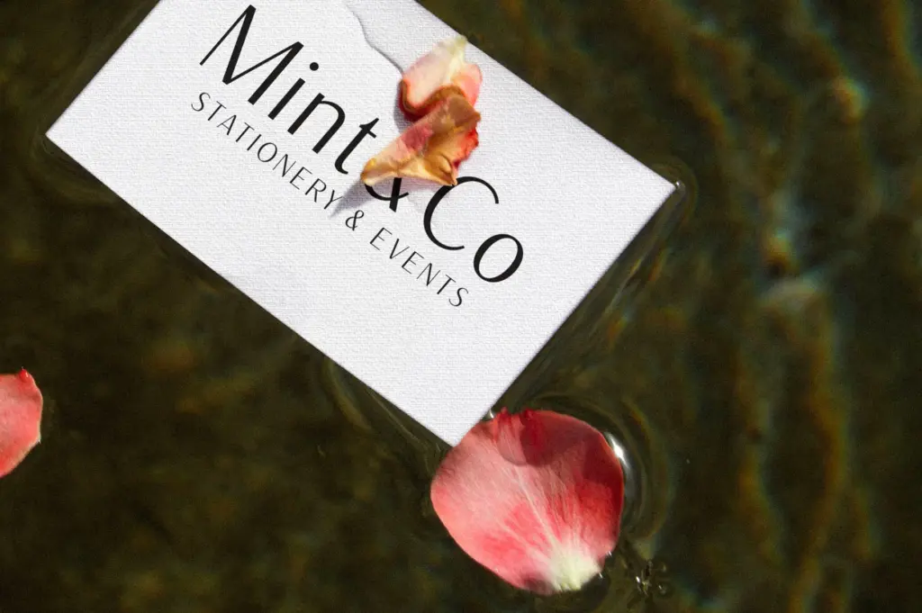
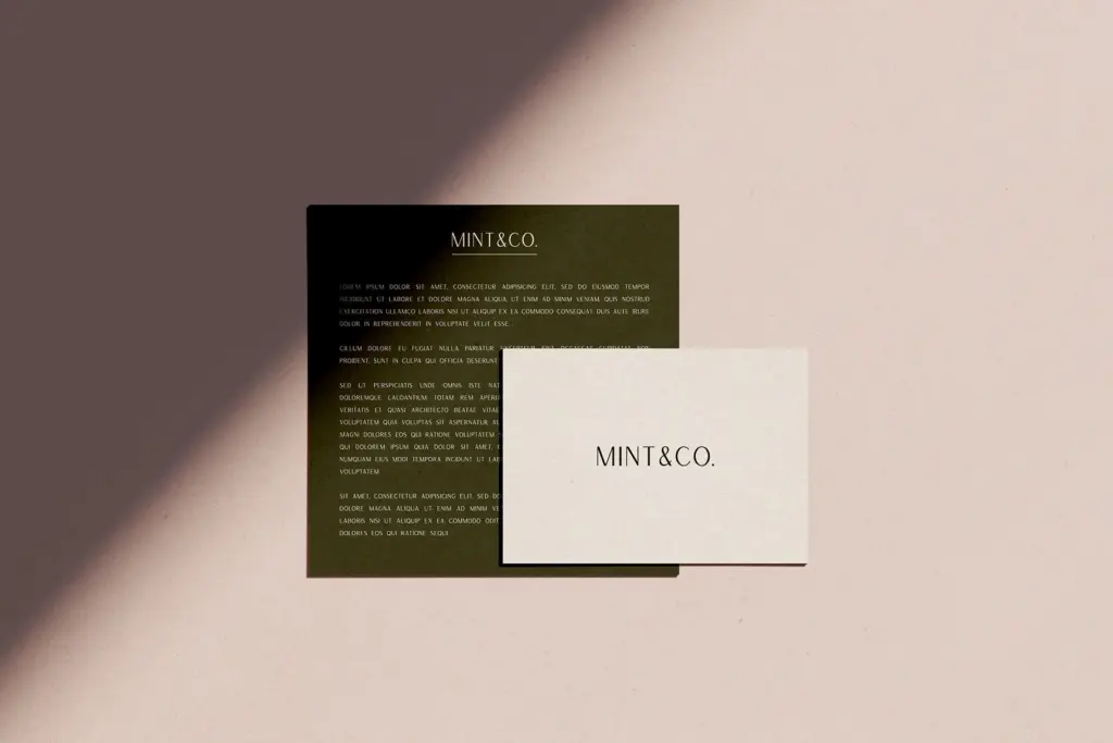
Versailles is aimed squarely at logotypes, wordmarks, and web headings, and that’s where the contrast earns its keep — at large sizes, the thick-thin rhythm is visible enough to give a mark some presence without tipping into ornamental territory. It reads well set wide and short, the way a brand name or a page header typically sits.
At body text sizes the contrast becomes a liability rather than an asset. The thinner strokes start to lose weight against the thicker ones, and at small sizes or lower resolutions this can flatten out unevenly rather than gracefully. This is a headline and identity tool, not a paragraph-setting typeface, and treating it as one will show its limits quickly.
For branding projects, packaging, social media graphics, or a website’s H1 and H2 tags, it does a clean, dependable job — the kind of typeface that won’t fight with a layout or demand much justification. Pair it with a plain, low-contrast sans for body copy and let Versailles carry the header weight where its contrast can actually be seen.
What we liked, and what we didn’t
Strengths
- Visible thick-thin contrast gives wordmarks and headlines a formal, considered presence
- Clean, even curves keep the design from tipping into decorative territory
- Extended non-English character support broadens its use beyond English-only branding
Trade-offs
- Contrast thins out and loses clarity at small or body-text sizes
- No alternate glyphs, ligatures, or OpenType features for designers wanting more control
Versailles is a competent, restrained contrast sans built specifically for logotypes and headings, and it does that job cleanly. It isn't built for body text or for designers wanting stylistic flexibility, and it doesn't try to be.
Verdict

Tantype reviews typefaces in depth — every font is tested in real branding, editorial and screen layouts before a word gets written. 555+ fonts reviewed and counting.