
Apostrophe: a distressed serif family for vintage print effects
Design style
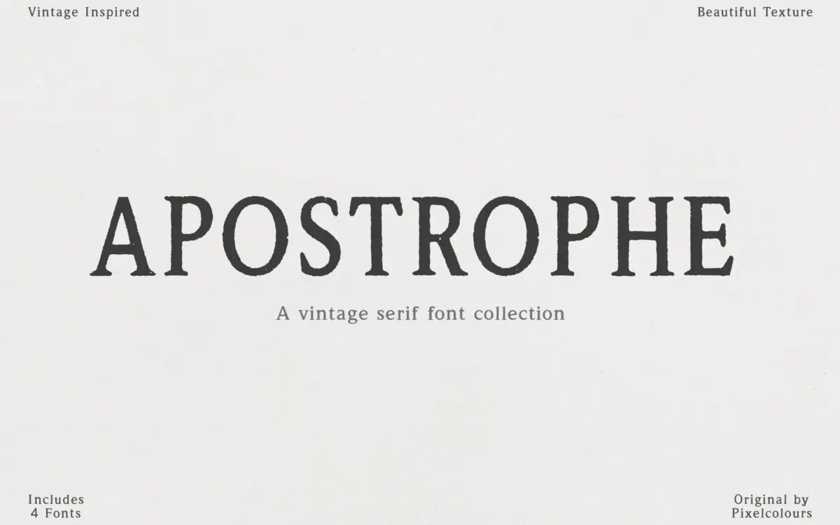
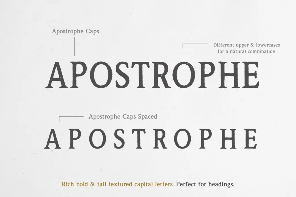
Apostrophe leans hard into the look of old letterpress and antique type specimens. The strokes carry visible texture — worn edges, uneven ink coverage, and a general roughness that reads as printed rather than drawn on screen. Instead of a single weight, the collection is built around variation: a regular text cut, a spaced version of that same regular, and a set of capitals that come in their own textured, slightly bolder alphabet. The caps are noticeably taller and heavier than the lowercase companion, which is a deliberate move rather than an inconsistency — it lets you build the kind of mismatched, hand-set look you’d see on an old grocery tin or a reprinted broadside.
The imperfections are the point here. Some letters sit at a slight slant, some vary in size, and none of it is trying to look clean. That’s a specific aesthetic decision, and it works as long as you want that specific aesthetic. If you need a serif that reads as neutral or contemporary, this isn’t it — the texture is baked into the letterforms themselves, not an effect you can dial back.
Character set and features
The family is really four related fonts rather than one: Regular, Regular Spaced, Caps, and Caps Spaced. The spaced versions widen the letter spacing enough to be usable for body copy or longer lines of text, where the tighter default spacing of the regular cut would start to feel cramped and busy given the texture. The Caps set is worth calling out separately — it isn’t just an uppercase version of the regular, but a distinct alphabet with its own uppercase and lowercase forms, designed so the two can be mixed for a more organic, hand-set feel. That’s a useful trick for headlines that need to look like they were assembled from mismatched wood type rather than typed in one font.
Language support is included, though as with any heavily textured display face, expect diacritics and accented characters to carry the same rough treatment as the base letters rather than a cleaner variant.

Use cases
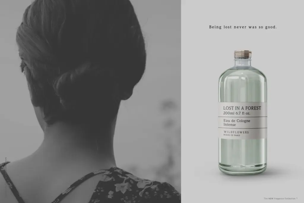
This is a font for projects that want to look printed, aged, or handled — packaging labels for small-batch goods, apothecary or general-store branding, retro posters, menu headers, or any layout referencing early 20th-century print culture. The spaced regular can carry short paragraphs of body text in that same register, though it’s not built for long-form reading; it’s a supporting voice, not a workhorse text face. The Caps alphabet is best kept to headlines, logotypes, and short lockups where the texture and irregular letterforms can be appreciated at size rather than lost in a paragraph.
It won’t suit anything that needs to look tidy, modern, or corporate — the roughness doesn’t scale down gracefully to small print or dense text, and pairing it with a clean sans for contrast is really a necessity rather than an option. Used within its lane, though, it does the vintage-print job convincingly, and the four-part structure gives you enough variation to build a layout without reaching for a second typeface.
What we liked, and what we didn’t
Strengths
- The mismatched Caps alphabet gives headlines a genuinely hand-set, organic feel.
- Four related cuts (regular, spaced, caps, caps spaced) offer real layout flexibility without switching fonts.
- The texture and imperfect letterforms read as authentically printed rather than filtered.
Trade-offs
- The heavy texture makes it unsuitable for small sizes or dense body text.
- It's tied to a specific vintage-print look, so it won't flex into cleaner or more contemporary branding work.
Apostrophe is a convincingly rough, print-inspired serif family that does one job well: vintage packaging and headline work. It's not built for body text or modern branding, and the texture limits how small it can go, but within its niche it's a solid, characterful option.
Verdict

Tantype reviews typefaces in depth — every font is tested in real branding, editorial and screen layouts before a word gets written. 555+ fonts reviewed and counting.