
Northlake: A Rustic Serif with Rounded Edges for Vintage-Leaning Branding
Design style
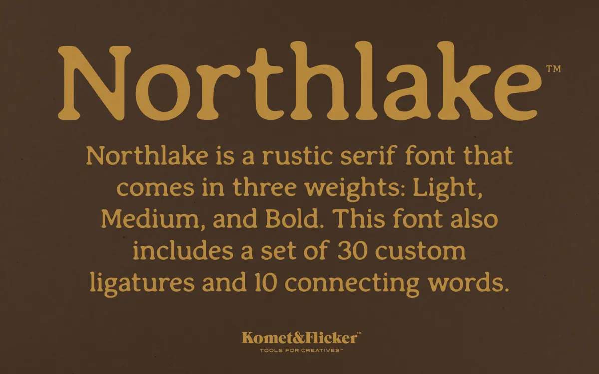
Northlake is a serif built on soft geometry. The serifs are present and sturdy, but their corners have been sanded down rather than left sharp, which gives the whole family a slightly worn, handled look without tipping into a distressed or grunge treatment. That’s a useful distinction: the rusticity here comes from the drawing itself, not from added texture or noise, so the letterforms stay clean at any size you set them.
The three weights — Light, Medium, and Bold — read as a coherent progression rather than three separate personalities. Light softens the rustic quality into something closer to a gentle editorial serif; Bold pushes the rounded terminals into something chunkier and more suited to headline work. Medium sits in between and is probably where most projects will land by default.
Character set and features
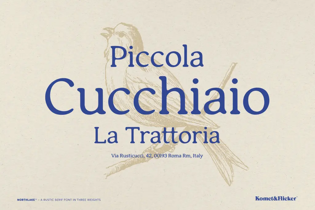
The headline feature is the ligature set: 30 custom ligatures plus 10 pre-built connecting words like “and” and “the.” This is a genuinely useful inclusion rather than a decorative flourish, because rounded rustic serifs are exactly the kind of letterform where awkward letter collisions show up quickly — a lowercase ‘th’ or ‘and’ set without any connection can look mechanical against a typeface that’s otherwise trying to feel handmade. The connecting words in particular save the kind of manual kerning work that usually falls to whoever is setting the type, provided your layout software actually applies OpenType features (check this before committing to a long piece of body copy).
Because the ligatures are doing real work here, using Northlake in software that ignores OpenType features will get you a noticeably flatter result than the specimen images suggest. That’s worth testing early rather than discovering after a design is signed off.
Use cases
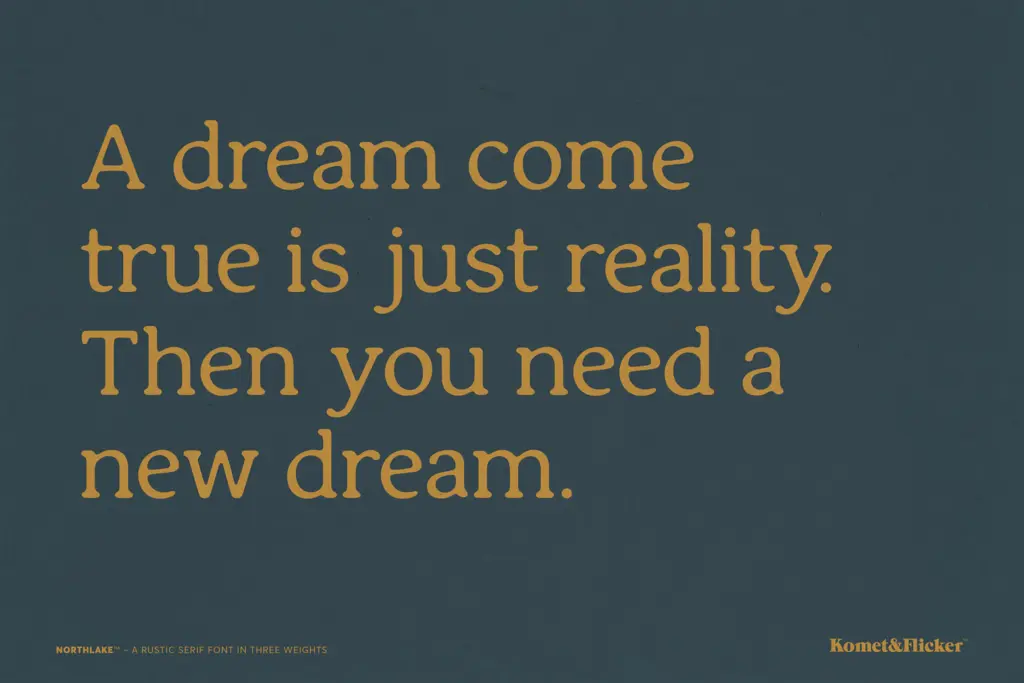
Northlake is aimed squarely at branding and packaging work that wants a lived-in, small-batch feel — think farm-to-table labels, outdoor and craft goods branding, or editorial pieces going for a warm, unfussy tone. The Light and Medium weights hold up reasonably well in short paragraphs and subheads, though I wouldn’t push this into dense body text at small sizes; the rounded serifs and connecting ligatures are built for display and short-to-medium copy, not long-form reading.
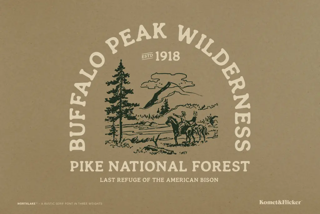
Bold is the weight to reach for on packaging fronts, signage, and logotypes, where the softened terminals read as approachable rather than corporate. It also plays well in wordmarks where you want a serif with some warmth but not the formality of a traditional book serif.
Where Northlake is less convincing is anywhere that calls for crispness — tech branding, anything minimal or high-contrast, or long editorial columns where the rounded rustic quality would just start to look soft and undifferentiated at length. It’s a font with a specific mood, and it’s better used where that mood is the point rather than an incidental texture.
What we liked, and what we didn’t
Strengths
- Ligatures and connecting-word glyphs solve a real problem specific to rounded rustic serifs
- Three weights progress coherently from editorial-soft to headline-sturdy
- Rounded terminals give it warmth without resorting to distressed textures
Trade-offs
- Legibility drops at small sizes or in long body text
- OpenType features must be supported by the software or the ligature work is lost
Northlake does one thing well: a rounded, softened rustic serif with genuinely useful ligature support for short-to-medium copy. It's not built for long-form reading or minimal branding, but for packaging and craft-adjacent identity work it earns its keep.
Verdict

Tantype reviews typefaces in depth — every font is tested in real branding, editorial and screen layouts before a word gets written. 555+ fonts reviewed and counting.