
PS Badge Monogram Bold: A Slab-Serif Monogram Generator for Fast Badge Logos
Design style
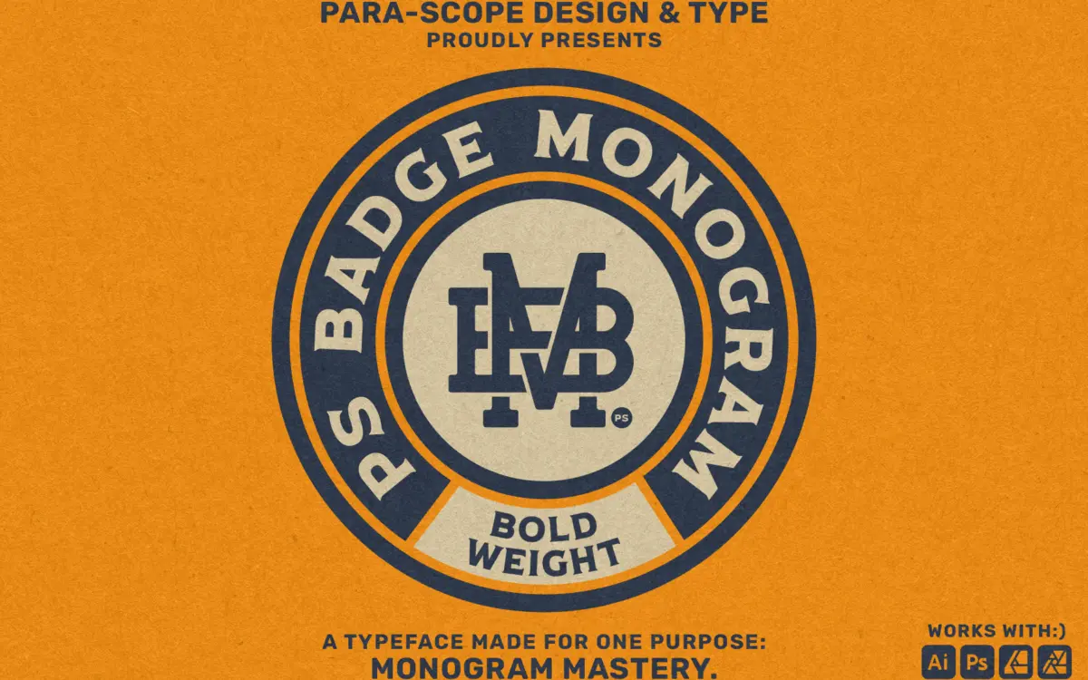
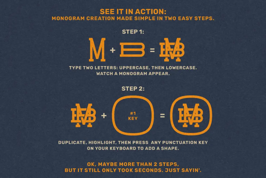
PS Badge Monogram is not a typeface in the usual sense — it’s a monogram-building system dressed up as a font. Typing two letters produces a combined badge-style mark, built from bold slab-serif forms that lean into the crest-and-emblem tradition common to barbershops, breweries, and merch labels. The slabs are thick, the serifs are squared off rather than bracketed, and the letters are drawn to interlock rather than sit side by side. That’s the whole premise: instead of hand-fitting kerning and overlaps in an illustration app, you type the two initials and a pre-built combination appears.
The bold weight is the operative word here. Strokes are heavy, counters are tight, and the forms read as a solid stamp rather than a delicate mark. This works in its favour — badge lettering is meant to look permanent and stamped, not airy — but it also means the letterforms have limited range. There’s one mood on offer: confident, blunt, a little retro. If you need a lighter or more refined monogram register, this isn’t it.
Character set and features
Because each glyph is a pre-composed two-letter combination rather than an individual letter, the character set works differently from a normal font. It ships in two styles — Solid and Gapped — which give you either a fused monogram block or one with a visible seam between the letters, useful depending on whether you want the badge to read as one unit or as two initials you can still parse individually.
The appeal for production work is real: a thousand-plus combinations living in a font file rather than a folder of PNGs means smaller storage, faster access, and — crucially — the ability to convert to outlines and scale to any size without quality loss. That’s a meaningful practical advantage over pre-rendered monogram packs, and it’s the strongest argument for choosing a font-based system like this over a graphic asset pack.
The trade-off is that you’re locked into the designer’s spacing and letter-pairing decisions. There’s no kerning to adjust, no baseline shift, no way to nudge one letter half a point closer without leaving the intended system. For some pairs the interlocking will look considered and tight; for others, given the sheer number of combinations required, the fit will be serviceable rather than bespoke. That’s an inherent limitation of any two-letter automated system, not a flaw unique to this one, but it’s worth knowing going in.
Use cases
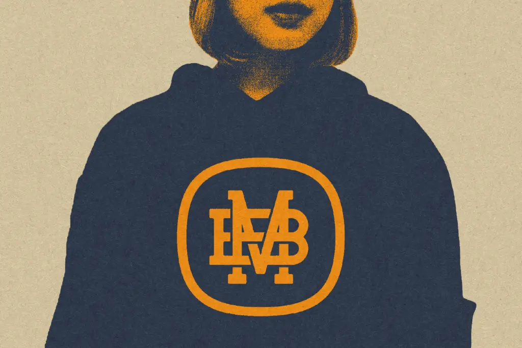
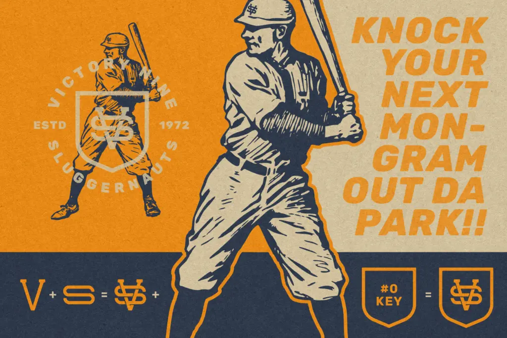
This is a tool for people who need a badge monogram fast and don’t have time to hand-letter one: apparel decoration, product stamps, wedding monograms for stationery and signage, quick client logo concepts, or personalised merch where a bold two-letter crest does the job. It’s well suited to any project where the monogram is meant to look stamped, solid, and slightly vintage rather than airy or calligraphic.
It’s less suited to jobs needing a single custom mark refined over many rounds — designers who need pixel-level control over kerning and letter interaction should treat this as a fast starting sketch, not a finished logo. Used that way, generating a base shape to trace and adjust, it earns its place in a toolkit even for more demanding client work.
What we liked, and what we didn’t
Strengths
- Outputs scalable vector monograms instead of bulky raster files
- Solid and Gapped styles cover two distinct badge treatments
- Bold slab forms give an immediate stamped, vintage-badge feel
Trade-offs
- No manual kerning control over how individual letter pairs interlock
- Only one weight and mood available, limiting use beyond the badge aesthetic
PS Badge Monogram trades typographic nuance for speed, and for badge-style merch and quick logo concepts that trade pays off. Designers who need fine control over letter fit will find the automated pairings a starting point rather than a finished product.
Verdict

Tantype reviews typefaces in depth — every font is tested in real branding, editorial and screen layouts before a word gets written. 555+ fonts reviewed and counting.