Script
3.9
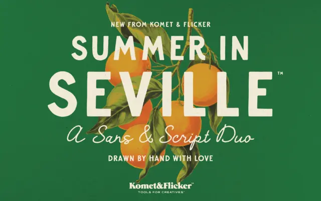
Summer in Seville: a hand-drawn sans and script duo for retro branding
Design style Summer in Seville pairs two hand-drawn faces built around the same idea of worn, old-world lettering. The sans…
 Tantype

Design style Summer in Seville pairs two hand-drawn faces built around the same idea of worn, old-world lettering. The sans…
Tantype
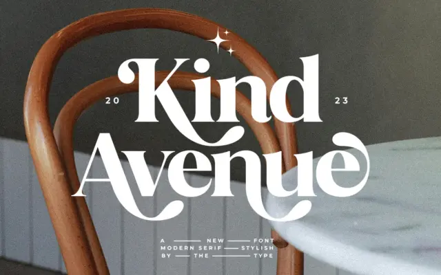
Design style Kind Avenue sits in that familiar territory of retro serifs pulling from mid-century signage and print — the…
Tantype
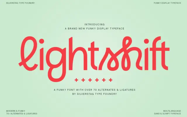
Design style Lightshift sits in that crowded corner of type design where sans-serif geometry gets loosened up with script-style connections.…
Tantype
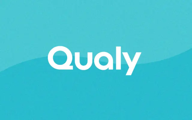
Design style Qualy is a geometric sans reduced to its bare structural bones. Circles read as circles, verticals are dead…
Tantype
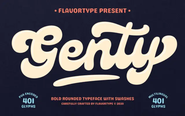
Design style Genty is a heavyweight script with rounded, bouncy strokes that lean more toward novelty lettering than traditional calligraphy.…
Tantype
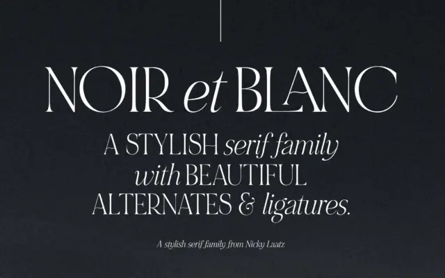
Design style NOIR et BLANC is built around a deliberate mismatch: bold, high-contrast uppercase serifs paired with a slanted, lower-contrast…
Tantype
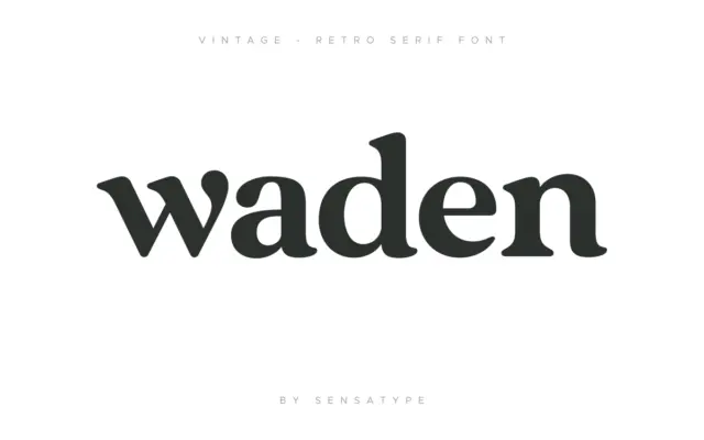
Design style Vintage is a serif built around the idea of layering rather than a single confident letterform. The base…
Tantype
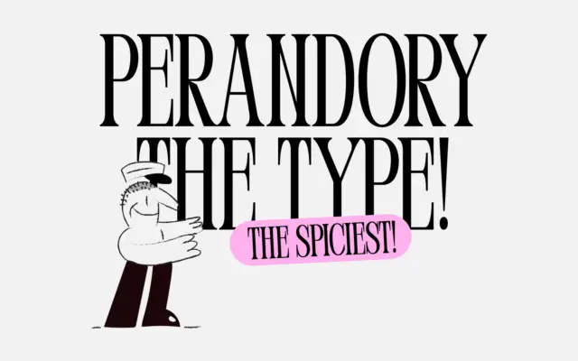
Design style Perandory is a display serif built around tension rather than comfort. The brief describes it as inspired by…
Tantype
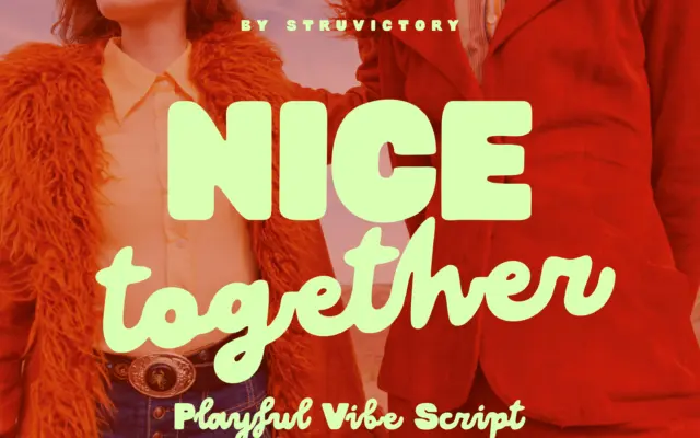
Design style Nice Together is the script half of a two-style release, drawn as a loose, lowercase-only handwritten face with…
Tantype