
Vintage: A Layered Retro Serif Built for Stacking Effects
Design style
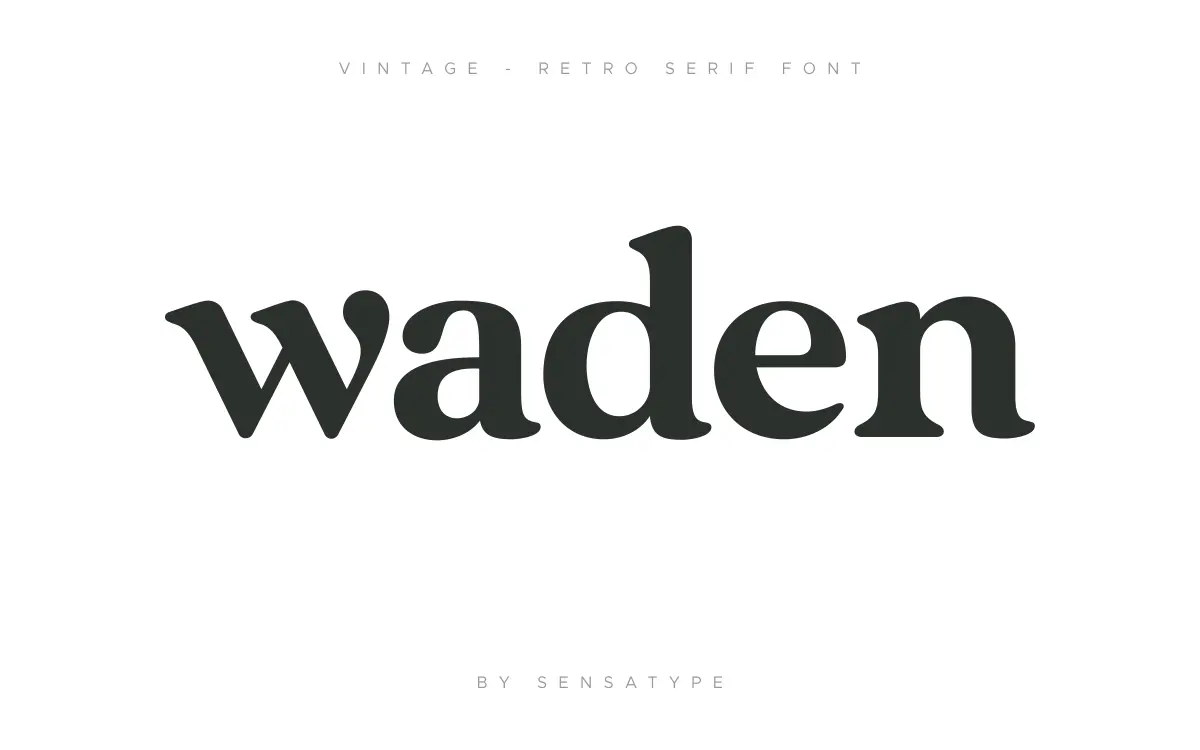
Vintage is a serif built around the idea of layering rather than a single confident letterform. The base weight is a moderate-contrast serif with the kind of slightly bulged bracketed serifs and rounded joins you associate with old badge lettering and hand-painted signage. On its own it reads as a solid, workmanlike display serif — nothing groundbreaking in the skeleton, but the proportions are even and the curves don’t wobble.
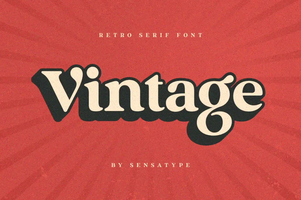
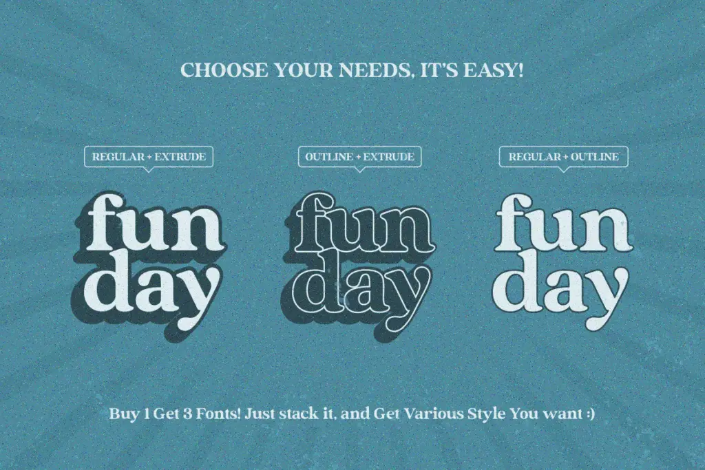
The real design idea is the stacking system. The family ships with a base font, an Outline companion and an Extrude companion, drawn to align exactly on top of each other. Layer them in a design app and you get a dimensional, screen-printed look without redrawing anything. That’s the point of view here: less about a novel letter shape, more about a modular effect you build in seconds. If you strip away the layering, the base face is pleasant but fairly generic vintage-serif fare.
Character set and features
Coverage is straightforward: uppercase and lowercase A–Z, numerals, standard punctuation, and accented characters for Western European languages, so basic multilingual setting in French, German, Spanish and similar is covered. There are stylistic alternates for a handful of letters, useful for breaking up repetition in short badge-style lines, though the alternate set isn’t deep enough to give every word a fully different personality.
The three-file structure (regular, outline, extrude) is really the headline feature rather than an extensive glyph set. If you’re expecting swash-heavy ligatures or a script companion, this isn’t that font — it’s a display serif with a dimensional trick, not an ornamented calligraphic system. Kerning is even enough at display sizes, though tight tracking on the outline layer can look muddy at small point sizes, so this is not a face for body text or fine print.
Use cases
This font is built for short-word, large-scale work: logo lockups, badge and label designs, packaging headers, social posts, and stationery pieces that want a retro, hand-crafted feel without an illustrator’s hourly rate. The layered files make it genuinely handy for anyone working in Illustrator or Photoshop who wants a quick dimensional wordmark — stack base, outline and extrude, adjust colours and offsets, done. It also suits Canva-style quick-turnaround projects where a single stylised word needs to look considered without much fussing.
It’s less suited to anything requiring sustained reading — paragraph text, long headlines, or dense editorial layouts will expose the display-only design and the softness of the outline weight at small sizes. Treat it as a short-copy, high-impact tool: a name on a bottle, a word on a badge, a title on a flyer. For that narrow but common brief, it does the job efficiently, and the built-in layering saves real production time compared with faking the effect by hand.

What we liked, and what we didn’t
Strengths
- Base, outline and extrude files align perfectly for instant dimensional effects
- Stylistic alternates help break up repetition in short badge-style lines
- Western European accented characters allow basic multilingual short-copy use
Trade-offs
- The base letterforms are pleasant but not especially distinctive on their own
- Outline layer loses clarity at small sizes, limiting it to display use only
Vintage is a competent retro serif whose real value is the ready-made layering system rather than the base letterforms themselves. It's a fast route to a dimensional badge or logo look, but it's not built for reading at length or for subtle typographic work.
Verdict

Tantype reviews typefaces in depth — every font is tested in real branding, editorial and screen layouts before a word gets written. 555+ fonts reviewed and counting.