
Genty: A Bold Rounded Script Built for Loud, Playful Branding
Design style
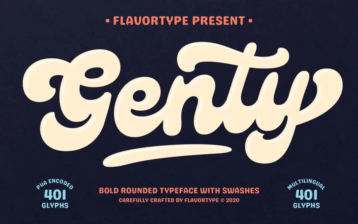
Genty is a heavyweight script with rounded, bouncy strokes that lean more toward novelty lettering than traditional calligraphy. The letterforms are thick and confident, with soft, blunted terminals that give the whole face a friendly, almost bubblegum quality. Where a lot of script fonts chase elegance through thin-thick contrast, Genty goes the other way: it’s chunky throughout, so the rhythm comes from the swash flourishes rather than stroke modulation.
The swashes are the real design statement here. They loop under baselines, swoop off ascenders, and occasionally climb into the space above the cap height. This is a script built to be noticed, not to disappear into a paragraph. It sits in a lineage of retro-leaning display scripts that took hold in badge design and packaging a few years back, and it wears that influence openly rather than trying to hide it.
Character set and features
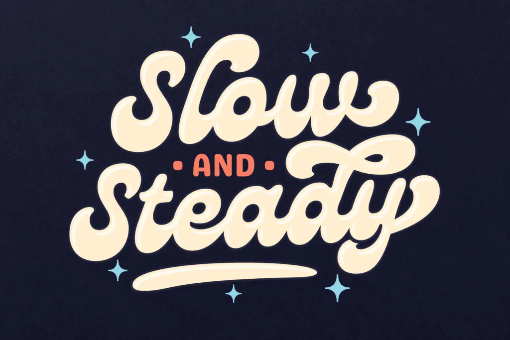
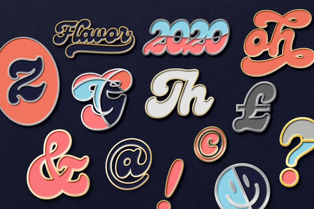
Genty comes loaded with OpenType infrastructure: contextual alternates, ligatures, and stylistic sets that reportedly offer up to fifteen alternate forms for some letters. That’s a genuinely useful depth of coverage for a script font, since scripts live or die on how well repeated letters avoid looking mechanically identical. Ascender and descender swashes, uppercase swashes, and under-letter swoops round out the set, giving you enough variation to hand-letter a headline without any single character betraying the others as copies.
The catch with any font this generous in alternates is that it asks something of you. Genty’s default glyphs are usable straight out of the box, but the font’s real personality only shows up once you start swapping in alternates and manually kerning the swashes so they don’t collide with neighbouring letters. This isn’t a font you drop in and walk away from — it rewards the kind of fiddling that letterers already expect to do, but it will frustrate anyone hoping for instant, no-touch results. A companion sans serif is included for pairing, which is a practical inclusion given how demanding the script is on its own; it’s not something to lean on for body copy regardless.
Use cases
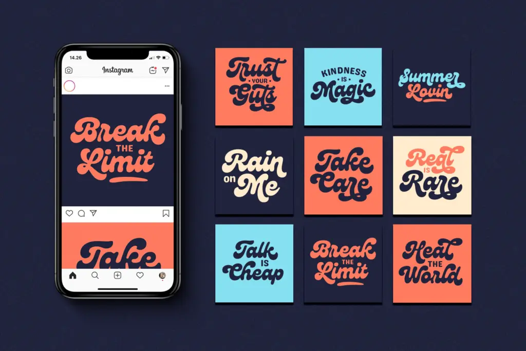
Genty is built for short bursts of text: logotypes, badge lockups, product labels, social graphics, event posters. Anywhere a brand wants a warm, slightly retro, unmistakably handmade voice, this delivers it convincingly. The bundled social stickers and Instagram story assets confirm where the seller expects most of this font’s life to be spent — quick, disposable, high-visibility graphics rather than long-form editorial layouts.
It is not a font for setting sentences. The swash weight and letter width mean it gets visually noisy fast once you go beyond a word or two, and legibility drops off quickly at small sizes. Treat it strictly as a display and lettering tool, paired with a plain typeface for anything that needs to actually be read rather than looked at, and it earns its keep.
What we liked, and what we didn’t
Strengths
- The alternate and swash system offers real variation across repeated letters rather than obvious copy-paste repetition.
- The bold, rounded stroke weight gives it a warm, tactile personality that reads well at poster and badge scale.
- The included sans serif companion gives a practical, ready-made pairing for supporting text.
Trade-offs
- Legibility drops sharply below display sizes, so it's unsuitable for anything resembling body copy.
- Getting the swashes to sit cleanly against neighbouring letters requires manual kerning rather than working out of the box.
Genty is a confident, swash-heavy display script that does one job well: loud, retro-flavoured branding moments. It demands manual tuning to look its best and has no business setting anything longer than a headline, but within that lane it's a distinctive, well-built option.
Verdict

Tantype reviews typefaces in depth — every font is tested in real branding, editorial and screen layouts before a word gets written. 555+ fonts reviewed and counting.