
Kind Avenue: A Retro Serif That Toggles Between Conservative and Playful
Design style
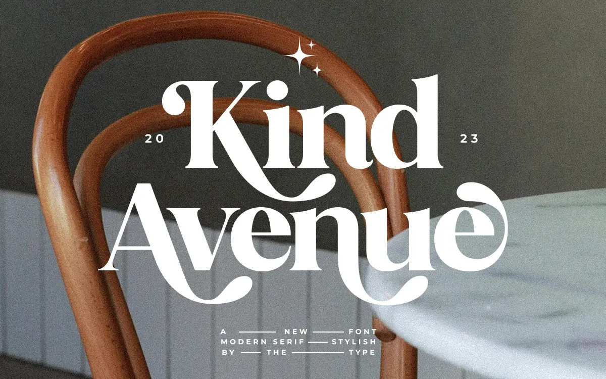
Kind Avenue sits in that familiar territory of retro serifs pulling from mid-century signage and print — the kind of letterform that wants to sit on a diner menu or a record sleeve without shouting about it. Left alone, it reads as fairly conservative: even stroke contrast, restrained serifs, a steady baseline rhythm that doesn’t call attention to itself. That’s the design’s real trick. It doesn’t commit to one register. Swap in the alternate characters and ligatures and the same skeleton starts to loosen up, with swashier terminals and connected forms that push it toward something more expressive and less buttoned-down.
The trade-off is that this dual personality means the font is doing two jobs at once, and neither is pushed as far as it could be. It’s not aggressively retro in the way a bold 60s script poster face might be, and it’s not a fully settled text serif either. It occupies a middle ground that’s useful precisely because it’s moderate, but designers looking for a strong, singular point of view might find it a little noncommittal on first glance.
Character set and features
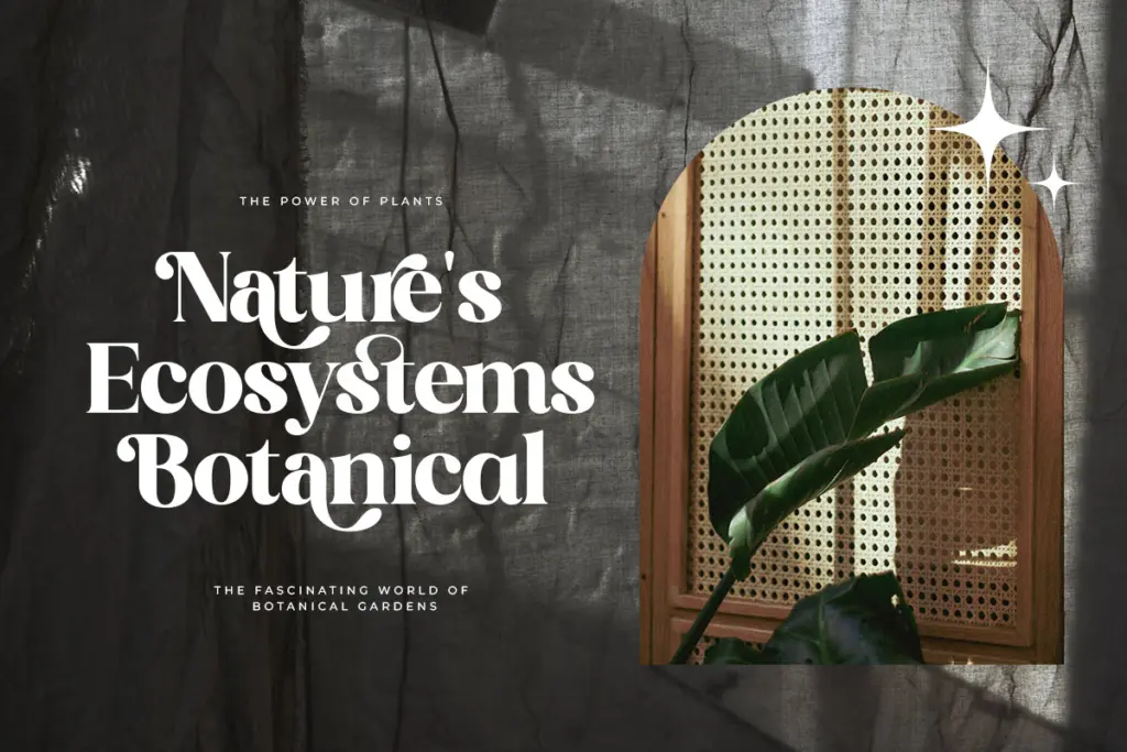
The alternates and ligatures are the actual substance of this release, not a decorative add-on. Swapping standard letters for their alternates changes the tone of a word noticeably — a heading set in default characters looks tidy and forgettable, the same heading with a few swapped-in alternates picks up personality without needing a second typeface in the layout. That’s a genuinely practical feature for anyone building a logotype or a short headline where a bit of idiosyncrasy matters.
Multilingual support is broad, covering the extended Latin diacritics needed for most Central and Eastern European languages, which matters if the brief has any international reach at all. The catch with a font built around manual substitution is that it asks for attention. Ligatures and alternates generally need to be accessed through OpenType features or picked by hand in software that supports it — Canva-style drag-and-drop tools may only expose the default set, in which case you’re working with the calmer, more generic side of the font’s personality and missing the point of buying it.

Use cases
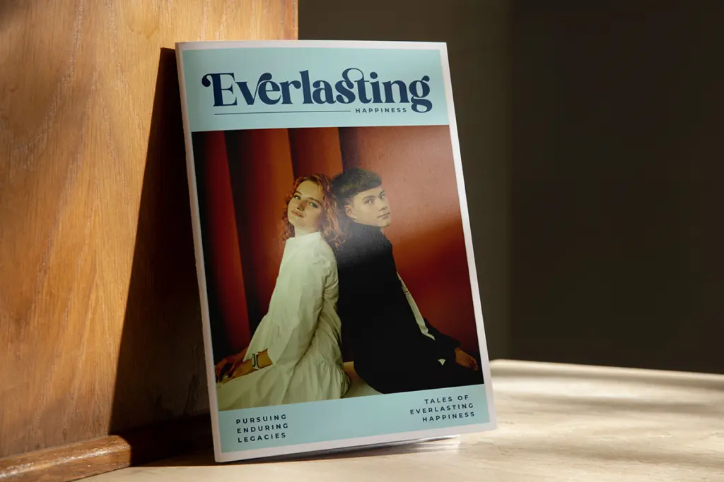
This is a headline and short-copy font before it’s a body-text font. It performs at display sizes — packaging labels, book covers, social graphics, small branding marks — where the alternates and ligatures have room to be seen and appreciated. At smaller sizes the retro serif detailing softens into something plainer, which is fine for a paragraph of copy but doesn’t showcase what makes the typeface interesting.
It suits projects with a light vintage brief: a coffee packaging label, a craft brand’s cover typography, a 60s-leaning social post, a small run of branded stationery. It’s less suited to anything requiring a wide weight range or a strict corporate system, since what’s described here is a single stylistic serif with alternates rather than a full family with multiple weights. Designers should treat the alternates as the reason to buy it, and plan layouts that actually use them rather than defaulting to the base character set.
What we liked, and what we didn’t
Strengths
- Alternate characters and ligatures genuinely change the tone of a headline without swapping fonts.
- Broad extended-Latin diacritic support makes it usable across several European languages.
- Restrained default forms mean it doesn't look dated or gimmicky at rest.
Trade-offs
- The alternates require OpenType-aware software; drag-and-drop tools may only show the plainer default set.
- As a single stylistic serif rather than a full weight family, it has limited range for larger branding systems.
Kind Avenue is a competent retro serif whose real value is in its alternates and ligatures, which let one design flex between restrained and playful. It's best used at display sizes on packaging, covers and short branding copy rather than as a workhorse text face, and its usefulness depends on whether your software actually exposes its OpenType features.
Verdict

Tantype reviews typefaces in depth — every font is tested in real branding, editorial and screen layouts before a word gets written. 555+ fonts reviewed and counting.